- Home
- /
- SAS Communities Library
- /
- How to customize your SAS Visual Analytics report: Part 3 - Create a d...
- RSS Feed
- Mark as New
- Mark as Read
- Bookmark
- Subscribe
- Printer Friendly Page
- Report Inappropriate Content
How to customize your SAS Visual Analytics report: Part 3 - Create a dynamic title
- Article History
- RSS Feed
- Mark as New
- Mark as Read
- Bookmark
- Subscribe
- Printer Friendly Page
- Report Inappropriate Content
This is my third article in a series of three that walks through different ways to customize your SAS Visual Analytics report. Check out the first entry on creating a custom graph and second article on augmenting data with custom categories.
As I mentioned previously in this series, creating reports in SAS Visual Analytics is a very iterative process. You start by building a graph, make incremental changes, review, make additional changes and so on. This last entry will focus on how to create a dynamic title for your report.
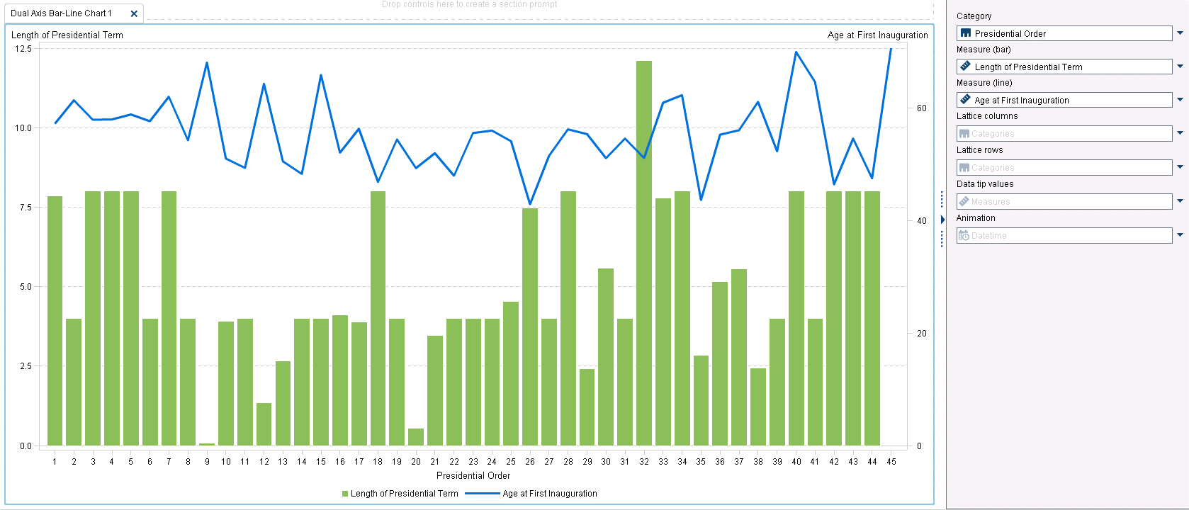
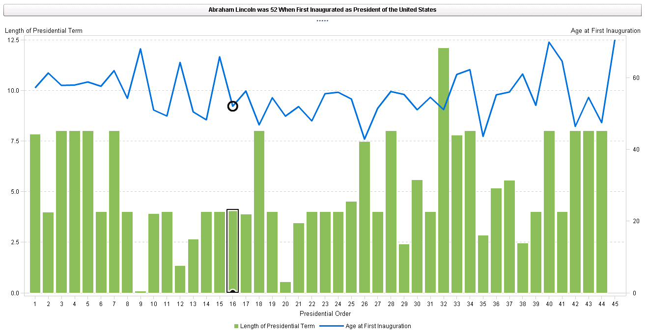
We start in Report Designer by building a simple Dual Axis Bar-Line Chart. The roles are defined as :
- Category - [PresidentialOrder]
- Measure (bar) - [Length of Presidential Term] (green bar)
- Measure (line) - [Age at First Inauguration] (blue line)
Sort the chart by Presidential Order in ascending order
Note - If you are using the companion SAS data set provided for these exercises, Presidential Order was changed from Measure to Category before adding it to the above chart. This is an example of how simple and straight forward it is to change the characteristics of your data.
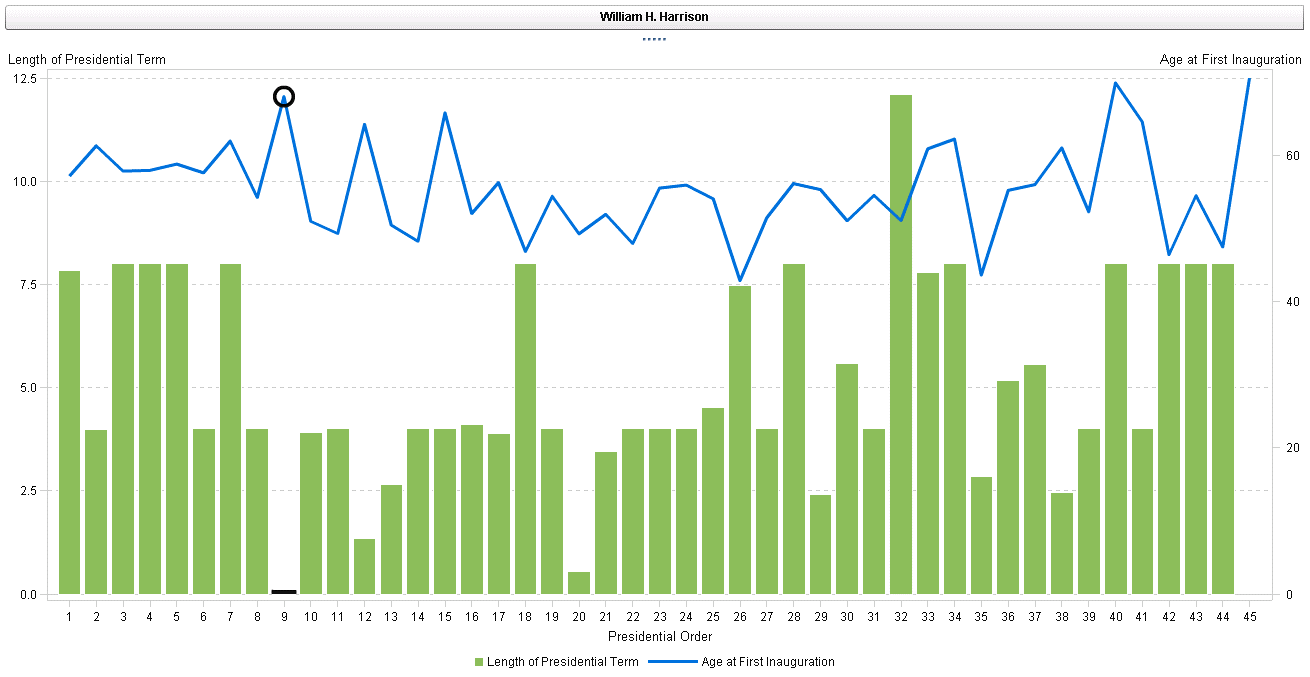
One item that jumps out at me is that president number nine had an extremely short presidency (William Henry Harrison died after 31 days in office). But the graph is incomplete ... that is, unless I knew the name of president number nine, I would be left wondering. A visualization should never leave the user guessing what something means. A simple solution is to add a dynamic title that changes when the user selects a bar.
How to create a dynamic report title
We will use the Button Bar to display the dynamic title in the existing dual axis bar chart
- From the Report Designer, click on the Objects tab
- Drag in the Button Bar control
- Click on the Data tab
- Add President to the category
- Remove Frequency from the Frequency role (otherwise it will show up in your “title”)
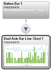
- Create an interaction by clicking on the Interaction tab on the right pane
- Click on the Interactions View
- Hover over the Bar Chart until the arrow changes to a pencil
- Drag a line from the Bar Chart to the Button Bar
- Click Close
- There is now an interaction, where clicking on an individual bar (or point on the line) will dynamically change the selection of the button bar
Now when you select an individual bar, the title will dynamically change to your selection.
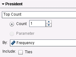
The result is much better. A user can interact with the report and immediately know what president has been selected. But as the report currently exists, there is a limitation that can easily be fixed. If you deselect your selection on the chart, ALL the presidents show up in the button bar, which is extremely busy, as well as confusing. We can change this by creating a rank (on the button bar) for the category President, and showing the Top Count of 1, by frequency. Also, deselect ties, otherwise all presidents with a frequency of 1 will display. Now if you deselect your selection on the chart, only one president will show up in the button bar.
And don't forget you can always change the font, background color, etc. by clicking on the Styles tab on the right and making the appropriate changes.
This dynamic title helps to give more information about the report. But what if we want to add even more information to the report title? What if we want to include not only the name of the selected president (category), but also their age when first inaugurated (measure)?
How to combine text and measures in a dynamic title
To create a dynamic title with a combination of category and measure, we will need to create a calculation, and then apply that calculation to the button bar.
- In Report Designer, click on the Data tab
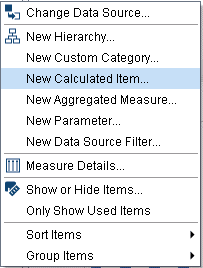
- Click on the
and select “New Calculated Item”
- Name the Calculation “Dynamic Title”
- Drag in the Concatenate operator (either search for it or find it under Text-simple)
- Drag in President from the Character Data Item
- Type in “ was” in the second operator
- Note - there is a space before and after “ was ” so the dynamic title displays properly
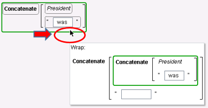
- Drag in Concatenate one more time
- Note – when you drag in concatenate again, you will want to add it to the end of your existing expression. To do this, before dropping it on the workspace, hover over the bottom right of the existing expression. This will wrap the text at the end of your existing expression.
- I also want to bring in a number (age). The Concatenate operator expects a character, but the age is a numeric measure. We can do this with the Format operator.
- Drag in the Format operator (either search for it, or find it under Text-simple)
- Now you are able to drag in the measure “Age at First Inauguration” without error
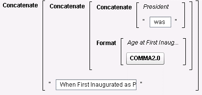
- Format it as appropriate (I used comma2 and 0 decimal in my example)
- Drag in Concatenate one last time
- Type in “When First Inaugurated as President of the United States”
- Once again, make sure there is a space before your text begins
Belows are images of the formula, in both Visual and Text mode:
- Replace the Category of the Button Bar to the new calculation “Dynamic Title”
- Add a new Rank for Dynamic Title, to Top Count of 1, based on frequency
- Now when you select a president from the bar chart, the title dynamically gives you the name AND age of the president, along with some other text. In the example below, selecting on president 16 (Abraham Lincoln) shows the following title.
Dynamic titles are a very powerful feature that increases your users understanding of a report. I hope you are able to leverage them in your reports. Happy Visualizing!
- Mark as Read
- Mark as New
- Bookmark
- Permalink
- Report Inappropriate Content
Hi Steve,
I tried to create button bar to create dynamic title and I am not getting a option to create interaction from Dual line bar chart to this button bar. Could you please guide me ..!
Catch up on SAS Innovate 2026
Nearly 200 sessions are now available on demand with the SAS Innovate Digital Pass.
Explore Now →SAS AI and Machine Learning Courses
The rapid growth of AI technologies is driving an AI skills gap and demand for AI talent. Ready to grow your AI literacy? SAS offers free ways to get started for beginners, business leaders, and analytics professionals of all skill levels. Your future self will thank you.
- Find more articles tagged with:
- How to customize a SAS Visual Analytics report
