- Home
- /
- SAS Communities Library
- /
- How to create an animated bubble plot in SAS Visual Analytics
- RSS Feed
- Mark as New
- Mark as Read
- Bookmark
- Subscribe
- Printer Friendly Page
- Report Inappropriate Content
How to create an animated bubble plot in SAS Visual Analytics
- Article History
- RSS Feed
- Mark as New
- Mark as Read
- Bookmark
- Subscribe
- Printer Friendly Page
- Report Inappropriate Content
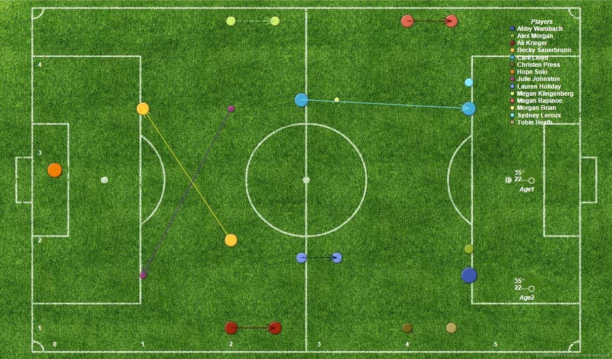
The community post describing the U.S. strategy in the 2015 FIFA Women’s World Cup included a SAS Visual Analytics animated bubble plot to show the evolution of player position from the start of the tournament to the final match against Japan. When first developing this graph, I considered using a bubble change plot to display the team transformation. I worked on a bubble change plot in SAS Visual Analytics Designer, and modified it in Graph Builder. But I realized that the bubble change plot wouldn’t effectively demonstrate movement of key players Carli Lloyd and Morgan Brian over a period of time. A bubble change plot shows changes in two sets of measures (time periods in this case) using bubbles and directed line segments.
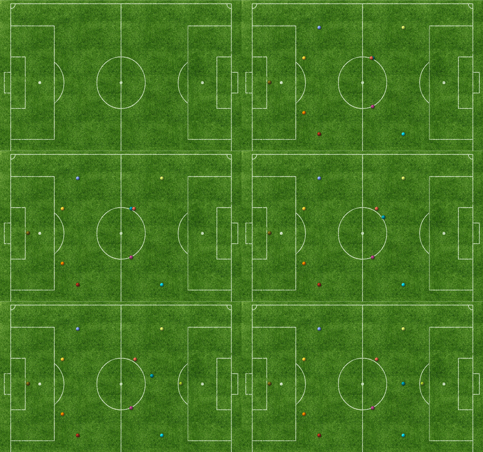
So, I added an animation to clearly distinguish the change in player lineup from a 4-4-2 formation to a 4-2-3-1 setup. The resulting graph reveals player movement over time, and brings out the “story” of Carli Lloyd’s success as an attacking midfielder.
In addition, I used a schematic soccer field as the background image. Here are instructions on how to incorporate a background image, bubble change plot, and animation into a graph in SAS Visual Analytics. I hope this entices you to give it a try. If you do, tell the community about it as part of the custom graph series!
Note: The graph examples are shown in SAS Visual Analytics 7.3.
How to incorporate the background image
1) Open SAS Visual Analytics and click on Report Designer.
2) In the left hand column, located within Other category, select Image.
3) Upload the image you wish to use.
- Select Load from repository if the image is already loaded within a specific folder.
- Select Load from local machine if the image is stored within the machine you are using.
4) Select Browse and locate the desired image.
- If you are uploading the image from your machine, select a location in the repository to save your image (ex: My Folder, Shared Projects, Shared Data).
5) For Scale Type, select Stretch in order to fit the whole section.
6) Next, click OK and your image will be uploaded.
How to incorporate the bubble change plot
1) On the left hand panel, in the Objects Tab, select the icon pictured to create a custom graph.

2) Within the popup, scroll all the way down and select Bubble Change Plot.
3) In Graph Builder, you may customize the Bubble Change Plot in the Properties Tab to your liking.
4) In the top left corner, select File, then select Save As. Locate in your folders where you would like to save your Custom Graph.
5) To go back to Report Designer, click on Report 1 (or name of your report) in the top left corner.
6) In the left hand column of Report Designer, scroll all the way down until you see the name of your Custom Graph, select it and drag it onto the section.
7) In order to overlay the Bubble Change Plot on top of the image, in the right hand panel select the Properties Tab and in the drop down text box select Section 1.
😎 Within the Properties Tab, in the general selection, change the layout to Precision and then click Yes.
9) Drag the Bubble Change Plot over the image in order to start the process of creating an Infographic, by clicking on the Bubble Change Plot and placing it exactly over the image.
10) Next, click on the image and drag the dimensions to fit the screen.
11) In the Roles tab on the right hand side, be sure you have such variables: Group, Y end, X end, Y start, X start, Size start, Size end.
12) To load your data, click on the left hand side panel and on click on the Data Tab. Click the drop down arrow and select your desired data source, then click OK.
How to customize the bubble change plot
1) In order to make the Infographic look presentable, the Bubble Change Plot background should be transparent. To do this, click on the Bubble Change Plot then within the right hand panel select the Styles Tab and have Custom Graph 1 (or name of your Custom Graph) selected in the text box. Within the Border and Fill category, scroll the bar for Background all the way to the right to make the background transparent.
2) Then, in the Frame Styling category move the scroll bar all the way to the right for Wall background, this will set the background of the Bubble Change Plot to transparent.
3) To make the legend background transparent as well, drag the scroll bar for Legend background to the right.
4) To remove grid lines, click on the Properties Tab and in the Grid Lines category uncheck “Show grid lines”.
5) Within the X Axis and Left Y Axis categories uncheck the box labeled “Show Label”.
6) In the Legend section, you have the option of either displaying or hiding the legend.
7) From here, click on the Styles tab and under Frame Styling select a color for axis lines, reference lines, and legend outline that correlates with your background image. To blend in with the soccer field, I chose a light green color, see below:

How to create the bubble plot with an animation
1) After the image is loaded, on the left hand panel, select Bubble Plot in the Graphs Category and drag it onto the section.
2) In order to overlay the Bubble Plot on top of the field, in the right hand panel select the Properties Tab and in the drop down text box select Section 1.
3) Within the Properties Tab, in the General section, change the layout to Precision and then click Yes.
4) Drag the Bubble Plot over the image in order to start the process of creating an Infographic, by clicking on the Bubble Plot and placing it exactly over the image.
5) Next, click on the image and drag the dimensions to the fit the screen. The background image should be beneath the Bubble Plot.
6) To load your data, click on the left hand side panel and on click on the Data Tab. Click the drop down arrow and select your desired data source, then click OK.
7) Customize the Bubble Plot exactly as stated above in the “How to customize the bubble change plot” process.
😎 In the Roles tab, check to see if your X axis, Y axis, Size, Group, and Animation roles are filled. The Animation variable must be a date/time.
9) To regulate the Animation’s speed, drag the scroll bar to have the Animation play at 1/5x, 1x, or 5x.
10) Press Play to watch the animation start, and press loop to continuously play the animation.
This is the resulting graph:

SAS AI and Machine Learning Courses
The rapid growth of AI technologies is driving an AI skills gap and demand for AI talent. Ready to grow your AI literacy? SAS offers free ways to get started for beginners, business leaders, and analytics professionals of all skill levels. Your future self will thank you.
- Find more articles tagged with:
- sas_visual_analytics_custom_graph_object
- world_cup_visualizations

