- Home
- /
- SAS Communities Library
- /
- How to Survive Survival Analysis with SAS - Part II
- RSS Feed
- Mark as New
- Mark as Read
- Bookmark
- Subscribe
- Printer Friendly Page
- Report Inappropriate Content
How to Survive Survival Analysis with SAS - Part II
- Article History
- RSS Feed
- Mark as New
- Mark as Read
- Bookmark
- Subscribe
- Printer Friendly Page
- Report Inappropriate Content
Editor's note: SAS programming concepts in this and other Free Data Friday articles remain useful, but SAS OnDemand for Academics has replaced SAS University Edition as a free e-learning option. Hit the orange button below to start your journey with SAS OnDemand for Academics:
A couple of weeks ago, I posted an article on Surviving Survival Analysis that I was really excited about. I wanted to expand on that to show some of the other graph-enhancing features you could do (including changing colours), but kept running into roadblocks. After a quite of bit of head scratching, back-and-forth with SAS Technical Support, and talking to friends, I’ve finally figured out what the issue was trying to change the colours of the lines in my Kaplan-Meier curve (hint: combination new things I didn’t know 
So, now that I have something to write about, let’s get down to it!
Get started with SAS OnDemand for Academics
Get the Data
If you recall, I’m using the New York Patient Dataset, but have significantly truncated it to one site. The 2012 data can be downloaded from here (you can also get the 2011 data).
Getting the data ready
Before we can down to the actual analysis, we have to do some preliminary data manipulation to make our lives easier in the long run.
We’re creating a temporary table (called work.import2) and inserting the Length_of_stay variable with a new variable “Illness_Category”, which is using the APR_Severity_of_Illness_Descript variable (the same one we used in the previous article). The case statement takes the classifications and assigns a number in front (Minor becomes 1-Minor, etc.). The reason we’re doing this is so that when we have the legend, the data will be sorted in a logical order.
proc sql;

create table work.import2 as
select length_of_stay,
case when APR_Severity_of_Illness_Descript = 'Minor' then '1-Minor'
	 when APR_Severity_of_Illness_Descript = 'Moderate' then '2-Moderate'
	 when APR_Severity_of_Illness_Descript = 'Major' then '3-Major'
	 when APR_Severity_of_Illness_Descript = 'Extreme' then '4-Extreme'
end as Illness_Category
from work.import1;
quit;
The Results
The next section of code is something I’ve not introduced prior to this – but it’s relatively straightforward. PROC TEMPLATE allows you to build a template that you want to apply to your graphs and tables.
proc template;
   define style Styles.StatColor;
      parent = Styles.HTMLBlue;
      style GraphData1 / contrastcolor = green;
      style GraphData2 / contrastcolor = orange;
      style GraphData3 / contrastcolor = yellow;
      style GraphData4 / contrastcolor = red;
   end;
run;
The first line is calling the style a name that is easy to remember. The next line indicates the style you want to use as the base, in my case HTMLBlue. The next four lines are the key ones – you have to have one “style” indicated for each category on your graph. We have 4 categories, therefore 4 rows (Green, Orange, Yellow and Red). The END terminates the building of the template, and then run as per usual.
The next section of code is the slightly modified PROC LIFETEST we saw in the previous article.
ods html5(id=web) style=Styles.StatColor;

proc lifetest data=work.import2 notable plots=(survival (cb atrisk));
time length_of_stay;
strata Illness_Category;
quit;
There is in fact one difference – the ods line which specifies the template to be used. HTML5 is the output we want, and then style indicating the template we’ve created.
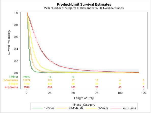
Here’s the output:
You can see the lines are clearly labelled, sorted in a logical order, and all with just a few lines of code. I highly recommend reading up on PROC TEMPLATE – you can cause irreversible changes to your previously installed templates, and from what I understand they are challenging to restore. You can do a lot with PROC TEMPLATE, from inserting images, modifying fonts, adding notes, and a wide range of other modifications.
Now it’s your turn!
Did you find something else interesting in this data? Share in the comments. I’m glad to answer any questions.
- Mark as Read
- Mark as New
- Bookmark
- Permalink
- Report Inappropriate Content
- Mark as Read
- Mark as New
- Bookmark
- Permalink
- Report Inappropriate Content
Hi @Atims
Can you provide an example of what you mean? There are a lot of great papers at www.lexjansen.com - simply search for what you're looking for, and you should be able to find papers on your topic (or at least something close that you can modify).
Good luck and have a good evening
Chris
Catch up on SAS Innovate 2026
Dive into keynotes, announcements and breakthroughs on demand.
Explore Now →SAS AI and Machine Learning Courses
The rapid growth of AI technologies is driving an AI skills gap and demand for AI talent. Ready to grow your AI literacy? SAS offers free ways to get started for beginners, business leaders, and analytics professionals of all skill levels. Your future self will thank you.
- Find more articles tagged with:
- Data for learning
- Free Data Friday


