- Home
- /
- SAS Communities Library
- /
- Examining the rising price of gasoline in the U.S. with SAS
- RSS Feed
- Mark as New
- Mark as Read
- Bookmark
- Subscribe
- Printer Friendly Page
- Report Inappropriate Content
Examining the rising price of gasoline in the U.S. with SAS
- Article History
- RSS Feed
- Mark as New
- Mark as Read
- Bookmark
- Subscribe
- Printer Friendly Page
- Report Inappropriate Content
Editor's note: SAS programming concepts in this and other Free Data Friday articles remain useful, but SAS OnDemand for Academics has replaced SAS University Edition as a free e-learning option. Hit the orange button below to start your journey with SAS OnDemand for Academics:
Welcome back to the Free Data Friday series! I hope everyone had a great summer and looks forward to getting back into analytics and free data.
Today’s post is relatively simple and answers questions I’ve had for a while on transportation costs. We’re going to be looking at gas prices, specifically for the US and how they’ve changed over the past 22 years or so.
Get the data
I got the data from the US Energy Information Administration, and you can download it here.
Get Started with SAS OnDemand for Academics
Get the data ready
There were a lot of columns in the data set – many of them I didn’t understand – so I went with the Date and the first column called “Weekly U.S. Regular Conventional Retail Gasoline Prices (Dollars per Gallon).” I used this because it had the most data available and I really wanted “big data." I changed the name of the variable to “All_Types_Dollar_Per_Gallon” when I imported the file.
The results
The first thing I wanted to visualize was a simple line graph using all the data so I could see when things really peaked. I used the SAS University Edition Task to create the graph, but when I ran it I got the following error message:
“Too many discrete values.” OK, so basically there’s too much data and SAS UE can’t handle it for the line graph. Not to worry, we have alternatives! Our second option is a scatterplot; again, I’m going to use the Task and select the Category and Group variables, leaving everything else blank.
Now this is better – and very apparent that there has been a dramatic and significant increase in the price of gas throughout the US over the past 12 years. (And all my American friends are now going “No kidding!”) Although this graph is very clear and provides some really good information, I wanted to drill down a little more and see what the average per quarter was.
Proc sql;
Create table work.quarter as
Select distinct qtr(Date), avg(All_Types_Dollar_Per_Gallon)
From work.import
Group by qtr(Date)
Order by qtr(Date);
Quit;
When I created the scatterplot for this, it looks like 2005 was the year that average price jumped above $2 a gallon and pretty much has stayed there since.
So now I wanted to see if there was any particular quarter that was consistently lower/higher than any other. I use this type of analysis when I’m starting any sort of forecasting or longitudinal analysis to see if there are any clear seasonal trends that I need to be aware of. For this I’m using the Box Plot task, and using the data in the Work.Quarter table.
For the data I’m looking at, it doesn’t appear that there are any significant differences between quarters – Q2 and Q3 tend to be a little higher, but if I was continuing this analysis I wouldn’t be too terribly concerned. I should note however that a more in-depth look at the year-by-year variation would be needed before I went too much further with any forecasts or projections.
Now it’s your turn!
Did you find something else interesting in this data? Share in the comments. I’m glad to answer any questions.
- Mark as Read
- Mark as New
- Bookmark
- Permalink
- Report Inappropriate Content
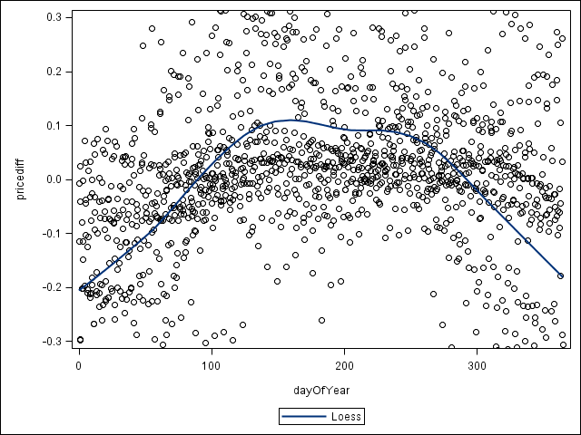
Look at it another way:
proc sql;
create table pricediff as
select
    date,
    intck("day", intnx("year",date,0), date) as dayOfYear,
    All_Types_Dollar_Per_Gallon - mean(All_Types_Dollar_Per_Gallon) as pricediff
from import
group by year(date);
quit;

proc sgplot data=pricediff;
loess x=dayOfYear y=pricediff;
yaxis min=-0.3 max=0.3;
run;
- Mark as Read
- Mark as New
- Bookmark
- Permalink
- Report Inappropriate Content
@PGStats great visualization! I had looked for daily data (wanted to see if Prices correlated to day of week) but this is interesting. Thanks for sharing and have a great weekend!
Chris
Catch up on SAS Innovate 2026
Dive into keynotes, announcements and breakthroughs on demand.
Explore Now →SAS AI and Machine Learning Courses
The rapid growth of AI technologies is driving an AI skills gap and demand for AI talent. Ready to grow your AI literacy? SAS offers free ways to get started for beginners, business leaders, and analytics professionals of all skill levels. Your future self will thank you.
- Find more articles tagged with:
- Data for learning
- Free Data Friday


