- Home
- /
- SAS Communities Library
- /
- A SAS analysis of traffic to US Government websites
- RSS Feed
- Mark as New
- Mark as Read
- Bookmark
- Subscribe
- Printer Friendly Page
- Report Inappropriate Content
A SAS analysis of traffic to US Government websites
- Article History
- RSS Feed
- Mark as New
- Mark as Read
- Bookmark
- Subscribe
- Printer Friendly Page
- Report Inappropriate Content
Editor's note: SAS programming concepts in this and other Free Data Friday articles remain useful, but SAS OnDemand for Academics has replaced SAS University Edition as a free e-learning option. Hit the orange button below to start your journey with SAS OnDemand for Academics:
Further to my post last week about the US Primaries, I wanted to find more American data to explore. After some poking around, I found a couple of great datasets at https://analytics.usa.gov. One in particular was about the traffic on US Government websites, and I was intrigued. Would there be anything relevant to the upcoming elections?
Get the Data
I recommend going through the Analytics website – definitely enough there for me to write a year’s worth of Free Data Friday posts! However, the data I used for this article came from https://analytics.usa.gov/data/live/all-domains-30-da

ys.csv. The data imported without issue. Note: the data is for the past 30 days based on the date you’re pulling the data, so numbers will change. I ran my data on October 30, 2016.
Get started with SAS OnDemand for Academics
Getting the data ready
Nothing was required to get the data ready – it was already in a format that I could use, and there were no missing or clearly incorrect data.
The results
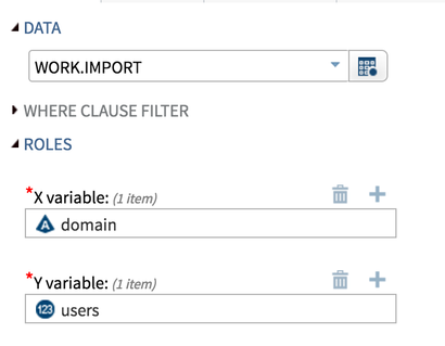
So the first thing I wanted to do is get a sense of the data, for which I did a simple scatterplot using the Task that comes with SAS University Edition:
However, when I run this task, I get an error message I’ve not seen before:
Gah! What the heck am I supposed to do now? Unfortunately, we can’t use the task as it is. However, I can copy the code and make a couple of minor tweaks:
/*--Set output size--*/
ods graphics / discretemax=2000 imagemap=off;
/* The discretemax allows me to turn off the default of 1000 distinct datapoints and customize it.  Turning the imagemap off removes the mouseovers for each datapoint */

/*--SGPLOT proc statement--*/
proc sgplot data=WORK.IMPORT   ;
            /*--Scatter plot settings--*/
            scatter x=domain y=users / transparency=0.0 name='Scatter';

            /*--X Axis--*/
            xaxis grid;

            /*--Y Axis--*/
            yaxis grid;
run;

ods graphics / reset;
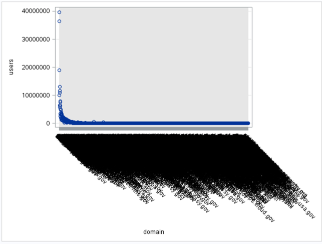
This gives us the graph as below – pretty useless as we can’t see the individual sites, but it does allow us to see overall volumes and to get a sense of what’s considered a “high traffic” site.
To make the scatter plot useful, I’m going to limit the dataset to those sites who had more than 5,000,000 (again, this from the past 30 days, so 5 million users should give me a significantly smaller dataset).
Here’s my PROC SQL to generate the dataset:
proc sql;
create table work.import2 as
select * from work.import
where users>5000000;
quit;
When I run my scatter plot on work.import2 using the same X- and Y-variables, I get the following. Much more reasonable as I can now read the individual sites:
I don’t know what tools.usps.gov is. When I try and go to the site it says Server Not Found, so I assume you have to log in to get there. In any case, they have a huge number of visitors.
One and done or repeat visitors?
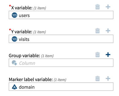
The next comparison I wanted to do was Users and Visits, to see if most people are going in only once during the 30 days or if there are sites people tend to go to repeatedly. Here’s how I set up my task:
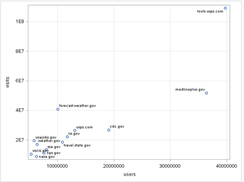
And here are the results:
Because of limited space on the Y-axis, SAS has made a minor change to the formatting – the values are now in exponential format, where 4E7 means 4 to the 10^7 (or 40,000,000). Again, the tools.usps.gov is clearly the top of the pile – but it also appears most users just go in once. The forecast.weather.gov site however appears to have most visitors that view more than once, which makes sense. Knowing how often I check the weather, this doesn’t surprise me.
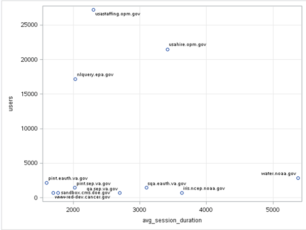
For the final analysis, let's look at average duration of a user’s session. Are they logging on and quickly leaving, potentially an indication of getting what they need quickly or realizing it’s the wrong site?
I wanted to limit my data to those people who stayed longer than 2,000 seconds; this indicate that these people have found what they’re looking for and spending an average of more than 30 minutes reading it. Or they haven’t found what they’re looking for and are determined to find it.
Here’s my code for the creation of the subdata:
proc sql;
create table work.import2 as
select * from work.import
where avg_session_duration>2000;
quit;
Here’s the scatterplot showing the results:
The usastaffing.opm.gov site has a large number of users but most spend about 30 minutes. On the other end of the spectrum, water.noaa.gov has a smaller number of users, but they spend significantly longer on the site, almost a full hour and a half. I would imagine that this site is limited to people working in meteorology, oceanography, etc. and possibly looking at satellite images or other types of data/documentation that require significant time to review.
So although I can't say for certain that any of these sites have anything to do with the election, I'm curious to see an American perspective on this data!
Now it’s your turn!
Did you find something else interesting in this data? Share in the comments. I’m glad to answer any questions.
- Mark as Read
- Mark as New
- Bookmark
- Permalink
- Report Inappropriate Content
I suspect that tools.usps.com is something called by the customer service bits for things like tracking packages, hold mail requests and the likes. It might be interesting to check the duration for that one explicitly to see if it is as short as I think it may be. It may well be in the less than 5 or 10 seconds.
- Mark as Read
- Mark as New
- Bookmark
- Permalink
- Report Inappropriate Content
Good point - I must admit I assumed it was something to do with voter registration (being Canadian, I don't know the process). I was thinking I would do something like this after the election to see if there's a shift or change. I tried to go to the site but was told that i needed to log in, so didin't try to go any further.
Thanks for your time 🙂
Chris
- Mark as Read
- Mark as New
- Bookmark
- Permalink
- Report Inappropriate Content
Your comment mentioned you couldn't get to tools.usps.gov, but the graph says tools.usps.com - is it possible you had a typo when you were trying it?
- Mark as Read
- Mark as New
- Bookmark
- Permalink
- Report Inappropriate Content
...nope, it was .gov that was a typo - it's the tools.usps.com I can't seem to access....
(always a compliment when a SAS Celebrity reads my stuff!)
Nice catch, and thanks for reading 🙂
Chris
Catch up on SAS Innovate 2026
Dive into keynotes, announcements and breakthroughs on demand.
Explore Now →SAS AI and Machine Learning Courses
The rapid growth of AI technologies is driving an AI skills gap and demand for AI talent. Ready to grow your AI literacy? SAS offers free ways to get started for beginners, business leaders, and analytics professionals of all skill levels. Your future self will thank you.
- Find more articles tagged with:
- Data for learning
- Free Data Friday
