- Home
- /
- SAS Communities Library
- /
- 3 Steps to Building Waterfall Charts with Interactive Subtotals
- RSS Feed
- Mark as New
- Mark as Read
- Bookmark
- Subscribe
- Printer Friendly Page
- Report Inappropriate Content
3 Steps to Building Waterfall Charts with Interactive Subtotals
- Article History
- RSS Feed
- Mark as New
- Mark as Read
- Bookmark
- Subscribe
- Printer Friendly Page
- Report Inappropriate Content
I'm a big fan of using Waterfall Charts in my SAS Visual Analytics reports. In particular, I think they show very well when they are used to visualize time series data. The only thing I don't like about them is you can only have one cumulative bar at the end of the graphic. In fact, it would be really nice if a user could interactively choose where to display cumulative bars in their report's waterfall charts.
For example, a sales organization might want to know the subtotals of new sales after each quarter of the fiscal year. Alternatively, someone looking at academic data would want to see the subtotals for their data at the end of the academic year (which might be in June). This got me thinking, is it possible to give report users the great visual display of a waterfall chart, but also give them the functionality to interactively choose where they would like cumulative bars placed? Well, as it turns out, the answer is yes! Using the SAS® Graph Builder, I was able to build the report below which has this functionality:
Pretty Neat! The report above displays sales data sourced from the "prdsale" dataset available in the "SASHELP" library. SAS also provides this dataset on the SAS Viya Example Data Sets website.
The user can first see a waterfall chart that has the standard Final (cumulative) bar at the end of the year. However, if they wish, they can interactively select one or more months and additional cumulative bars appear!
In this post, I'll outline three steps to recreate this custom graph and report. Let's get started!
Step 1: Build the graph
Start by creating a new custom graph using the SAS® Graph Builder. Drag the following objects onto the canvas in the following order:
- Waterfall Chart
- Bar Chart
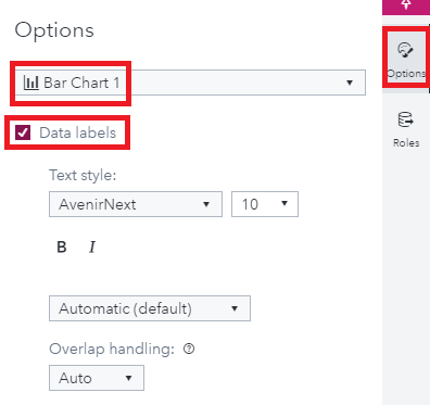
Next select the options menu on the left and from the drop down select "Bar Chart 1" and select the "Data labels" checkbox.
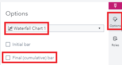
Still within the options menu, select "Waterfall Plot 1" and deselect the "Final (cumulative) bar" checkbox:
And you're done! You've successfully built the custom graph. Save your graph and give it a name.
Step 2: Prepare your data
As I mentioned above, for this article I will be using the prdsale dataset from the sashelp library. The first thing we will want to do is summarize the sales figures in our data by Country, Year and Month. PROC SQL is a great choice for doing this. After the data has been summarized, we will also need to generate a Year to Date (YTD) column for the sales data we just summarized. However, we must also ensure that the YTD column is calculated properly within its respective by-groups of Country and year. For this, we'll dust off our handy data step skills!
The code to do this is below:
proc sql;
create table sums as select
Country, Year, Month,sum(actual) as MonthlySales format=dollar18.0
from sashelp.prdsale
group by Country, Year, Month;
quit;

data sums2;
set sums;
   by Country year month;
   if first.Country or first.Year then SalesYTD=0;
   SalesYTD + MonthlySales;
   format SalesYTD dollar18.0;
run;
With all our sales data in place, we will need to think about the structure of the graph's data. The X axis of the graph shows both the "Month" and "Month YTD" values. Hence, we will need to build a data structure that has both of these sets of categorical values in the within the same variable. One way to do this is to create two copies of our working data set and generate the categorical variable with the appropriate values. After this we can append the datasets back together.
The code to do this is below:
data Monthly;
set sums2;
length Months $9;
Months = put(Month,MONNAME3.);
drop SalesYTD;
run;

data YTD;
set sums2;
length Months $9;
Months = put(Month,MONNAME3.) || " - YTD";
drop MonthlySales;
run;

data dynamicTotalWaterfall;
set YTD Monthly;
run;
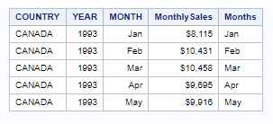
A few observations from the "Monthly" dataset are printed below:
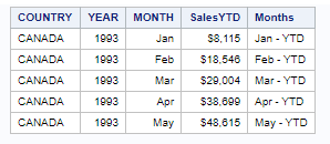
And a few observations from the "YTD" dataset are printed below:
And finally, a few observations from the "dynamicTotalWaterfall" dataset are printed below:
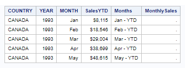
Great! Our data is now ready for SAS Visual Analytics!
Step 3: Build the report!
Begin by creating a new Visual Analytics report and adding the data set 'dynamicTotalWaterfall' to your report. We are going to first create a parameter that will capture the date values that the user selects from the list control. To do this, from the data menu on the left click "New data item" and choose "Parameter":
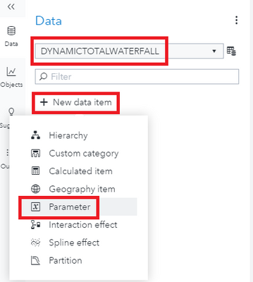
At the next screen name your parameter "dateParameter", select the checkbox for "Multiple Values" and press "OK":
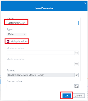
Before we add our new custom graph, lets add the list control to the report. From the "Objects" menu, find the "Controls" section and drag the "List" object onto the reporting canvas. Once it is there, select the "Roles" menu on the right, for the Category role select "Month" and for the Parameter role select "dateParameter":

We need to make one final edit to our list control. From the "Options" menu on the right, scroll down until you see the "Required" checkbox and select it:

Since we created our YTD summary based on the subgroups Country and Year, we will need to require that the report user filter the graph by both of these variables. Let's do this by adding two new dropdown controls as page controls to our report as required prompts:

Great! Now our list control is ready and it's time to add our custom graph. To do this, import the custom graph to the Visual Analytics report we're working on. Drag the custom graph into the report's canvas and place it to the right of the list control we just created:
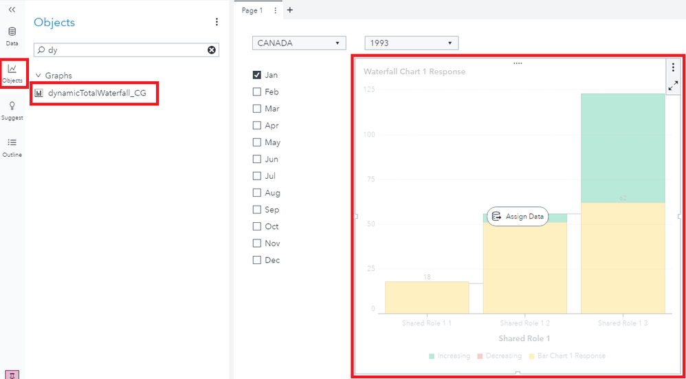
Great! Now all we have to do is apply the proper roles to our custom graph. Go to the "Roles" menu on the right pane and select your custom graph from the top dropdown. Apply the roles as shown below:
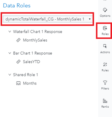
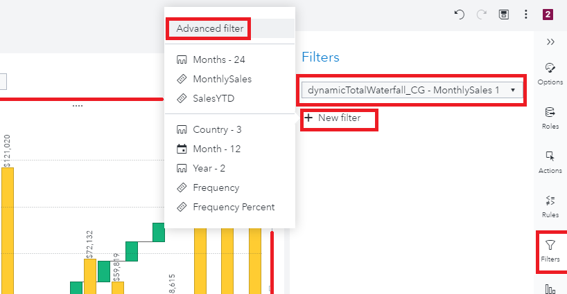
What makes this graph dynamic is the user's ability to choose which month they would like to display the year to date sales. This means, that the graph should always be showing all the "MonthlySales" data while also only showing the "SalesYTD" for the selected months in the list control. To achieve this, we can add a custom filter to our graph. With the custom graph selected, navigate to the Filters menu and click the "New filter" button and select "Advanced filter":
At the next screen, we can create a filter that will meet the reporting needs. First, we start with an expression which will filter out any records that have the string "YTD" in the "Months" variable. This will ensure that all the "MonthlySales" data will be displayed. Then we add an "OR" operator and within in add the logic to select any records that have the string "YTD" in the "Months" variable AND are currently in the "dateParameter" parameter (this is why we added the parameter to our list control earlier!). The visual view of this filter is below:
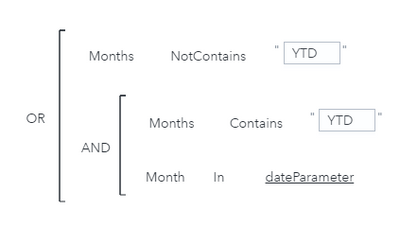
And the text for this filter is below:
( 'Months'n NotContains 'YTD' ) OR ( ( 'Months'n Contains 'YTD' )
AND ( 'Month'n In 'dateParameter'p ) )
Great! We can now see our graph! But wait, when we select a few months in our list control, something seems wrong...
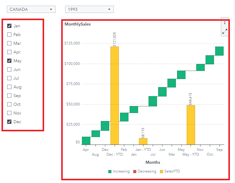
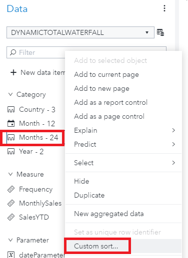
Of course! The months are out of order! Since we had to create a custom categorical variable for our x-axis, Visual Analytics is simply sorting its values alphabetically. This can easily be fixed by creating a custom sort on our "Months" variable. To do this, from the data menu on the left, right-click the "Months" variable and choose: "Custom Sort":
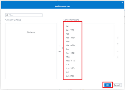
And that's it! You have successfully built a Waterfall Chart that allows users to interactively choose where cumulative total bars are placed! Additionally, you used this graph to visualize the sashelp.prdsale data in SAS Visual Analytics! All that's left is for us to add some window dressing. For this, I simply added a title to the list control to inform the user that a selection made there will result in subtotal bars being displayed. After this edit, our final report looks like this:
How to make this example work for you
This example was created in SAS Visual Analytics 8.5. For this report's data source, I used the "prdsale" dataset available in the "SASHELP" library. SAS also provides this dataset on the SAS Viya Example Data Sets website.
On Github, you will find the following support files for this article:
- A JSON file containing the completed custom graph - dynamicTotalWaterfall_CG.json
- A JSON file containing the completed report - WaterfallChartWithDynamicSubtotals.json
- The code which creates the final dynamicTotalWaterfall data set - dynamicTotalWaterfallETL.sas
Take Me to GitHub!
Import the data on your SAS Visual Analytics instance. Import the report via the "Import via GUI" section of these instructions.
Catch up on SAS Innovate 2026
Dive into keynotes, announcements and breakthroughs on demand.
Explore Now →SAS AI and Machine Learning Courses
The rapid growth of AI technologies is driving an AI skills gap and demand for AI talent. Ready to grow your AI literacy? SAS offers free ways to get started for beginners, business leaders, and analytics professionals of all skill levels. Your future self will thank you.


