- RSS Feed
- Mark Topic as New
- Mark Topic as Read
- Float this Topic for Current User
- Bookmark
- Subscribe
- Mute
- Printer Friendly Page
- Mark as New
- Bookmark
- Subscribe
- Mute
- RSS Feed
- Permalink
- Report Inappropriate Content
Hello,
I would like to create a basic scatter plot after a fixed effects regression. I am using PROC GLM for the FE regression. Best would be to add an effectplot line to the my code, as such:
proc glm data=individuals;
class year (ref='2010' ) age_gr (ref='0' );
absorb id;
model cost=year|type/ solution;
effectplot fit / obs;
run;
but effectplot doesn't seem to work with GLM. What are my other options?
Thank you.
Accepted Solutions
- Mark as New
- Bookmark
- Subscribe
- Mute
- RSS Feed
- Permalink
- Report Inappropriate Content
I don't know what a good plot is, you still haven't really described what you hope to see/learn here.
The problem with the EFFECTPLOT is that is only defined for a single X-variable, but your model has two X-variables, plus an ABSORB variable. You can't plot just one variable of the model, you have to determine what you want to do about the other variables in the model (plus the ABSORB variable) in order to get anything meaningful. When there's more than one X-variable, as you have, usually people don't plot the actual data on a scatterplot, they plot the model residuals as the y-variable on a scatterplot.
Paige Miller
- Mark as New
- Bookmark
- Subscribe
- Mute
- RSS Feed
- Permalink
- Report Inappropriate Content
@GKati wrote:
Hello,
I would like to create a basic scatter plot after a fixed effects regression.
Scatter plot of what?
Have you looked at ODS Graphics to see if the plot you want is already in there?
Paige Miller
- Mark as New
- Bookmark
- Subscribe
- Mute
- RSS Feed
- Permalink
- Report Inappropriate Content
Hi @PaigeMiller :
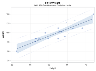
I would like a scatterplot of cost vs type with a regression line and 95% CIs. Sort of like the graph attached.
I know that this can be generated by adding the line
effectplot fit / obs;
to my code above.
The problem is that I need to perform a Fixed Effects and using PROC GLM is the only way I know how to do that and PROC GLM doesn't support the effectplot command.
K.
- Mark as New
- Bookmark
- Subscribe
- Mute
- RSS Feed
- Permalink
- Report Inappropriate Content
So the example plot you show doesn't really fit the analysis you are doing, as far as I can see.
So in the scatterplot you want, please be specific. What is the X-axis variable? What is the Y-axis variable? What are the lines on the plot, relative to the variables you have?
Paige Miller
- Mark as New
- Bookmark
- Subscribe
- Mute
- RSS Feed
- Permalink
- Report Inappropriate Content
- Mark as New
- Bookmark
- Subscribe
- Mute
- RSS Feed
- Permalink
- Report Inappropriate Content
I don't know what a good plot is, you still haven't really described what you hope to see/learn here.
The problem with the EFFECTPLOT is that is only defined for a single X-variable, but your model has two X-variables, plus an ABSORB variable. You can't plot just one variable of the model, you have to determine what you want to do about the other variables in the model (plus the ABSORB variable) in order to get anything meaningful. When there's more than one X-variable, as you have, usually people don't plot the actual data on a scatterplot, they plot the model residuals as the y-variable on a scatterplot.
Paige Miller
- Ask the Expert: The AI Advantage: How SAS Customer Intelligence 360 Solves Real Marketing Challenges | 27-Jan-2026
- DCSUG presents SAS OnDemand for Academics: the Easy Way to Learn SAS For Free for Students, Educator | 27-Jan-2026
- Ask the Expert: How to Supercharge Enterprise Agentic Workflows With SAS Retrieval Agent Manager | 05-Feb-2026
- Ask the Expert - Génération de données synthétiques : innovation et confidentialité | 10-Feb-2026
- Ask the Expert: Implementing a Digital Twin for the Monopoly Board Game Using SAS® Viya® | 12-Feb-2026
- SAS CI360 Tips and Tricks: Quick Wins, Shortcuts and Hidden Features Every Marketer Should Know | 17-Feb-2026
- SAS Bowl LIX, Integrating SAS and Git | 18-Feb-2026
SAS' Charu Shankar shares her PROC SQL expertise by showing you how to master the WHERE clause using real winter weather data.
Find more tutorials on the SAS Users YouTube channel.


