- Home
- /
- Programming
- /
- Graphics
- /
- sgrender: alignemt of tick marks
- RSS Feed
- Mark Topic as New
- Mark Topic as Read
- Float this Topic for Current User
- Bookmark
- Subscribe
- Mute
- Printer Friendly Page
- Mark as New
- Bookmark
- Subscribe
- Mute
- RSS Feed
- Permalink
- Report Inappropriate Content
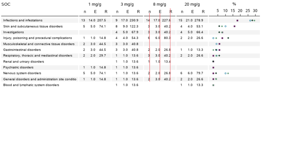
Doing a adverse event plot were I have to put some stat numbers together with a scatter plot (see below). Now I want the stat numbers to be right aligned with the tickmark at the x axis (see red inserted line).
proc template;
   define statgraph demo;
      begingraph ;
            layout overlay;
                      scatterplot y=name x=w / markercharacter =weightc   MARKERCHARACTERPOSITION=left    xaxis=x2;
                       scatterplot y=name x=h / markercharacter =height   MARKERCHARACTERPOSITION=left    xaxis=x2;
             endlayout;
      endgraph;
   end;
run;

data class2;
 set sashelp.class;
 weightc=put(weight,4.1);
 heightc=put(height,4.1);
 w="kg";
 h="cm";
run;

proc sgrender data=class2 template=demo;
run;
Have created a little sandbox example using the good old sashelp.class :-). Any ideas on how to solve this?
- Mark as New
- Bookmark
- Subscribe
- Mute
- RSS Feed
- Permalink
- Report Inappropriate Content
I see at least two issues.
First I think you have the wrong variable for the markercharacter in the second scatter plot statement.
Second, if you expect the formatted value to have a decimal for everything you need to provide a wide enough format.
Using 4.1 with values like 112.5 for example, Alfred's weight you do not have enough space to display 112.5 you would need a 5.1. Otherwise the width specification of 4 means 112. uses all the positions. And if there is no value to right of the decimal then SAS doesn't display the decimal.
So see if this gets closer to what you expect:
proc template;
   define statgraph demo;
      begingraph ;
            layout overlay;
                      scatterplot y=name x=w / markercharacter =weightc   MARKERCHARACTERPOSITION=left    xaxis=x2;
                       scatterplot y=name x=h / markercharacter =heightc   MARKERCHARACTERPOSITION=left    xaxis=x2;
             endlayout;
      endgraph;
   end;
run;

data class2;
 set sashelp.class;
 weightc=put(weight,5.1);
 heightc=put(height,4.1);
 w="kg";
 h="cm";
run;

proc sgrender data=class2 template=demo;
run;
- Mark as New
- Bookmark
- Subscribe
- Mute
- RSS Feed
- Permalink
- Report Inappropriate Content
Thanks for your input. However the issue is the right alignment of the tickmark with the height and weight data. A solution could be to insert trailering blanks on the "kg" and "cm" but they just seem to be cut off when displaying.....Another solution could be to go with the axais table as Matange suggesst below.
- Mark as New
- Bookmark
- Subscribe
- Mute
- RSS Feed
- Permalink
- Report Inappropriate Content
You will get better results using AxisTable for displaying the numbers. This can be done using SGPLOT with YAXISTABLE. YAXISTABLE has many options for positioning of the text. You can also use AXISTABLE in GTL.
See:
https://blogs.sas.com/content/iml/2019/09/11/axis-tables-rotated-text.html
See the last example.
- Mark as New
- Bookmark
- Subscribe
- Mute
- RSS Feed
- Permalink
- Report Inappropriate Content
Thanks for your suggestion about the AXISTABLE solution. Was down that road initially but then used the scatterplot option as it was easier to make dynamic. Will revert and try this once more 🙂
Catch up on SAS Innovate 2026
Dive into keynotes, announcements and breakthroughs on demand.
Explore Now →Learn how use the CAT functions in SAS to join values from multiple variables into a single value.
Find more tutorials on the SAS Users YouTube channel.
SAS Training: Just a Click Away
Ready to level-up your skills? Choose your own adventure.


