- Home
- /
- Programming
- /
- Graphics
- /
- Re: plot multiple variables on the same axis
- RSS Feed
- Mark Topic as New
- Mark Topic as Read
- Float this Topic for Current User
- Bookmark
- Subscribe
- Mute
- Printer Friendly Page
- Mark as New
- Bookmark
- Subscribe
- Mute
- RSS Feed
- Permalink
- Report Inappropriate Content
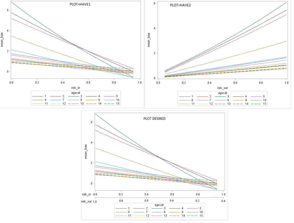
How to create plot=desired in the image below at bottom instead two separate plots have1 and have2? Data attached in text file. Using SAS 9.4.
proc import datafile="...\plot.txt"
out=c.testplot
dbms=tab replace;
guessingrows=max;
run;

proc sgplot data=plot;
series x=risk_out y=mean_bias / group=agecat;
run;
proc sgplot data=plot;
series x=risk_out y=mean_bias / group=agecat;
run;Accepted Solutions
- Mark as New
- Bookmark
- Subscribe
- Mute
- RSS Feed
- Permalink
- Report Inappropriate Content
Try this and see if you like it:
proc sgplot data=plot;
series x=risk_out y=mean_bias / group=agecat;
series x=risk_out y=mean_bias / group=agecat x2axis;
run;
Hope this helps!
Dan
- Mark as New
- Bookmark
- Subscribe
- Mute
- RSS Feed
- Permalink
- Report Inappropriate Content
Try this and see if you like it:
proc sgplot data=plot;
series x=risk_out y=mean_bias / group=agecat;
series x=risk_out y=mean_bias / group=agecat x2axis;
run;
Hope this helps!
Dan
- Mark as New
- Bookmark
- Subscribe
- Mute
- RSS Feed
- Permalink
- Report Inappropriate Content
- Mark as New
- Bookmark
- Subscribe
- Mute
- RSS Feed
- Permalink
- Report Inappropriate Content
You'll need an attribute map then you can set the colors the same across the two groups, perhaps one set is dashed and the other isn't to differentiate easily...
https://blogs.sas.com/content/iml/2017/01/30/auto-discrete-attr-map.html
- Mark as New
- Bookmark
- Subscribe
- Mute
- RSS Feed
- Permalink
- Report Inappropriate Content
- Mark as New
- Bookmark
- Subscribe
- Mute
- RSS Feed
- Permalink
- Report Inappropriate Content
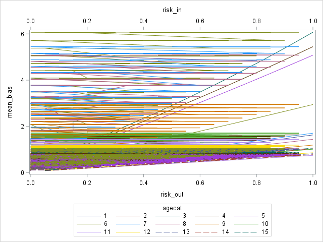
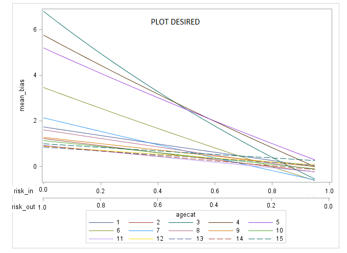
Hi Dan, any idea to fix the plot below? I also put the plot desired below.
proc sgplot data=plot /*data attached*/;
series x=risk_out y=mean_bias / group=agecat;
series x=risk_in y=mean_bias / group=agecat x2axis;
run;
Output from above code:

- Mark as New
- Bookmark
- Subscribe
- Mute
- RSS Feed
- Permalink
- Report Inappropriate Content
Without seeing the data, or knowing the full intent of the plot, I'm going to have to make a guess at your desired outcome. It appears that you really want to draw only RISK_OUT, but you want a secondary axis influenced by RISK_IN. If that is true, then you just need to make your RISK_IN plot fully transparent, like the following:
proc sgplot data=plot /*data attached*/;
series x=risk_out y=mean_bias / group=agecat;
series x=risk_in y=mean_bias / group=agecat x2axis transparency=1;
run;
Let me know if this works for you.
Thanks!
Dan
- Mark as New
- Bookmark
- Subscribe
- Mute
- RSS Feed
- Permalink
- Report Inappropriate Content
Thanks Dan.
Response variable 'mean_bias' aligns with unique reverse combination of risk_in and risk_out. So showing 'mean_bias' as a function of reverse combinations of risk_in and risk_out is the goal of the plot.
Plot desired shows that Risk_in takes 0 when Risk_out takes 1.0. These two risks are complementary to each other where max probability can not exceed 1. So, risk_in can not take 1 when risk_out takes 1. In other words, if one adds risk_in+risk_out at each increment the total always would be 1. I put in the first few observations of data where group variable was cut. But hopefully, this chunk of data would tell you the story of how my data is organized at least for the relationship between 'mean_bias' and the reverse combination of 'risk_in' and 'risk_out'. I have 62 counties. So after axis issue's solved I will have to think of panel options.
data dan;
input agecat county	risk_in	risk_out mean_bias;
datalines;
1	83	0	0.05	0.1592907908
1	83	0	0.1	0.233784996
1	83	0.05	0.1	0.233784996
1	83	0.1	0.15	0.3085880658
1	83	0.05	0.15	0.3085880658
1	83	0	0.15	0.3085880658
1	83	0	0.2	0.3837018973
1	83	0.15	0.2	0.3837018973
1	83	0.05	0.2	0.3837018973
1	3	0.1	0.2	0.3837018973
1	3	0	0.25	0.4591284108
1	3	0.15	0.25	0.4591284108
1	3	0.2	0.25	0.4591284108
1	3	0.1	0.25	0.4591284108
1	3	0.05	0.25	0.4591284108
1	3	0.1	0.3	0.5348695495
1	3	0.2	0.3	0.5348695495
1	3	0.15	0.3	0.5348695495
1	3	0.25	0.3	0.5348695495
;

proc sgplot data=dan /*data attached*/;
series x=risk_out y=mean_bias / group=agecat;
series x=risk_in y=mean_bias / group=agecat x2axis transparency=1;
run;
Desired plot:
Learn how use the CAT functions in SAS to join values from multiple variables into a single value.
Find more tutorials on the SAS Users YouTube channel.
SAS Training: Just a Click Away
Ready to level-up your skills? Choose your own adventure.


