- Home
- /
- Programming
- /
- Graphics
- /
- how to write a code for horizontal charts
- RSS Feed
- Mark Topic as New
- Mark Topic as Read
- Float this Topic for Current User
- Bookmark
- Subscribe
- Mute
- Printer Friendly Page

- Mark as New
- Bookmark
- Subscribe
- Mute
- RSS Feed
- Permalink
- Report Inappropriate Content
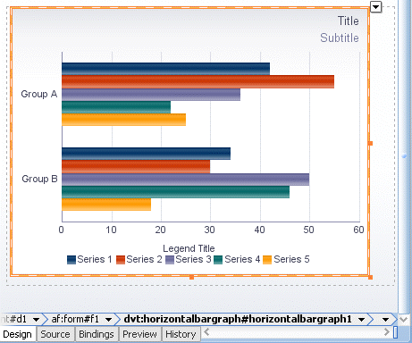
Hi
I was trying to find an example code to draw a horizontal chart like below.
I know how to write a code if there was only series 1, but I could not find any sample code online if there were multiple series 1,2,3,...5
It would be greatly appreciated if someone can let me know a sample code so I can learn from it. Thanks!
Accepted Solutions

- Mark as New
- Bookmark
- Subscribe
- Mute
- RSS Feed
- Permalink
- Report Inappropriate Content
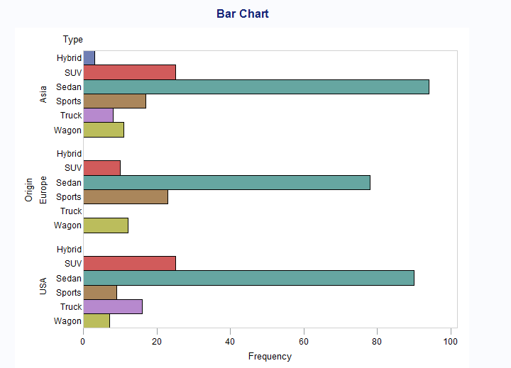
PROC SQL;
CREATE VIEW WORK.SORTTempTableSorted AS
SELECT T.Type, T.Origin
FROM SASHELP.CARS as T
;
QUIT;
PATTERN1 COLOR = _STYLE_;
PATTERN2 COLOR = _STYLE_;
PATTERN3 COLOR = _STYLE_;
PATTERN4 COLOR = _STYLE_;
PATTERN5 COLOR = _STYLE_;
PATTERN6 COLOR = _STYLE_;
PATTERN7 COLOR = _STYLE_;
PATTERN8 COLOR = _STYLE_;
PATTERN9 COLOR = _STYLE_;
PATTERN10 COLOR = _STYLE_;
PATTERN11 COLOR = _STYLE_;
PATTERN12 COLOR = _STYLE_;
Axis1
STYLE=1
WIDTH=1
;
Axis2
STYLE=1
WIDTH=1
MINOR=NONE
;
;
TITLE;
TITLE1 "Bar Chart";
FOOTNOTE;
PROC GCHART DATA=WORK.SORTTempTableSorted
;
HBAR
Type
/
GROUP=Origin
CLIPREF
SPACE=0
FRAME TYPE=FREQ
NOLEGEND
COUTLINE=BLACK
MAXIS=AXIS1
RAXIS=AXIS2
PATTERNID=MIDPOINT
;
/* -------------------------------------------------------------------
End of task code.
------------------------------------------------------------------- */
RUN; QUIT;

- Mark as New
- Bookmark
- Subscribe
- Mute
- RSS Feed
- Permalink
- Report Inappropriate Content
What version of SAS are you running?
- Mark as New
- Bookmark
- Subscribe
- Mute
- RSS Feed
- Permalink
- Report Inappropriate Content
Try this little example and see if it works for you:
Title "Average MPG by Origin and Vehicle Type";
proc sgplot data=sashelp.cars;
hbar origin / response=mpg_city stat=mean group=type
groupdisplay=cluster datalabel;
run;
- Mark as New
- Bookmark
- Subscribe
- Mute
- RSS Feed
- Permalink
- Report Inappropriate Content
If your data is not grouped, you can overlay multiple bar charts in a manner similar to the following:
proc sgplot data=sashelp.class;
hbar age / response=weight stat=mean barwidth=0.4 discreteoffset=-0.2 datalabel;
hbar age / response=height stat=mean barwidth=0.4 discreteoffset=0.2 datalabel;
run;

- Mark as New
- Bookmark
- Subscribe
- Mute
- RSS Feed
- Permalink
- Report Inappropriate Content
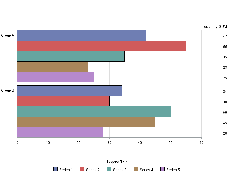
You could do it with SAS/Graph Proc Gchart...
data my_data;
length my_group $20 my_series $20;
infile datalines dlm=':';
input my_group my_series quantity;
datalines;
Group A:Series 1:42
Group A:Series 2:55
Group A:Series 3:35
Group A:Series 4:23
Group A:Series 5:25
Group B:Series 1:34
Group B:Series 2:30
Group B:Series 3:50
Group B:Series 4:45
Group B:Series 5:28
;
run;
axis1 label=none value=none;
axis2 label=none;
axis3 label=none minor=none;
legend1 label=(position=top j=c 'Legend Title') shape=bar(.15in,.15in);
proc gchart data=my_data;
hbar my_series / type=sum sumvar=quantity
group=my_group subgroup=my_series space=0
maxis=axis1 gaxis=axis2 raxis=axis3
autoref clipref cref=graydd
legend=legend1;
run;
- Mark as New
- Bookmark
- Subscribe
- Mute
- RSS Feed
- Permalink
- Report Inappropriate Content
PROC SQL;
CREATE VIEW WORK.SORTTempTableSorted AS
SELECT T.Type, T.Origin
FROM SASHELP.CARS as T
;
QUIT;
PATTERN1 COLOR = _STYLE_;
PATTERN2 COLOR = _STYLE_;
PATTERN3 COLOR = _STYLE_;
PATTERN4 COLOR = _STYLE_;
PATTERN5 COLOR = _STYLE_;
PATTERN6 COLOR = _STYLE_;
PATTERN7 COLOR = _STYLE_;
PATTERN8 COLOR = _STYLE_;
PATTERN9 COLOR = _STYLE_;
PATTERN10 COLOR = _STYLE_;
PATTERN11 COLOR = _STYLE_;
PATTERN12 COLOR = _STYLE_;
Axis1
STYLE=1
WIDTH=1
;
Axis2
STYLE=1
WIDTH=1
MINOR=NONE
;
;
TITLE;
TITLE1 "Bar Chart";
FOOTNOTE;
PROC GCHART DATA=WORK.SORTTempTableSorted
;
HBAR
Type
/
GROUP=Origin
CLIPREF
SPACE=0
FRAME TYPE=FREQ
NOLEGEND
COUTLINE=BLACK
MAXIS=AXIS1
RAXIS=AXIS2
PATTERNID=MIDPOINT
;
/* -------------------------------------------------------------------
End of task code.
------------------------------------------------------------------- */
RUN; QUIT;
- Mark as New
- Bookmark
- Subscribe
- Mute
- RSS Feed
- Permalink
- Report Inappropriate Content
Thank you so much for all of your quick responses!! All of them are very useful. Thanks again!
Hi Hai.kuo, I was trying to understand the meaning of each lines of your code, but may I know why you have 12 lines of PATTERN statement?
I read about it in the link below, but I still wasn't sure why there had to be 12 lines of these because there are only 6 types of cars?
Thanks very much!
- Mark as New
- Bookmark
- Subscribe
- Mute
- RSS Feed
- Permalink
- Report Inappropriate Content
You have Robert and Dan who are way better expert than I am regarding SAS/Graph, and way better qualified to answer your question ![]() .
.
Like I said, I cheated, the code was machine generated from a Task in Eguide, and to be honest, this is one of the major reasons I like EG.
Haikuo
.jpg")
Catch up on SAS Innovate 2026
Nearly 200 sessions are now available on demand in the Innovate Hub.
Watch Now →Learn how use the CAT functions in SAS to join values from multiple variables into a single value.

Find more tutorials on the SAS Users YouTube channel.
SAS Training: Just a Click Away
Ready to level-up your skills? Choose your own adventure.
-
7 replies
-
12-10-2014 03:29 PM
-
4618 views
-
7 likes
-
4 in conversation
-
