- Home
- /
- Programming
- /
- Graphics
- /
- how to add confidence interval to display longitudinal pattern using p...
- RSS Feed
- Mark Topic as New
- Mark Topic as Read
- Float this Topic for Current User
- Bookmark
- Subscribe
- Mute
- Printer Friendly Page
- Mark as New
- Bookmark
- Subscribe
- Mute
- RSS Feed
- Permalink
- Report Inappropriate Content
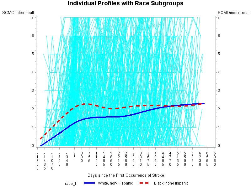
I was asked to add confidence interval in a graph, which was used to identify the average trend within subjects by group (race) over time.
My outcome here is called 'SCMOindex_reall' and I have 2021 individuals in total. The time variable refers to days since the first occurrence of certain condition. The original graph displays the individual profiles plus the average trend by race. I'm not sure if there is any option out there for adding CI in each line using proc gplot. If not, i'll be willing to use other procedure/way to generate a similar graph. You inputs and suggestions will be highly appreciated. Thank you!
proc gplot data=temp.limitaion_long_new_f;
plot scMoIndex_reall*t=spid
/ haxis=-1800 TO 7000 by 365
  vaxis=0 TO 7 by 1;
plot2 scMoIndex_reall*t=race_f;
symbol1 v=none repeat=2021 i=join color=cyan;
symbol2 v=none i=sm50s color=blue width=3 line=1;
symbol3 v=none i=sm50s color=red width=3 line=2;
label t='Days since the First Occurrence of Stroke';
format race_f race.;
title 'Individual Profiles with Race Subgroups';
run;
quit;
- Mark as New
- Bookmark
- Subscribe
- Mute
- RSS Feed
- Permalink
- Report Inappropriate Content
Without seeing your data, this is a bit of a "guestimate", but try something like this (notice the placeholder for your CI variables):
ods graphics / attrpriority=none;
proc sgplot data=temp.limitaion_long_new_f;
label t='Days since the First Occurrence of Stroke';
format race_f race.;
title 'Individual Profiles with Race Subgroups';
xaxis values=-(1800 TO 7000 by 365);
yaxis  values=(0 TO 7 by 1);
y2axis  values=(0 TO 7 by 1);
series y=scMoIndex_reall x=t / group=spid lineattrs=(color=cyan pattern=solid);
series y=scMoIndex_reall x=t / group=race_f smooth lineattrs=(thicknesst=3)
       y2axis name="race";
scatter y=scMoIndex_reall x=t / group=race_f markerattrs=(size=0) y2axis
            yerrorupper=<your upper CI var> yerrorlower=<your lower CI var>;
keylegend "race";
run;
- Mark as New
- Bookmark
- Subscribe
- Mute
- RSS Feed
- Permalink
- Report Inappropriate Content
- Mark as New
- Bookmark
- Subscribe
- Mute
- RSS Feed
- Permalink
- Report Inappropriate Content
For my example, you would need to compute the CI outside of SGPLOT using the raw data, and reference the two variables in the SCATTER statement.
- Mark as New
- Bookmark
- Subscribe
- Mute
- RSS Feed
- Permalink
- Report Inappropriate Content
- Mark as New
- Bookmark
- Subscribe
- Mute
- RSS Feed
- Permalink
- Report Inappropriate Content
Yes, your other variables should be fine.
- Mark as New
- Bookmark
- Subscribe
- Mute
- RSS Feed
- Permalink
- Report Inappropriate Content
http://support.sas.com/documentation/cdl/en/grstatproc/62603/HTML/default/viewer.htm#a003155517.htmI... this day and age you should really have long since moved to proc sgplot/GTL, if not for your own sanity, but other programmers.
Look at this blog, has thousands of examples of all types of graphs with code:
https://blogs.sas.com/content/graphicallyspeaking/
And one of the posts shows getting CI:
However there are many ways and methods to getting confidence intervals.
As for your specific question maybe something like this:
http://support.sas.com/documentation/cdl/en/grstatproc/62603/HTML/default/viewer.htm#a003155517.htm
But I am not sure which line you are talking about - that graph just looks like a mass of light blue to me??
- Mark as New
- Bookmark
- Subscribe
- Mute
- RSS Feed
- Permalink
- Report Inappropriate Content
Catch up on SAS Innovate 2026
Nearly 200 sessions are now available on demand with the SAS Innovate Digital Pass.
Explore Now →Learn how use the CAT functions in SAS to join values from multiple variables into a single value.
Find more tutorials on the SAS Users YouTube channel.
SAS Training: Just a Click Away
Ready to level-up your skills? Choose your own adventure.


