- Home
- /
- Programming
- /
- Graphics
- /
- Re: distribution without markers/dots
- RSS Feed
- Mark Topic as New
- Mark Topic as Read
- Float this Topic for Current User
- Bookmark
- Subscribe
- Mute
- Printer Friendly Page
- Mark as New
- Bookmark
- Subscribe
- Mute
- RSS Feed
- Permalink
- Report Inappropriate Content
Hi all,
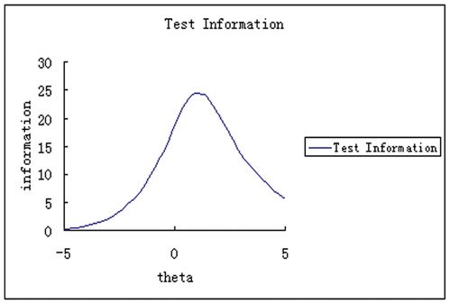
I two numeric-Continuous variables. I'd like to draw a distribution where one continues variable x-axis and the other one is y-axis. I draw scatter plots with the curve but I don't want dots in the graph. It should be more like Kernel or Normal distribution. However, as I know I can draw Kernel or Normal distribution with only one variable using density. I want a distribution as seen below.
Could you help me to draw it?
Thanks.
Accepted Solutions
- Mark as New
- Bookmark
- Subscribe
- Mute
- RSS Feed
- Permalink
- Report Inappropriate Content
Using @PeterClemmensen's data set.
Maybe:
proc sgplot data=have;
   pbspline x=scores y=ss;
run;
or
proc sgplot data=have;
   reg x=scores y=ss / degree=3 nomarkers;
run;
We kind of need a bit more description of your expectations than "no dots".
- Mark as New
- Bookmark
- Subscribe
- Mute
- RSS Feed
- Permalink
- Report Inappropriate Content
Can you post your data or a sample of it?
- Mark as New
- Bookmark
- Subscribe
- Mute
- RSS Feed
- Permalink
- Report Inappropriate Content
Sure, Here it is! It is in the attachment.
Thanks
- Mark as New
- Bookmark
- Subscribe
- Mute
- RSS Feed
- Permalink
- Report Inappropriate Content
the scores will be x-axis and ss will be y-axis.
Thanks
- Mark as New
- Bookmark
- Subscribe
- Mute
- RSS Feed
- Permalink
- Report Inappropriate Content
I'm not really sure how you expect this data to yield a plot like you posted. However, to get things started, you can fit a normal density plot like this
data have;
input scores ss;
datalines;
920 5.5
941 6.3
935 8.2
910 9.5
972 10.5
954 .
925 9.2
900 8.7
;

proc sgplot data=have;
   density ss;
run;- Mark as New
- Bookmark
- Subscribe
- Mute
- RSS Feed
- Permalink
- Report Inappropriate Content
Using @PeterClemmensen's data set.
Maybe:
proc sgplot data=have;
   pbspline x=scores y=ss;
run;
or
proc sgplot data=have;
   reg x=scores y=ss / degree=3 nomarkers;
run;
We kind of need a bit more description of your expectations than "no dots".
- Mark as New
- Bookmark
- Subscribe
- Mute
- RSS Feed
- Permalink
- Report Inappropriate Content
Thank you so much!
I tried the second one and it worked!
Thank you!
Learn how use the CAT functions in SAS to join values from multiple variables into a single value.
Find more tutorials on the SAS Users YouTube channel.
SAS Training: Just a Click Away
Ready to level-up your skills? Choose your own adventure.


