- Home
- /
- Programming
- /
- Graphics
- /
- Why Does SGPLOT Trim Some Observations Automatically?
- RSS Feed
- Mark Topic as New
- Mark Topic as Read
- Float this Topic for Current User
- Bookmark
- Subscribe
- Mute
- Printer Friendly Page
- Mark as New
- Bookmark
- Subscribe
- Mute
- RSS Feed
- Permalink
- Report Inappropriate Content
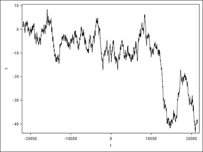
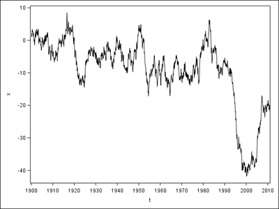
When I apply VALUES and VALUESFORMAT in XAXIS, SGPLOT automatically trims some trailing observations. The left uses a naked format so displays correctly, but the right uses YEAR10 in VALUES and YEAR4. in VALUESFORMAT so ends much earlier than the left. How can I avoid this problem?
Here's the code.
data have;
t=mdy(1,1,1900);
do until(year(t)>2018);
x+rannor(1);
output;
t=intnx("month",t,1);
end;
run;
ods listing gpath="!userprofile\desktop\";
ods graphics/reset imagename="out";
proc sgplot;
series x=t y=x;
run;
proc sgplot;
series x=t y=x;
xaxis values=("1jan1900"d to "1jan2019"d by year10) valuesformat=year4.;
run;
quit;
Thanks for your help.
Accepted Solutions
- Mark as New
- Bookmark
- Subscribe
- Mute
- RSS Feed
- Permalink
- Report Inappropriate Content
Try adding the VALUESHINT option to the XAXIS. This should make the VALUES option place the ticks correctly without constraining the axis range.
Hope this helps!
Dan
- Mark as New
- Bookmark
- Subscribe
- Mute
- RSS Feed
- Permalink
- Report Inappropriate Content
Your interval is uneven, what happens if it ends at 2020, not 2019 as indicated in your specification?
xaxis values=("1jan1900"d to "1jan2019"d by year10) valuesformat=year4.;
My guess is because it's not a full interval it cuts off at the last 10 interval, instead of going past as the default behaviour.
If the specified range is not evenly divisible by the increment value, the highest value displayed on the axis is the last incremental value below the ending value for the range. For example, this value list produces a maximum axis value of 9:
values=(0 to 10 by 3)
@Junyong wrote:
When I apply VALUES and VALUESFORMAT in XAXIS, SGPLOT automatically trims some trailing observations. The left uses a naked format so displays correctly, but the right uses YEAR10 in VALUES and YEAR4. in VALUESFORMAT so ends much earlier than the left. How can I avoid this problem?
Here's the code.
data have;
t=mdy(1,1,1900);
do until(year(t)>2018);
x+rannor(1);
output;
t=intnx("month",t,1);
end;
run;
ods listing gpath="!userprofile\desktop\";
ods graphics/reset imagename="out";
proc sgplot;
series x=t y=x;
run;
proc sgplot;
series x=t y=x;
xaxis values=("1jan1900"d to "1jan2019"d by year10) valuesformat=year4.;
run;
quit;
Thanks for your help.
- Mark as New
- Bookmark
- Subscribe
- Mute
- RSS Feed
- Permalink
- Report Inappropriate Content
Try adding the VALUESHINT option to the XAXIS. This should make the VALUES option place the ticks correctly without constraining the axis range.
Hope this helps!
Dan
- Mark as New
- Bookmark
- Subscribe
- Mute
- RSS Feed
- Permalink
- Report Inappropriate Content
Any values list will "trim the data" if the limits are less than the range of the values.
It is actually a useful feature as you can quickly modify the amount of data displayed as needed.
Such as
proc sgplot;
series x=t y=x;
xaxis values=(-1750 -600 0 380 1800);
run;
Catch up on SAS Innovate 2026
Dive into keynotes, announcements and breakthroughs on demand.
Explore Now →Learn how use the CAT functions in SAS to join values from multiple variables into a single value.
Find more tutorials on the SAS Users YouTube channel.
SAS Training: Just a Click Away
Ready to level-up your skills? Choose your own adventure.


