- Home
- /
- Programming
- /
- Graphics
- /
- Text rows uneven in forest plot
- RSS Feed
- Mark Topic as New
- Mark Topic as Read
- Float this Topic for Current User
- Bookmark
- Subscribe
- Mute
- Printer Friendly Page
- Mark as New
- Bookmark
- Subscribe
- Mute
- RSS Feed
- Permalink
- Report Inappropriate Content
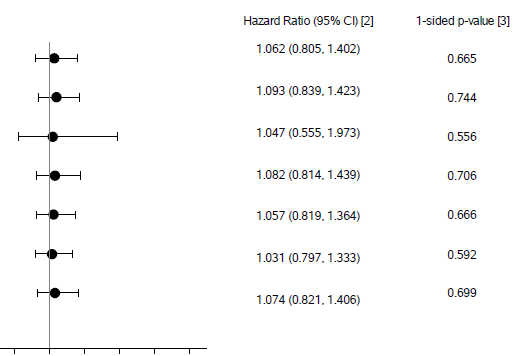
I'm working on a forest plot with several columns of associated data. The alignment is slightly off:
Note that in the first row, the p-val is slightly lower than the HR/CI. By the last row, the p-val sits higher than the HR/CI.
Code for the text columns from proc template:
layout overlay / xaxisopts=(display=none)
yaxisopts=(reverse=true display=none) walldisplay=none;
scatterplot x=dummy y=ord / markercharacter=hr_ci;
endlayout; *** overlay - Hazard Ratio/CI column***;

layout overlay / xaxisopts=(display=none)
yaxisopts=(reverse=true display=none) walldisplay=none;
scatterplot x=dummy y=ord / markercharacter=pval;
endlayout; *** overlay - p-value column ***;
Dummy is, as the name implies, a dummy value (= 1 for every record). Ord is the numeric order of the rows. The markercharacters hr_ci and pval are the character results you see above.
Is there any way to "straighten out" the row alignment?
- Mark as New
- Bookmark
- Subscribe
- Mute
- RSS Feed
- Permalink
- Report Inappropriate Content
Use axis tables. There are many example of forest plots in the graphically speaking blog.
- Mark as New
- Bookmark
- Subscribe
- Mute
- RSS Feed
- Permalink
- Report Inappropriate Content
I have always used annotate for that: http://documentation.sas.com/?docsetId=grstatgraph&docsetTarget=p0fnr3r0fc0jfjn1rtp6di3ygpom.htm&doc...
it can be a bit fidgety but you get things exactly where you want them
- Mark as New
- Bookmark
- Subscribe
- Mute
- RSS Feed
- Permalink
- Report Inappropriate Content
Thanks, everyone--I was out yesterday so one of our plot gurus was called in to look at it. Her solution: make the dots smaller. The size was knocking everything else out of whack.
But you have given me a lot of food for thought if I ever run into a similar situation where dot size doesn't help. 🙂
- Mark as New
- Bookmark
- Subscribe
- Mute
- RSS Feed
- Permalink
- Report Inappropriate Content
I'm glad you got it worked out. If you don't switch to use axis tables, next time at least look into the TEXT statement (unless you are using a release from before it came out) as an alternative to SCATTER.
- Mark as New
- Bookmark
- Subscribe
- Mute
- RSS Feed
- Permalink
- Report Inappropriate Content
Just an FYI...The three separate scatter statements cause different y-offsets due to size of markers and text. As you increase marker size or text size), offsets increase, causing the alignment problems in different containers (Layout Overlays). Each container with separate axes will have separate offsets based on their individual contents.
One way to overcome this is to set fixed offsets on all containers (yaxisopts=(offsetmin=0.05 offsetmax=0.05). Or, use common row axes to force all offsets to be the same. This will also happen with TEXT plot or AXISTABLE. One way to avoid this is to use only ONE Layout Overlay, and put the axis tables in the INNERMARGIN.
Your use case may be simple enough that you can use SGPLOT with a YAXISTABLE of two columns on the right side. GTL may not be required. See example here: https://blogs.sas.com/content/graphicallyspeaking/2016/05/30/ctspedia-clinical-graphs-subgrouped-for.... Note the use of two yAxisTables on the left and one yAxisTable on the right with 3 variables.
Catch up on SAS Innovate 2026
Dive into keynotes, announcements and breakthroughs on demand.
Explore Now →Learn how use the CAT functions in SAS to join values from multiple variables into a single value.
Find more tutorials on the SAS Users YouTube channel.
SAS Training: Just a Click Away
Ready to level-up your skills? Choose your own adventure.


