- Home
- /
- Programming
- /
- Graphics
- /
- Re: Stacked bar chart
- RSS Feed
- Mark Topic as New
- Mark Topic as Read
- Float this Topic for Current User
- Bookmark
- Subscribe
- Mute
- Printer Friendly Page
- Mark as New
- Bookmark
- Subscribe
- Mute
- RSS Feed
- Permalink
- Report Inappropriate Content
Hello
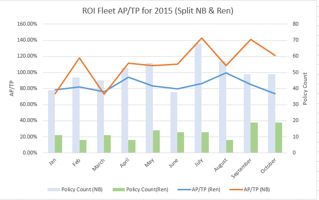
I'm trying to create a chart as above but I'm not able to do it when the data is split by new business and renewal. I have attached my dataset and here is the code I have used where the data is not split by new bus/renewal
proc sgplot data=testsum ;
title bold height = 1.5 "aptp";
vbar period / response=PolCountfillattrs=(color = DEPPK ) legendlabel = "policy count";
vline period / response=APTP y2axis lineattrs=(color=blb thickness = 2) legendlabel = "APTP";
yaxis label = "vehicle exposure years" labelattrs=(weight=bold size = 10);
y2axis label = "APTP" labelattrs=(weight=bold size = 10);;
xaxis display = (nolabel) ;
run;
Accepted Solutions
- Mark as New
- Bookmark
- Subscribe
- Mute
- RSS Feed
- Permalink
- Report Inappropriate Content
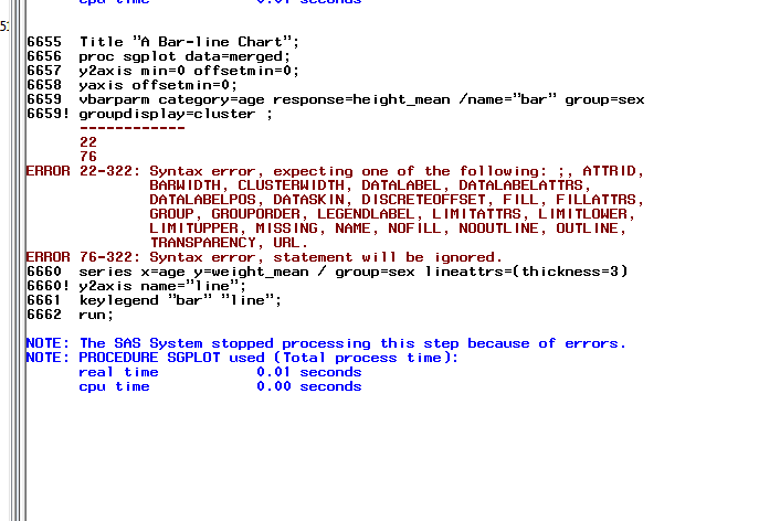
Just remove the GROUPDISPLAY option. I think you will get the cluster effect by default.
- Mark as New
- Bookmark
- Subscribe
- Mute
- RSS Feed
- Permalink
- Report Inappropriate Content
I believe you are looking for the group= option:
There is also a typo:
response=PolCountfillattrs
Should have space before fill.
- Mark as New
- Bookmark
- Subscribe
- Mute
- RSS Feed
- Permalink
- Report Inappropriate Content
Generally, you can use the GROUP option, as mentioned by RW9; however, in this case, you'll need to do a little more. In your example, you have two categorical charts overlaid with different group variables ("categorical" meaning a VBAR/HBAR, VLINE/HLINE, or DOT). There is currently a restriction on those charts in that you can use only one group variable, and it must apply to all overlays. However, there is a workaround where you can do the calcuations using PROC MEANS, merge the data, and use VBARPARM and SERIES instead. I made a simple example below. Let me know if you have any questions.
Thanks!
Dan
proc means data=sashelp.class nway;
class sex age;
var weight;
output out=temp1 mean=weight_mean;
run;
proc means data=sashelp.class nway;
class sex age;
var height;
output out=temp2 mean=height_mean;
run;
proc sort data=temp1; by sex age; run;
proc sort data=temp2; by sex age; run;
data merged;
merge temp1 temp2 (keep=sex age height_mean);
by sex age;
run;
Title "A Bar-line Chart";
proc sgplot data=merged;
y2axis min=0 offsetmin=0;
yaxis offsetmin=0;
vbarparm category=age response=height_mean / group=sex groupdisplay=cluster name="bar";
series x=age y=weight_mean / group=sex lineattrs=(thickness=3) y2axis name="line";
keylegend "bar" "line";
run;
- Mark as New
- Bookmark
- Subscribe
- Mute
- RSS Feed
- Permalink
- Report Inappropriate Content
Hi Dan
Thanks for your help, however, I'm getting this error when I run the code.
- Mark as New
- Bookmark
- Subscribe
- Mute
- RSS Feed
- Permalink
- Report Inappropriate Content
Just remove the GROUPDISPLAY option. I think you will get the cluster effect by default.
- Mark as New
- Bookmark
- Subscribe
- Mute
- RSS Feed
- Permalink
- Report Inappropriate Content
Many thanks for your help Dan (and RW9)
Catch up on SAS Innovate 2026
Dive into keynotes, announcements and breakthroughs on demand.
Explore Now →Learn how use the CAT functions in SAS to join values from multiple variables into a single value.
Find more tutorials on the SAS Users YouTube channel.
SAS Training: Just a Click Away
Ready to level-up your skills? Choose your own adventure.


