- Home
- /
- Programming
- /
- Graphics
- /
- Re: SGPLOT VBAR maximum data points on xaxis reached
- RSS Feed
- Mark Topic as New
- Mark Topic as Read
- Float this Topic for Current User
- Bookmark
- Subscribe
- Mute
- Printer Friendly Page
- Mark as New
- Bookmark
- Subscribe
- Mute
- RSS Feed
- Permalink
- Report Inappropriate Content
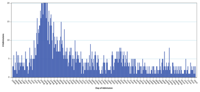
I have been running report that produces a bar chart of the daily COVID-19 hospital admissions from March 15 2020 to current. The bar chart stops displaying dates after July 14, 2021. Is there a limit to the number of bars that can be displayed in a VBAR chart?
Is there an option that will allow me to display the whole time line from March 15 2020 for the forseeable future or do I have to start sampling the data points?
Accepted Solutions
- Mark as New
- Bookmark
- Subscribe
- Mute
- RSS Feed
- Permalink
- Report Inappropriate Content
It won't hurt to show your code.
If you are using an option to force a tick mark for every date that might limit things.
I would typically use a Needle plot to show a large number of values like this.
Example creating some dummy count data per day and displaying it.
data example;
  do date='01Jan2020'd to '31DEC2021'd;
     value= rand('integer',100);
     output;
  end;
  format date date9.;
run;

Proc sgplot;
   needle x= date y=value;
run;
- Mark as New
- Bookmark
- Subscribe
- Mute
- RSS Feed
- Permalink
- Report Inappropriate Content
Here is the PROC SGPLOT statement that I am using. The data is 403 observations for admissions from March 15, 2020 - August 15, 2021. The last data point in chart is July 21,2021
proc sgplot data=CovidAdmitSummary;
vbar CovidAdmitDT /response=Admissions nooutline barwidth=.7 missing;
xaxis fitpolicy=rotatethin interval=day ;
yaxis label='# Admissions' max=20 grid gridattrs=(color=lightblue pattern=1 thickness=.5);
format CovidAdmitDT date5.;
label CovidAdmitDT='Day of Admission';
run;
- Mark as New
- Bookmark
- Subscribe
- Mute
- RSS Feed
- Permalink
- Report Inappropriate Content
It is extremely easy to test the needle plot.
Change your code to read
needle x=CovidAdmitDt y=Admissions;
instead of the VBAR you are currently using.
- Mark as New
- Bookmark
- Subscribe
- Mute
- RSS Feed
- Permalink
- Report Inappropriate Content
See this thread on DISCRETEMAX:
Catch up on SAS Innovate 2026
Nearly 200 sessions are now available on demand with the SAS Innovate Digital Pass.
Explore Now →Learn how use the CAT functions in SAS to join values from multiple variables into a single value.
Find more tutorials on the SAS Users YouTube channel.
SAS Training: Just a Click Away
Ready to level-up your skills? Choose your own adventure.


