- Home
- /
- Programming
- /
- Graphics
- /
- SAS9.4 Enterprise Guide 8.3 proc sgplot minor tick marks issue
- RSS Feed
- Mark Topic as New
- Mark Topic as Read
- Float this Topic for Current User
- Bookmark
- Subscribe
- Mute
- Printer Friendly Page
- Mark as New
- Bookmark
- Subscribe
- Mute
- RSS Feed
- Permalink
- Report Inappropriate Content
Hi All,
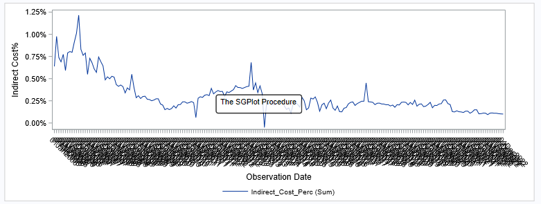
I hope someone will be able to assist me. I'm trying to draw a bar graph using monthly data fromMarch2014 to Jan2024, but my x-axis minor tick values comes out all squashed.
My code is as follows:
proc sgplot data=INDIRECT_COSTS;
vline OBS_DATE / response=Indirect_Cost_Perc;
yaxis label="Indirect Cost%";
xaxis label="Observation Date" minor minorcount=10;
keylegend / noborder;
run;
I've also tried the following code, but then I loose the detail:
proc sgplot data=INDIRECT_COSTS;
   vline OBS_DATE / response=Indirect_Cost_Perc;
   yaxis label="Indirect Cost%";
   xaxis label="Observation Date"  interval=month values=('01JAN2006'd to '01JUN2023'd by 120);
   keylegend / noborder;
run;
Accepted Solutions
- Mark as New
- Bookmark
- Subscribe
- Mute
- RSS Feed
- Permalink
- Report Inappropriate Content
Hello @MarieRall and welcome to the SAS Support Communities!
@MarieRall wrote:
I still have an issue if I want to create bars by date.
Here is an example plotting bars by date:
/* Create sample data for demonstration */

data have;
obs_date='01JAN2006'd;
Indirect_Cost_Perc=0.0064;
do i=1 to 208;
  sign=sign(Indirect_Cost_Perc);
  output;
  obs_date=intnx('month',obs_date,1);
  Indirect_Cost_Perc+rannor(1232176626)/1800;
end;
format obs_date date9. Ind: percent8.2;
run;

/* Create bar chart */

ods graphics / height=400 width=1300;
proc sgplot data=have;
vbarparm category=OBS_DATE response=Indirect_Cost_Perc / colormodel=(CXF2575F CXCAD5E5) colorresponse=sign;
yaxis label="Indirect Cost%";
xaxis label="Observation Date" interval=month fitpolicy=rotatethin;
keylegend / noborder;
run;
Result:
Is there anything you would like to change?
- Mark as New
- Bookmark
- Subscribe
- Mute
- RSS Feed
- Permalink
- Report Inappropriate Content
I found the solution. Instead of using "vline", I used "series" and that resolved my problem of the time series graphs. However I still have an issue if I want to create bars by date.
- Mark as New
- Bookmark
- Subscribe
- Mute
- RSS Feed
- Permalink
- Report Inappropriate Content
Hello @MarieRall and welcome to the SAS Support Communities!
@MarieRall wrote:
I still have an issue if I want to create bars by date.
Here is an example plotting bars by date:
/* Create sample data for demonstration */

data have;
obs_date='01JAN2006'd;
Indirect_Cost_Perc=0.0064;
do i=1 to 208;
  sign=sign(Indirect_Cost_Perc);
  output;
  obs_date=intnx('month',obs_date,1);
  Indirect_Cost_Perc+rannor(1232176626)/1800;
end;
format obs_date date9. Ind: percent8.2;
run;

/* Create bar chart */

ods graphics / height=400 width=1300;
proc sgplot data=have;
vbarparm category=OBS_DATE response=Indirect_Cost_Perc / colormodel=(CXF2575F CXCAD5E5) colorresponse=sign;
yaxis label="Indirect Cost%";
xaxis label="Observation Date" interval=month fitpolicy=rotatethin;
keylegend / noborder;
run;
Result:
Is there anything you would like to change?
- Mark as New
- Bookmark
- Subscribe
- Mute
- RSS Feed
- Permalink
- Report Inappropriate Content
- Mark as New
- Bookmark
- Subscribe
- Mute
- RSS Feed
- Permalink
- Report Inappropriate Content
The key here is that a category axis for a line chart (VLINE/HLINE) or a bar chart (such as VBAR/HBAR) is "discrete" by default, even when presented with time data. However, if you just set TYPE=TIME on your XAXIS statement, the axis will treat the data as time data, and all of your time-axis options will work as expected. You can use a SERIES if your data is pre-summarized; but if it isn't, I would recommend switching back to a VLINE. If you are also overlaying a VBAR on the graph, you will want to switch it back.
Hope this helps!
Catch up on SAS Innovate 2026
Nearly 200 sessions are now available on demand with the SAS Innovate Digital Pass.
Explore Now →Learn how use the CAT functions in SAS to join values from multiple variables into a single value.
Find more tutorials on the SAS Users YouTube channel.
SAS Training: Just a Click Away
Ready to level-up your skills? Choose your own adventure.


