- Home
- /
- Programming
- /
- Graphics
- /
- SAS GPLOT
- RSS Feed
- Mark Topic as New
- Mark Topic as Read
- Float this Topic for Current User
- Bookmark
- Subscribe
- Mute
- Printer Friendly Page
- Mark as New
- Bookmark
- Subscribe
- Mute
- RSS Feed
- Permalink
- Report Inappropriate Content
Hello,
I have the following data,
Dialy_batch_id alc count_ipc cont_odn count_accntg
20190518_0000000001 1 2013 2123 1432
20190518_0000000002 1 3013 1123 1532
20190518_0000000003 0 1013 3123 2432
I need to graph this to show the trend for each day(daily batch id).
Please help.
Thank you!
- Mark as New
- Bookmark
- Subscribe
- Mute
- RSS Feed
- Permalink
- Report Inappropriate Content
Examples of line charts are included in the documentation:
https://documentation.sas.com/?docsetId=grstatproc&docsetVersion=9.4&docsetTarget=n1vkttjoy99wkwn1iy...
- Mark as New
- Bookmark
- Subscribe
- Mute
- RSS Feed
- Permalink
- Report Inappropriate Content
@mauri0623 wrote:
Hello,
I have the following data,
Dialy_batch_id alc count_ipc cont_odn count_accntg
20190518_0000000001 1 2013 2123 1432
20190518_0000000002 1 3013 1123 1532
20190518_0000000003 0 1013 3123 2432
I need to graph this to show the trend for each day(daily batch id).
Please help.
Thank you!
Trend of what? Which variable is your horizontal axis, which the vertical.
Trend usually implies over dates or times. I do not see any variable that is a date or time.
You also only show a single set of values for each level of daily_batch_id. So there isn't much of a trend possible for each value.
Perhaps you intend to extract a date from the batch id variable? That would be possible in a data step with:
date = input(scan(daily_batch_id,1,'_'),yymmdd8.);
and assign an appropriate date format like Date9. or yymmdd8 if you like.
But we still would need to know what to plot.
Please provide example data in the form of a data step if want any actual code.
Instructions here: https://communities.sas.com/t5/SAS-Communities-Library/How-to-create-a-data-step-version-of-your-dat... will show how to turn an existing SAS data set into data step code that can be pasted into a forum code box using the {i} icon or attached as text to show exactly what you have and that we can test code against.
- Mark as New
- Bookmark
- Subscribe
- Mute
- RSS Feed
- Permalink
- Report Inappropriate Content
These are the frequency count of the missing for alc, odn, and accounting. All I need is graph showing the increase and decrease of these variable by batch_id. I did not mean a trend really.
- Mark as New
- Bookmark
- Subscribe
- Mute
- RSS Feed
- Permalink
- Report Inappropriate Content
@mauri0623 wrote:
These are the frequency count of the missing for alc, odn, and accounting. All I need is graph showing the increase and decrease of these variable by batch_id. I did not mean a trend really.
Still have the issue of only a single value for batch id. So no increase or decrease I can see.
And what is the horizontal axis supposed to be?
What kind of graph?
- Mark as New
- Bookmark
- Subscribe
- Mute
- RSS Feed
- Permalink
- Report Inappropriate Content
- Mark as New
- Bookmark
- Subscribe
- Mute
- RSS Feed
- Permalink
- Report Inappropriate Content
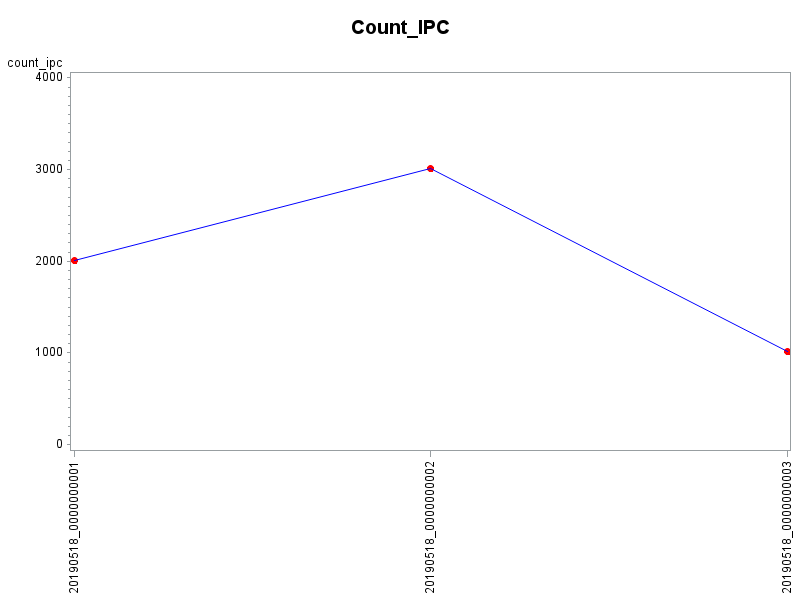
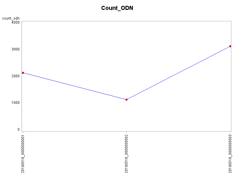
Here's one way to do it ...
data my_data;
length Dialy_batch_id $19;
input Dialy_batch_id alc count_ipc count_odn count_accntg;
datalines;
20190518_0000000001 1 2013 2123 1432
20190518_0000000002 1 3013 1123 1532
20190518_0000000003 0 1013 3123 2432
;
run;
axis1 label=none value=(angle=90);
symbol1 value=dot h=10pt color=red interpol=join ci=blue;
title ls=1.5 "Count_IPC";
proc gplot data=my_data;
plot count_ipc*Dialy_batch_id=1 / vzero haxis=axis1;
run;
title ls=1.5 "Count_ODN";
proc gplot data=my_data;
plot count_odn*Dialy_batch_id=1 / vzero haxis=axis1;
run;
Catch up on SAS Innovate 2026
Dive into keynotes, announcements and breakthroughs on demand.
Explore Now →Learn how use the CAT functions in SAS to join values from multiple variables into a single value.
Find more tutorials on the SAS Users YouTube channel.
SAS Training: Just a Click Away
Ready to level-up your skills? Choose your own adventure.


