- Home
- /
- Programming
- /
- Graphics
- /
- Remove axis frames in Panel Charts?
- RSS Feed
- Mark Topic as New
- Mark Topic as Read
- Float this Topic for Current User
- Bookmark
- Subscribe
- Mute
- Printer Friendly Page
- Mark as New
- Bookmark
- Subscribe
- Mute
- RSS Feed
- Permalink
- Report Inappropriate Content
Hi, first time poster form down under.
Love the site - its been very useful already - thanks all.
I have created a panel chart using SGPANEL and the PANELBY statement.
I have removed the individual panel borders but I have also been asked if I can remove the top and right hand axis 'frames' so that only the two axis lines are left.
Does anybody know how I might do this?
The relevant bits I tried in the style template are:
Style graphwalls / color=white frameborder=off;
Style GraphBorderLines / color=white Contrastcolor=white;
And the code for the plot and the ods graphics options are:
ods graphics on /reset=all border=off noborder height=9 cm width=15 cm imagefmt=emf noscale;
proc sgpanel data=plotdata noautolegend;
panelby type/ spacing=0 novarname noborder colheaderpos=bottom layout=columnlattice
uniscale=column columns=&ntypes;
scatter x=plotvalue y=category/markerattrs=(symbol=circlefilled color=black size=&dotsize);
colaxis display=(nolabel novalues noticks);
rowaxis label="%bquote(&yaxislabel)";
footnote height=8pt font='Arial' bold " Procedures";
- Mark as New
- Bookmark
- Subscribe
- Mute
- RSS Feed
- Permalink
- Report Inappropriate Content
Maybe you could also use SGPLOT with values of 1-4 for X axis, and jitter the markers within -0.5 to +0.5 of each value to position the markers correctly. Use UDF to get the right X axis tick values.
You can set NOBORDER on the ODS Graphics statement to remove the outer graph border. There is no option in SG to remove the inner wall border, but you may be able to get away with it by setting the GRAPHWALLS line color attribute in the style.
The option to suppress wall border has been added for V9.4. However, if you are using SAS 9.3, you could also use SGANNO to wipe out the borders. BTW, JITTER option has also been added at V9.4.
- Mark as New
- Bookmark
- Subscribe
- Mute
- RSS Feed
- Permalink
- Report Inappropriate Content
Thanks Sanjay.
I had already tried the graphwalls option in the style template, but with no luck.
For now I have gone with the SGANNO suggestion to blank out those lines, and will await 9.4 in a few weeks.
- Mark as New
- Bookmark
- Subscribe
- Mute
- RSS Feed
- Permalink
- Report Inappropriate Content
Hi Sanjay
Two years later and we have SAS 9.4...........
I am still not able to remove the top and left "axis" frames. nowall does not help.
If in the style template I set the contrastcolor for axislines to be red, it shows me that the top and right "frames" are axis lines.
Shall I assume there is still no way to not display these, and annotating over them with some white space is the only options still?
- Mark as New
- Bookmark
- Subscribe
- Mute
- RSS Feed
- Permalink
- Report Inappropriate Content
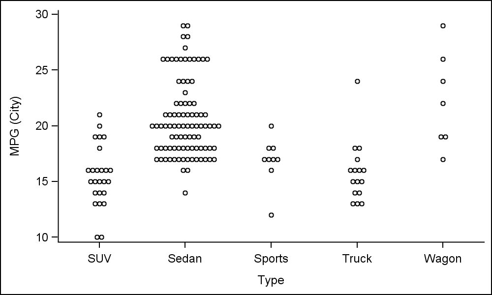
I am not sure why you are using SGPANEL. This graph can easily be done using 9.4 SGPLOT,and you can remove the right and top frame by setting the NOBORDER option. Maybe I did not understand your use case. Here is a similar one.
proc sgplot data=sashelp.cars(where=(origin='USA')) noborder;
scatter x=Type y=mpg_city / jitter markerattrs=(size=5);
run;

If you really want a PANEL without the top and right border, you will be able to do that using SAS 9.40M3 soon to be released this Summer. I added the gray wall color just to delineate the each classifier value.

- Mark as New
- Bookmark
- Subscribe
- Mute
- RSS Feed
- Permalink
- Report Inappropriate Content
Thanks Sanjay.
It was really a general question about the top and right borders in panel graphs rather than that particular graph.
Will wait for 9.40M3.
- Mark as New
- Bookmark
- Subscribe
- Mute
- RSS Feed
- Permalink
- Report Inappropriate Content
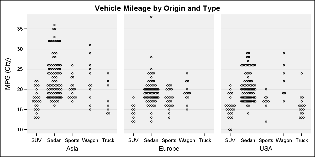
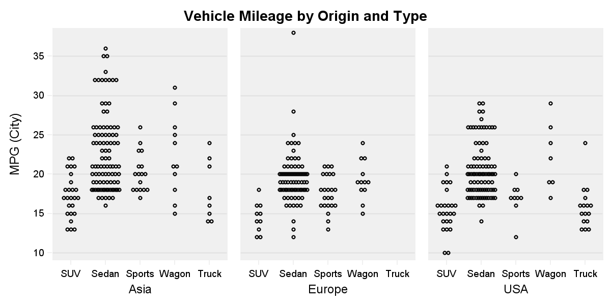
Here is a workaround that could work in some cases. Here, I have set the style attributes for specific elements in the style to "hide" the offending elements in the graph. You may lose some items (axis line and ticks are gray), but it depends on what is more important to you.
You can do this in SAS 9.4
proc template;
define style styles.panelBorder;
parent = Styles.listing;
class GraphColors
"Abstract colors used in graph styles" /
'gwalls' = cxF0F0F0
'gaxis' = cxF0F0F0
'gborderlines' = cxFFFFFF
;
class GraphWalls /
linethickness = 1px
linestyle = 1
frameborder = on
contrastcolor = GraphColors('gwalls')
backgroundcolor = GraphColors('gwalls')
color = GraphColors('gwalls');
end;
run;
title 'Vehicle Mileage by Origin and Type';
proc sgpanel data=sashelp.cars(where=(type ne 'Hybrid'));
panelby origin / onepanel rows=1 novarname layout=columnlattice
spacing=20 colheaderpos=bottom noborder;
scatter x=Type y=mpg_city / jitter markerattrs=(size=5);
rowaxis display=(noline) valueattrs=(size=7) grid;
colaxis display=(noline nolabel) valueattrs=(size=7) fitpolicy=none;
run;

- Mark as New
- Bookmark
- Subscribe
- Mute
- RSS Feed
- Permalink
- Report Inappropriate Content
Hi Sanjay,
Thanks for the helpful tip with using proc template. I tried to use what you suggested but that seemed to wipe out the x-axis line as well. Is there a way to put it back on?
Also, do you know how to break each panel label into multiple lines so that the label would not be truncated when the panel width is reduced?
Thanks much in advance!
Catch up on SAS Innovate 2026
Dive into keynotes, announcements and breakthroughs on demand.
Explore Now →Learn how use the CAT functions in SAS to join values from multiple variables into a single value.
Find more tutorials on the SAS Users YouTube channel.
SAS Training: Just a Click Away
Ready to level-up your skills? Choose your own adventure.


