- Home
- /
- Programming
- /
- Graphics
- /
- Plot x-axis is not formatted
- RSS Feed
- Mark Topic as New
- Mark Topic as Read
- Float this Topic for Current User
- Bookmark
- Subscribe
- Mute
- Printer Friendly Page
- Mark as New
- Bookmark
- Subscribe
- Mute
- RSS Feed
- Permalink
- Report Inappropriate Content
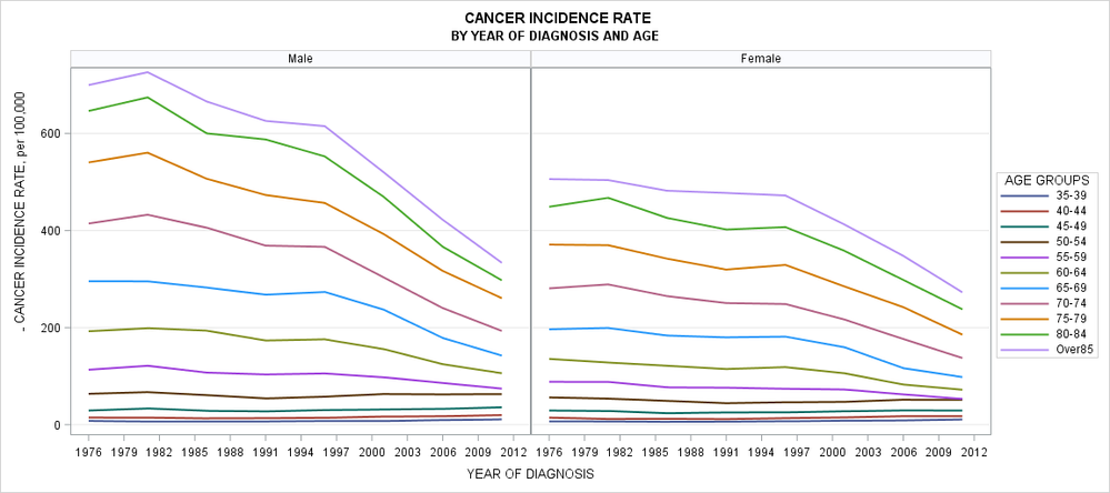
Is there any way to force the plot to take up on formatting on X-axis display? I'd like to show x axis as formatted for P as a range of time periods. S=Gender and A-Age formats taken up no problem. Do you know why and how to fix it?
proc format;
value P
1976="1976-1980"
1981="1981-1985"
1986="1986-1990"
1991="1991-1995"
1996="1996-2000"
2001="2001-2005"
2006="2006-2010"
2011="2011-2015"
;
value A
0 ="0-4"
5 ="5-9"
10="10-14"
15="15-19"
20="20-24"
25="25-29"
30="30-34"
35="35-39"
40="40-44"
45="45-49"
50="50-54"
55="55-59"
60="60-64"
65="65-69"
70="70-74"
75="75-79"
80="80-84"
85="Over85"
;
value S
1="Male"
2="Female";
;
run;

ods graphics / height=800 width=1800;
proc sgpanel data=mydata(where=(A>30));
panelby S/novarname onepanel LAYOUT=panel columns=2 ROWHEADERPOS=right COLHEADERPOS=both SKIPEMPTYCELLS;
series y=rate x=P/ group=A lineattrs=(pattern=solid) lineattrs=(thickness=2);
keylegend/title="AGE GROUPS" position=right;
format A A. S S. P P.;
colaxis label='YEAR OF DIAGNOSIS' fitpolicy=thin valuesformat=best4.0 values=(1980 to 2016 by 1);
rowaxis label='INCIDENCE RATE, per 100,000' grid;
title1 "INCIDENCE RATE";
title2 "BY YEAR OF DIAGNOSIS AND AGE";
run;
Accepted Solutions
- Mark as New
- Bookmark
- Subscribe
- Mute
- RSS Feed
- Permalink
- Report Inappropriate Content
In addition to the plot type issues I think you have defined your P format incorrectly to begin with.
I think you intended
proc format;
value P
1976 - 1980="1976-1980"
<etc>
if you wanted a grouping format.
And since you seem to want to combine the values then perhaps you should do that in a separate summary procedure or data step to create the appropriate Y axis value(s) using the P format to group the years. Since you have a rate displayed you probably cannot get the graphing procedure to combine things across years correctly (averaging rates in general yield incorrect results unless the denominator is identical for each and every group of data).
- Mark as New
- Bookmark
- Subscribe
- Mute
- RSS Feed
- Permalink
- Report Inappropriate Content
Interesting problem. There is an inconsistency in your variable names (you use X=P1 but set FORMAT P P.), but that doesn't seem to be the issue. For anyone interested in looking into this issue, here is some sample data:
data mydata;
do S = 1 to 2;
   do A = 0 to 85 by 5;
      do P = 1976 to 2011 by 5;
         rate = A + P; output;
      end;
   end;
end;
run;

ods graphics / height=800 width=1800;
proc sgpanel data=mydata(where=(A>30));
panelby S/novarname onepanel LAYOUT=panel columns=2 ROWHEADERPOS=right COLHEADERPOS=both SKIPEMPTYCELLS;
series y=rate x=P/ group=A lineattrs=(pattern=solid) lineattrs=(thickness=2);
keylegend/title="AGE GROUPS" position=right;
format A A. S S. P P.;
colaxis label='YEAR OF DIAGNOSIS' fitpolicy=rotate;
rowaxis label='INCIDENCE RATE, per 100,000' grid;
title1 "INCIDENCE RATE";
title2 "BY YEAR OF DIAGNOSIS AND AGE";
run;- Mark as New
- Bookmark
- Subscribe
- Mute
- RSS Feed
- Permalink
- Report Inappropriate Content
I think what you want here is a VLINE chart, not a SERIES plot. The axis for the SERIES is continuous by default, which is probably why the format did not show up. Also, the nature of your format is going to require some kind of aggregation (probably mean). Try replacing the SERIES statement with this statement and see if you get what you want:
vline p / response=rate group=A stat=mean lineattrs=(pattern=solid) lineattrs=(thickness=2);
Hope this helps!
Dan
- Mark as New
- Bookmark
- Subscribe
- Mute
- RSS Feed
- Permalink
- Report Inappropriate Content
In addition to the plot type issues I think you have defined your P format incorrectly to begin with.
I think you intended
proc format;
value P
1976 - 1980="1976-1980"
<etc>
if you wanted a grouping format.
And since you seem to want to combine the values then perhaps you should do that in a separate summary procedure or data step to create the appropriate Y axis value(s) using the P format to group the years. Since you have a rate displayed you probably cannot get the graphing procedure to combine things across years correctly (averaging rates in general yield incorrect results unless the denominator is identical for each and every group of data).
Catch up on SAS Innovate 2026
Nearly 200 sessions are now available on demand with the SAS Innovate Digital Pass.
Explore Now →Learn how use the CAT functions in SAS to join values from multiple variables into a single value.
Find more tutorials on the SAS Users YouTube channel.
SAS Training: Just a Click Away
Ready to level-up your skills? Choose your own adventure.


