- Home
- /
- Programming
- /
- Graphics
- /
- Re: PROC SGPLOT SERIES: Colour markers by variable values
- RSS Feed
- Mark Topic as New
- Mark Topic as Read
- Float this Topic for Current User
- Bookmark
- Subscribe
- Mute
- Printer Friendly Page
- Mark as New
- Bookmark
- Subscribe
- Mute
- RSS Feed
- Permalink
- Report Inappropriate Content
Hello,
I have some stock market data that I've put on a graph.
PROC SGPLOT DATA=HC2016 (WHERE=(Date=&d));
	XAXIS VALUES=(&start TO &finish BY MINUTE) INTERVAL=MINUTE;
	SERIES X=DT Y=Volume / LEGENDLABEL="Volume";
	SERIES X=DT Y=Close / Y2AXIS LEGENDLABEL="Close Price" DATALABEL=Signal markers;
RUN;
My Signal Variable has the following values: 0 (Orange Signal), 1 (Low Return), 2 (High return), 10 (Green Signal)
I would like to know how to colour the markers by Signal values. I want the "Orange Signal" value to be orange, the "Green Signal" value to be green and everything in between to be grey.
How do I change my syntax?
Also, how do I change the F6 and F7 values with Volume and Close Price?

Accepted Solutions
- Mark as New
- Bookmark
- Subscribe
- Mute
- RSS Feed
- Permalink
- Report Inappropriate Content
We ask for test data in the form of a datastep, I don't have time to type all that in. As such I am again guessing if this works, but it should:
data updated;
  set hc2016;
  close_orange=ifn(signal="Orange Signal",close,.);
  close_green=ifn(signal="Green Signal",close,.);
run;
/* What the above gives you is a dataset with your original data - as per your output as you want it now
   with two additional variables which hold the data needed to plot a point for the green marker and
   a point for the orrange marker*/

proc sgplot data=updated (where=(date=&d));
	xaxis values=(&start to &finish by minute) interval=minute;
	series x=dt y=volume / legendlabel="volume";
	series x=dt y=close / y2axis legendlabel="Close Price" datalabel=signal markers;
  /* Now we add to rows to overlay the colored point */
  scatter x=dt y=close_orange / y2axis markerattrs=(color=orange);
  scatter x=dt y=close_green / y2axis markerattrs=(color=green);
run;
The above should replicate what you have now, plus adding two points at the green and orange points.
- Mark as New
- Bookmark
- Subscribe
- Mute
- RSS Feed
- Permalink
- Report Inappropriate Content
It would be easier to help if we could see some of your data.
But I believe you can do this by adding
styleattrs datacontrastcolors=(orange green grey);right below your proc sgplot statement and grouping by Signal in your series options after the forward slash as
group = Signal
- Mark as New
- Bookmark
- Subscribe
- Mute
- RSS Feed
- Permalink
- Report Inappropriate Content
ERROR 22-322: Syntax error, expecting one of the following: ;, ASPECT, CYCLEATTRS, DATA, DATTRMAP, DESCRIPTION, NOAUTOLEGEND,
NOBORDER, NOCYCLEATTRS, NOOPAQUE, NOSUBPIXEL, NOWALL, OPAQUE, PAD, PCTLEVEL, PCTNDEC, RATTRMAP, SGANNO, SUBPIXEL,
TMPLOUT, UNIFORM.
- Mark as New
- Bookmark
- Subscribe
- Mute
- RSS Feed
- Permalink
- Report Inappropriate Content
Shouldn't yield an error if it is placed correctly as in this example.
proc sgplot data = sashelp.iris;
styleattrs datacontrastcolors=(orange green grey);
scatter x = sepallength y = sepalwidth / group = species;
run;- Mark as New
- Bookmark
- Subscribe
- Mute
- RSS Feed
- Permalink
- Report Inappropriate Content
Ok, I thought those were PROC SGPLOT options. My mystake.
The resulting graph looks weird however.

- Mark as New
- Bookmark
- Subscribe
- Mute
- RSS Feed
- Permalink
- Report Inappropriate Content
- Mark as New
- Bookmark
- Subscribe
- Mute
- RSS Feed
- Permalink
- Report Inappropriate Content
Please avoid coding all in uppper case, it makes reading your code so much harder.
If I was doing this, I would split out the three data items, so the data in orange goes in one column, the green in another, and all the rest in a third.
proc sgplot data=hc2016 (where=(date=&d));
  xaxis values=(&start to &finish by minute) interval=minute;
  series x=dt y=volume / legendlabel="volume";
  series x=dt y=close_grey / y2axis legendlabel="Close Price" datalabel=signal markers markerattrs=(color=grey);
  series x=dt y=close_orange / y2axis datalabel=signal markers markerattrs=(color=orange);
  series x=dt y=close_green / y2axis datalabel=signal markers markerattrs=(color=green);
run;
- Mark as New
- Bookmark
- Subscribe
- Mute
- RSS Feed
- Permalink
- Report Inappropriate Content
- Mark as New
- Bookmark
- Subscribe
- Mute
- RSS Feed
- Permalink
- Report Inappropriate Content
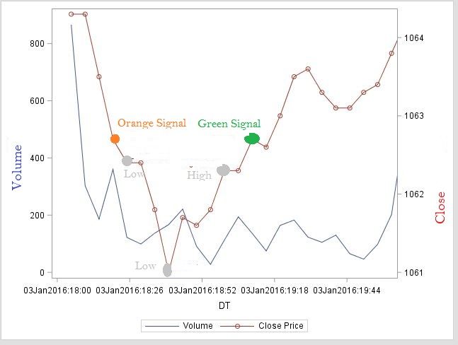
I edited my graph in Paint to show how I want it to look like (attached)

- Mark as New
- Bookmark
- Subscribe
- Mute
- RSS Feed
- Permalink
- Report Inappropriate Content
Sorry, your not making much sense. This has nothing to do with axis. The point is to do:
1) draw your graph all the as you have now, and exclude the two items you want to have in a nother color. Then to this code you add another two plots to add these points in and apply the color.
proc sgplot data=hc2016 (where=(date=&d));
  xaxis values=(&start to &finish by minute) interval=minute;
/* This creates the other line plot */
  series x=dt y=volume / legendlabel="volume";
/* This creates the line plot you currently have - the y variable should contain only those poits you want in grey */
  series x=dt y=close_grey / y2axis legendlabel="Close Price" datalabel=signal markers markerattrs=(color=grey);
/* This creates another overlay which should only have the one point for the orange (note you could also use scatter here) */
  series x=dt y=close_orange / y2axis datalabel=signal markers markerattrs=(color=orange);
/* This creates another overlay which should only have the one point for the green (note you could also use scatter) */
  series x=dt y=close_green / y2axis datalabel=signal markers markerattrs=(color=green);
run;
So plots as you have, then overlay that with the 1 point plot of the orange value, and then overlay again the one point plot of the green value.
- Mark as New
- Bookmark
- Subscribe
- Mute
- RSS Feed
- Permalink
- Report Inappropriate Content
I don't know how to explain it in a simpler way. I want to highlight some points on the price series with different colours.
I want to graph the Price and then overlay the points found in Signal variable. I want to highlight on the price series when an orange signal is given (orange dot), I want to show the significant spikes in prices (grey dots) and then finish with a green signal (green dot) to show the price has stabilized.
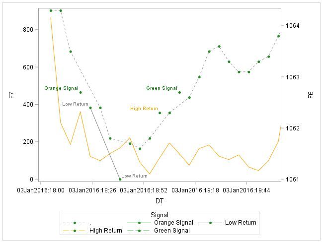
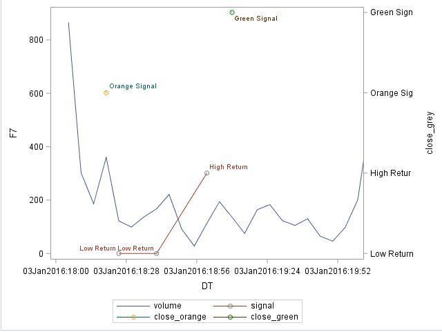
Your code gives me the attached result.
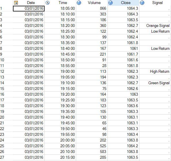
...I've attached a sample of data, maybe it will become clearer why this code won't work.


- Mark as New
- Bookmark
- Subscribe
- Mute
- RSS Feed
- Permalink
- Report Inappropriate Content
We ask for test data in the form of a datastep, I don't have time to type all that in. As such I am again guessing if this works, but it should:
data updated;
  set hc2016;
  close_orange=ifn(signal="Orange Signal",close,.);
  close_green=ifn(signal="Green Signal",close,.);
run;
/* What the above gives you is a dataset with your original data - as per your output as you want it now
   with two additional variables which hold the data needed to plot a point for the green marker and
   a point for the orrange marker*/

proc sgplot data=updated (where=(date=&d));
	xaxis values=(&start to &finish by minute) interval=minute;
	series x=dt y=volume / legendlabel="volume";
	series x=dt y=close / y2axis legendlabel="Close Price" datalabel=signal markers;
  /* Now we add to rows to overlay the colored point */
  scatter x=dt y=close_orange / y2axis markerattrs=(color=orange);
  scatter x=dt y=close_green / y2axis markerattrs=(color=green);
run;
The above should replicate what you have now, plus adding two points at the green and orange points.
- Mark as New
- Bookmark
- Subscribe
- Mute
- RSS Feed
- Permalink
- Report Inappropriate Content
RW9 solution should work fine; but, alternative option would be to use an attributes map. This approach would require no data manipulation in this case. The code would look something like the following:
data attrmap;
retain id "myid" markersymbol "circlefilled";
length value $ 13 markercolor $ 6;
input value $ 1-13 markercolor $;
cards;
Orange Signal orange
Low Return      gray
High Return     gray
Green Signal   green
;
run;

proc sgplot data=updated (where=(date=&d)) dattrmap=attrmap;
	xaxis values=(&start to &finish by minute) interval=minute;
	series x=dt y=volume / legendlabel="volume" name="V";
	series x=dt y=close / y2axis legendlabel="Close Price" datalabel=signal markers name="C";
  /* Now we add to rows to overlay the colored point */
  scatter x=dt y=close / y2axis group=signal attrid=myid name="signal";
  keylegend "V" "C" / position=bottomlleft;
  keylegend "signal" / position=bottomright;
run;
- Mark as New
- Bookmark
- Subscribe
- Mute
- RSS Feed
- Permalink
- Report Inappropriate Content
Here is a basic outline that will give you complete control:
1. Create a separate data set that contains the dates of interest, along with the labels to display.
2. Concatenate the data with the data set in (1).
3. Use the SERIES statement for the lines plots, and the STYLEATTRS and the SCATTER statement for the special points.
Here is an example for you to study. It uses data that we can all access. You can use this data in the future for additional questions.
data stocks;
set sashelp.stocks;
where stock="IBM" AND year(date) <= 1994;
run;

data SpecialPoints;
 Signal=0; x='03Aug1987'd; y=168.38;text="Green Signal "; output;
 Signal=1; x='01Sep1993'd; y=42;    text="Orange Signal"; output;
 Signal=2; x='01JUN1992'd; y=97.87 ;text="Gray Signal  "; output;
run;

data all;
set stocks SpecialPoints;
run;

proc sgplot data=all noautolegend;
styleattrs datacontrastcolors=(orange green grey);
series x=date y=volume;
series x=date y=close / y2axis lineattrs=(color=brown);
scatter x=x y=y / y2axis group=Signal datalabel=text
        markerattrs=(size=18 symbol=CircleFilled);
run;Catch up on SAS Innovate 2026
Nearly 200 sessions are now available on demand with the SAS Innovate Digital Pass.
Explore Now →Learn how use the CAT functions in SAS to join values from multiple variables into a single value.
Find more tutorials on the SAS Users YouTube channel.
SAS Training: Just a Click Away
Ready to level-up your skills? Choose your own adventure.


