- Home
- /
- Programming
- /
- Graphics
- /
- Re: PROC FREQ plots
- RSS Feed
- Mark Topic as New
- Mark Topic as Read
- Float this Topic for Current User
- Bookmark
- Subscribe
- Mute
- Printer Friendly Page
- Mark as New
- Bookmark
- Subscribe
- Mute
- RSS Feed
- Permalink
- Report Inappropriate Content
Hello all,
I was wondering if anyone can tell how to manipulate the plots generated by PROC FREQ. The code below generates the plot but I cannot change the title, axis names, etc. of the plot within the PROC FREQ procedure (neither the title nor the label statements make any difference).
Thanks a lot in advance!
Recep Gezer
ods graphics on;
ods html style=statistical;
proc freq data=master_blunt_penetrating order=data;
tables site*ttl_surgeon*o_expired/ cmh alpha=0.1 relrisk plots=relriskplot(logbase=E);
weight count;
label ttl_surgeon= "Trauma Team Leader" o_expired="Mortality";
title 'Raw data (ignoring hospital) - Blunt and penetrating injuries';
run;
ods graphics off;
ods html close;
Accepted Solutions
- Mark as New
- Bookmark
- Subscribe
- Mute
- RSS Feed
- Permalink
- Report Inappropriate Content
You can get the stats that PROC FREQ displays in the relative risk plot by using an ODS OUTPUT statement:
ods output relriskplot=out;This output data set includes the stratum relative risks, the common relative risk, and the confidence limits. (When you specify the LOGBASE= plot-option, the values in the output data set are the scaled values.)
- Mark as New
- Bookmark
- Subscribe
- Mute
- RSS Feed
- Permalink
- Report Inappropriate Content
Most of the plots associated with the procedures like proc freq are more intended for exploratory analysis.
If you want enough control for publication type graphics then the general approach is to create output data sets from the procedure and use the data in another graphing procedure with more options and control such as SGPLOT or SGPANEL or even the Graph Template Language.
- Mark as New
- Bookmark
- Subscribe
- Mute
- RSS Feed
- Permalink
- Report Inappropriate Content
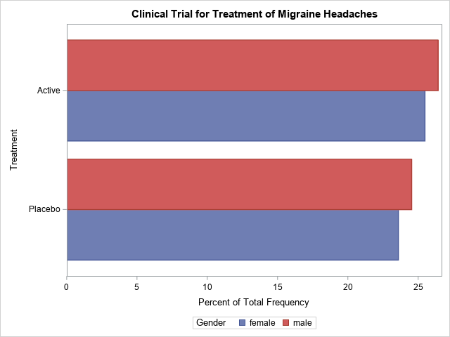
Here's an example, demonstrating what ballardw is talking about:
data Migraine;
input Gender $ Treatment $ Response $ Count @@;
datalines;
female Active Better 16 female Active Same 11
female Placebo Better 5 female Placebo Same 20
male Active Better 12 male Active Same 16
male Placebo Better 7 male Placebo Same 19
;
run;
proc freq data=Migraine;
tables Gender*Treatment*Response / out=freqout
relrisk plots(only)=relriskplot(stats) cmh noprint;
weight Count;
run;
title 'Clinical Trial for Treatment of Migraine Headaches';
proc sgplot data=freqout;
hbarparm category=treatment response=count / group=gender groupdisplay=cluster;
run;
- Mark as New
- Bookmark
- Subscribe
- Mute
- RSS Feed
- Permalink
- Report Inappropriate Content
Hmm ... well, I guess that sgplot isn't that helpful, since 'count' was in the original dataset. 😉 So, here's a better one, with something that was calculated by proc freq - the 'percent'...
proc sgplot data=freqout;
hbarparm category=treatment response=percent / group=gender groupdisplay=cluster;
run;
- Mark as New
- Bookmark
- Subscribe
- Mute
- RSS Feed
- Permalink
- Report Inappropriate Content
Thanks a lot for your response! The problem is taking the relative risks, especially calculated at the log base out of the PROC FREQ. For instance the "out=test" option in the TABLES statement below simply produces the counts for each combination of site*ttl_surgeon*o_expired in the TABLES statement. Presumably I can calculate the relative risks by those counts then convert them to the log base but the PROC FREQ code I use also calculates the pooled common relative risk with the CMH option (again I can calculate manually but then what's the point of using PROC FREQ?). For that reason I was hoping to be able to manipulate the relative risks plot within the PROC FREQ. I read a paper, also recommended by @Watts using PROC TEMPLATE to manipulate the plots but it's slightly more complicated than I hoped for! It may be my only option though:)
proc freq data=master_Penetrating order=data;
tables site*ttl_surgeon*o_expired/cmh alpha=0.1 relrisk plots=relriskplot(logbase=E) out=test;
weight count;
title 'Raw data (ignoring hospital) - Penetrating injuries';
run;
I also found this tip sheet for GTL (graph template language) which can be helpful.
Thanks all for your comments!
Recep
- Mark as New
- Bookmark
- Subscribe
- Mute
- RSS Feed
- Permalink
- Report Inappropriate Content
You can get the stats that PROC FREQ displays in the relative risk plot by using an ODS OUTPUT statement:
ods output relriskplot=out;This output data set includes the stratum relative risks, the common relative risk, and the confidence limits. (When you specify the LOGBASE= plot-option, the values in the output data set are the scaled values.)
- Mark as New
- Bookmark
- Subscribe
- Mute
- RSS Feed
- Permalink
- Report Inappropriate Content
Thank you very much for your response and I'm very sorry that I responded so late (I was away for a while)! This resolves my issue and gives a lot of flexibility within the PROC SGPLOT.
Regards...
- Mark as New
- Bookmark
- Subscribe
- Mute
- RSS Feed
- Permalink
- Report Inappropriate Content
You're welcome. Glad this helps.
- Mark as New
- Bookmark
- Subscribe
- Mute
- RSS Feed
- Permalink
- Report Inappropriate Content
There are some examples of how to customize PROC FREQ plots in this paper by Kathryn McLawhorn:
"Tables and Graphics that will FREQ You Out" .
See pages 19-20 for how to change titles and axis labels in PROC FREQ plots.
Some documentation is here:
Statistical Graphics Using ODS: Modifying Your Graphs
ODS Graphics Template Modification
Examples of ODS Graphics Template Modification
Catch up on SAS Innovate 2026
Dive into keynotes, announcements and breakthroughs on demand.
Explore Now →Learn how use the CAT functions in SAS to join values from multiple variables into a single value.
Find more tutorials on the SAS Users YouTube channel.
SAS Training: Just a Click Away
Ready to level-up your skills? Choose your own adventure.


