- Home
- /
- Programming
- /
- Graphics
- /
- Overlay Square in Heatmap
- RSS Feed
- Mark Topic as New
- Mark Topic as Read
- Float this Topic for Current User
- Bookmark
- Subscribe
- Mute
- Printer Friendly Page
- Mark as New
- Bookmark
- Subscribe
- Mute
- RSS Feed
- Permalink
- Report Inappropriate Content
Hi,
I'm trying to create a heat map of a strike zone in baseball. The data contains the x and y values for where the ball crossed the plate, and also whether it was hit or not. I'd like to create a heat map showing the best areas of contact, along with overlaying the strike zone.
Ideally, the strike zone would just be a box from coordinates (-1,1), (1,1), (-1,3), (1,3).
Here's the code for the heatmap, which doesn't include whether or not contact was made:
proc sgplot data=coded_hits_num;
	heatmap x=plate_x y=plate_z / colormodel=(blue yellow red);
	run;
Thank you for the help.
Accepted Solutions
- Mark as New
- Bookmark
- Subscribe
- Mute
- RSS Feed
- Permalink
- Report Inappropriate Content
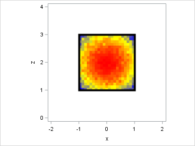
I think I would merge the data with the coordinates of the corners of the strike zone and use a POLYGON statement to draw the rectangle, as follows:
data coded_hits_num;
do x = -1 to 1 by 0.1;
   do z = 1 to 3 by 0.1;
      p = 1 - (x**2 + (z-2)**2) / 4;
      hits = rand("Binomial", p, 100);
      output;
   end;
end;
run;

data strikeZone;
ID = "S";
input xPoly zPoly;
datalines;
-1 1
 1 1
 1 3
-1 3
;

data all;
merge coded_hits_num strikezone;
run;

proc sgplot data=all aspect=1 noautolegend;
	heatmap x=x y=z / freq=hits colormodel=(blue yellow red) nxbins=21 nybins=21;
   polygon ID=ID x=xPoly y=zPoly / lineattrs=(thickness=5);
   xaxis min=-2 max=2;
   yaxis min=0 max=4;
run;
- Mark as New
- Bookmark
- Subscribe
- Mute
- RSS Feed
- Permalink
- Report Inappropriate Content
- Mark as New
- Bookmark
- Subscribe
- Mute
- RSS Feed
- Permalink
- Report Inappropriate Content
- Mark as New
- Bookmark
- Subscribe
- Mute
- RSS Feed
- Permalink
- Report Inappropriate Content
I think I would merge the data with the coordinates of the corners of the strike zone and use a POLYGON statement to draw the rectangle, as follows:
data coded_hits_num;
do x = -1 to 1 by 0.1;
   do z = 1 to 3 by 0.1;
      p = 1 - (x**2 + (z-2)**2) / 4;
      hits = rand("Binomial", p, 100);
      output;
   end;
end;
run;

data strikeZone;
ID = "S";
input xPoly zPoly;
datalines;
-1 1
 1 1
 1 3
-1 3
;

data all;
merge coded_hits_num strikezone;
run;

proc sgplot data=all aspect=1 noautolegend;
	heatmap x=x y=z / freq=hits colormodel=(blue yellow red) nxbins=21 nybins=21;
   polygon ID=ID x=xPoly y=zPoly / lineattrs=(thickness=5);
   xaxis min=-2 max=2;
   yaxis min=0 max=4;
run;
Catch up on SAS Innovate 2026
Dive into keynotes, announcements and breakthroughs on demand.
Explore Now →Learn how use the CAT functions in SAS to join values from multiple variables into a single value.
Find more tutorials on the SAS Users YouTube channel.
SAS Training: Just a Click Away
Ready to level-up your skills? Choose your own adventure.


