- Home
- /
- Programming
- /
- Graphics
- /
- Multiple but different labels on a given axis (xaxisopts & yaxisopts)
- RSS Feed
- Mark Topic as New
- Mark Topic as Read
- Float this Topic for Current User
- Bookmark
- Subscribe
- Mute
- Printer Friendly Page
- Mark as New
- Bookmark
- Subscribe
- Mute
- RSS Feed
- Permalink
- Report Inappropriate Content
Hi,
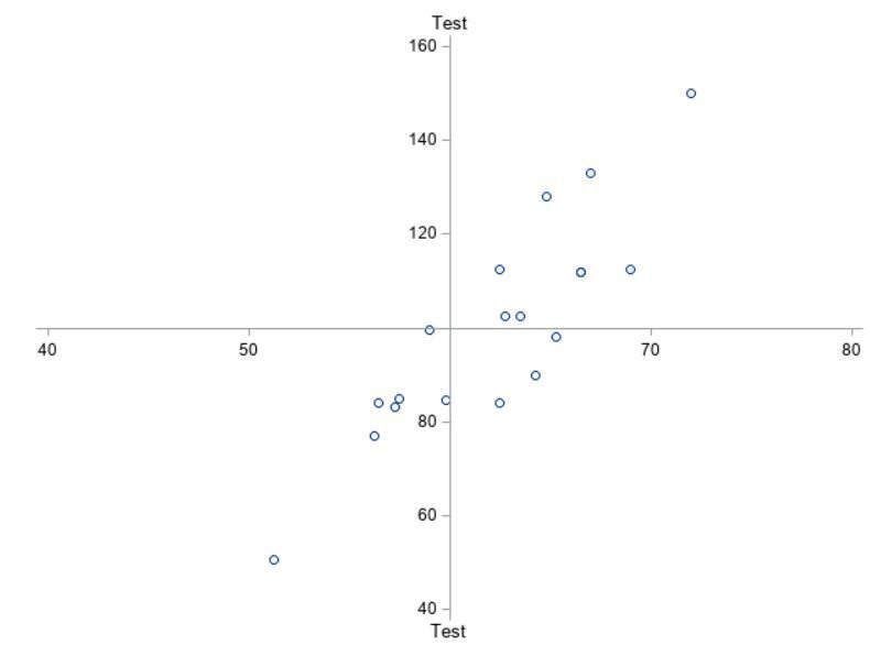
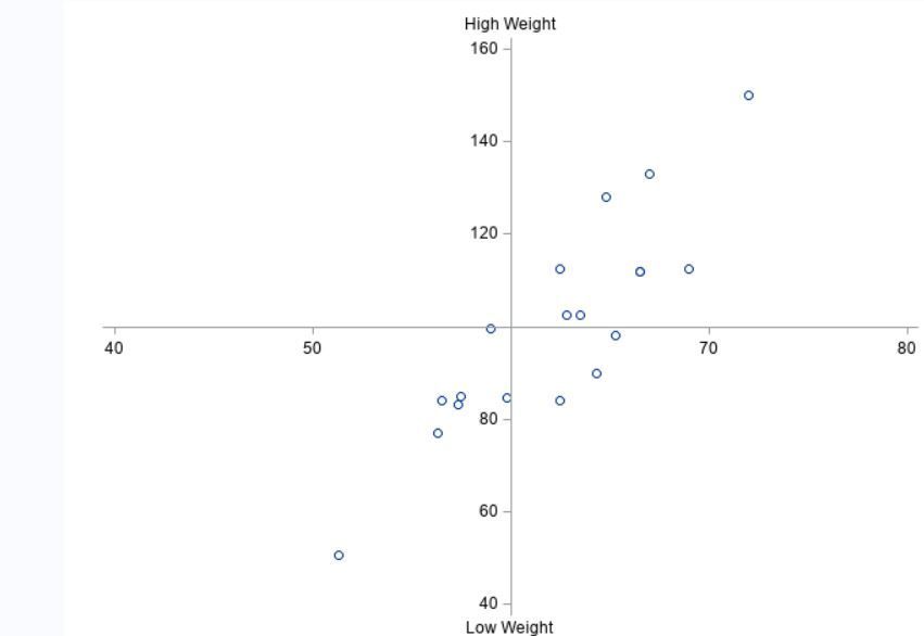
Is there a way to add two different labels to the same axis. I got it using reference lines but it would make more sens to me to do it with xaxisopts and yaxisopts.
proc template;
    define statgraph class;
        begingraph / border=false;
	        layout overlay
	            / xaxisopts=(label='Test'
	                         linearopts=(origin=60
	                                     tickvaluesequence=(start    =40
	                                                        end      =80
	                                                        increment=10)
	                                     viewmin=40
	                                     viewmax=80)
	                         displaysecondary=(label))
	              yaxisopts=(label     =' '
	                         linearopts=(origin=100
	                                     tickvaluesequence=(start    =40
	                                                        end      =160
	                                                        increment=20)
	                                     viewmin=40
	                                     viewmax=160))

	              walldisplay=none;

	        scatterplot x=height y=weight;

            endlayout;
        endgraph;
    end;
run;


*ods graphics/noborder;
proc sgrender data=sashelp.class template=class ;
run;
Expected result (obtained with reference lines after removing the labels from the axis)
Accepted Solutions
- Mark as New
- Bookmark
- Subscribe
- Mute
- RSS Feed
- Permalink
- Report Inappropriate Content
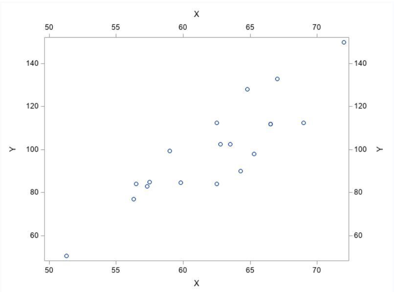
In order to use the x2/y2axis you have to have a graph that uses that axis even if that graph isn't visible. I took your example and added the same scatterplot to the x2/y2 axes but made the markers size 0 so they don't show up.
proc template;
    define statgraph class;
        begingraph / border=false;
	        layout overlay
	            / xaxisopts =(label='X')
                  x2axisopts=(label='A')
	              yaxisopts =(label='Y')
                  y2axisopts=(label='B')

	              walldisplay=none;

	        scatterplot x=height y=weight;
	        scatterplot x=height y=weight / xaxis=x2 yaxis=y2 markerattrs=(size=0pt);


            endlayout;
        endgraph;
    end;
run;


*ods graphics/noborder;
proc sgrender data=sashelp.class template=class ;
run;
- Mark as New
- Bookmark
- Subscribe
- Mute
- RSS Feed
- Permalink
- Report Inappropriate Content
I expect you would need to use x2/y2axis to add differing labels to an axis. For my money the axis on your given example is Weight, the high/low is a calculation plot not a label. E.g. going down your route, why is 0 not labelled as no weight/no height? Doesn't make sense does it. The label indicates what is plotted on that axis, not what the value is.
- Mark as New
- Bookmark
- Subscribe
- Mute
- RSS Feed
- Permalink
- Report Inappropriate Content
"why is 0 not labelled" where do you see a zero? I guess that you mean why the other axis has no labelled ?
Simply because I've tried to limit the code to describe the problem. In my real program Both axes have labels.
I'm using proc template and as such we don't have x2axis. I gave a trial with x2axisopts and displaysecondary but couldn't get a different label.
proc template;
    define statgraph class;
        begingraph / border=false;
	        layout overlay
	            / xaxisopts =(label='X' displaysecondary=all)
                  x2axisopts=(label='A')
	              yaxisopts =(label='Y' displaysecondary=all)
                  y2axisopts=(label='B')

	              walldisplay=none;

	        scatterplot x=height y=weight;


            endlayout;
        endgraph;
    end;
run;


*ods graphics/noborder;
proc sgrender data=sashelp.class template=class ;
run;- Mark as New
- Bookmark
- Subscribe
- Mute
- RSS Feed
- Permalink
- Report Inappropriate Content
In order to use the x2/y2axis you have to have a graph that uses that axis even if that graph isn't visible. I took your example and added the same scatterplot to the x2/y2 axes but made the markers size 0 so they don't show up.
proc template;
    define statgraph class;
        begingraph / border=false;
	        layout overlay
	            / xaxisopts =(label='X')
                  x2axisopts=(label='A')
	              yaxisopts =(label='Y')
                  y2axisopts=(label='B')

	              walldisplay=none;

	        scatterplot x=height y=weight;
	        scatterplot x=height y=weight / xaxis=x2 yaxis=y2 markerattrs=(size=0pt);


            endlayout;
        endgraph;
    end;
run;


*ods graphics/noborder;
proc sgrender data=sashelp.class template=class ;
run;
- Mark as New
- Bookmark
- Subscribe
- Mute
- RSS Feed
- Permalink
- Report Inappropriate Content
Thanks. How do I change the orientation of the axis label. I would like to have them all horizontal.
- Mark as New
- Bookmark
- Subscribe
- Mute
- RSS Feed
- Permalink
- Report Inappropriate Content
As far as I'm currently aware there is no rotation option for axis labels. However you can do a clever work around with the following code. A lattice layout doesn't necessarily have to have multiple rows/columns, but by using it you open up COLUMNHEADERS, ROWHEADERS, and SIDEBAR blocks where you can place ENTRY statements. These ENTRY statements are more customizable than the regular labels, and if you put them into a layout gridded block you can still create multiple lines for long labels.
proc template;
    define statgraph class;
        begingraph / border=false;
            layout lattice / rows=1 columns=1;
                columnheaders;
                      entry 'X-axis Label';
                endcolumnheaders;
                column2headers;
                      entry 'X2-axis Label';
                endcolumn2headers;
                rowheaders;
                      entry 'Y-axis Label';
                endrowheaders;
                row2headers;
                      entry 'Y2-axis Label';
                endrow2headers;
	        layout overlay
	            / xaxisopts =(display=(line ticks tickvalues))
	              yaxisopts =(display=(line ticks tickvalues))

	              walldisplay=none;

	        scatterplot x=height y=weight;

                endlayout ;
            endlayout;
        endgraph;
    end;
run;


*ods graphics/noborder;
proc sgrender data=sashelp.class template=class ;
run;- Mark as New
- Bookmark
- Subscribe
- Mute
- RSS Feed
- Permalink
- Report Inappropriate Content
Thanks. I won't further search an option which does not exist then.
I'll use the reference lines instead.
- Mark as New
- Bookmark
- Subscribe
- Mute
- RSS Feed
- Permalink
- Report Inappropriate Content
My point was not to find zero, my point was about creating a label based on a data item, i.e. high or low, e.g. why is zero not mentioned. The label should tell the user what is plotted on the axis, not what the value is representing, i.e. the label is Weight, the tick at the top states the high limit and low limit.
Anyway @JeffMeyers has given you an example. you could also just plot those two labels you want at the point you want them. In fact more or less anything can be overlaid using GTL.
Learn how use the CAT functions in SAS to join values from multiple variables into a single value.
Find more tutorials on the SAS Users YouTube channel.
SAS Training: Just a Click Away
Ready to level-up your skills? Choose your own adventure.


