- Home
- /
- Programming
- /
- Graphics
- /
- Lollipop Chart in SAS
- RSS Feed
- Mark Topic as New
- Mark Topic as Read
- Float this Topic for Current User
- Bookmark
- Subscribe
- Mute
- Printer Friendly Page

- Mark as New
- Bookmark
- Subscribe
- Mute
- RSS Feed
- Permalink
- Report Inappropriate Content
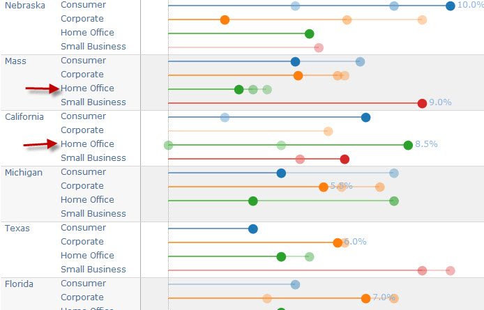
Is there a way to create lollipo chart such as the one shown below using SAS ?. What procedures should I use. I have SAS 9.3.
Accepted Solutions

- Mark as New
- Bookmark
- Subscribe
- Mute
- RSS Feed
- Permalink
- Report Inappropriate Content
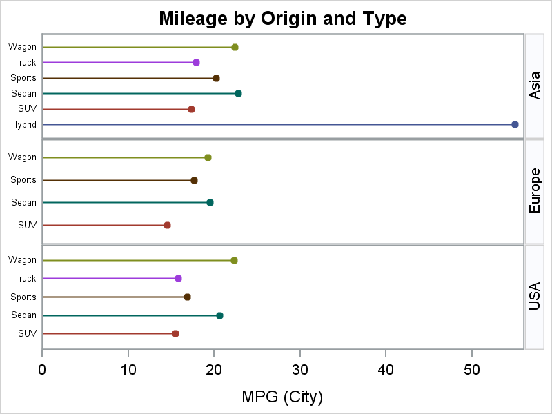
Use SAS 9.3 PROC SGPANEL: You have more options using SAS 9.4 or later.
proc means data=sashelp.cars;
class origin type;
vars mpg_city;
output out=cars(where=(_type_ =3))
mean=MeanMpg;
run;
data cars;
set cars;
zero=0;
run;
proc print;run;
ods graphics / reset width=4in height=3in imagename='CarsPanel';
title 'Mileage by Origin and Type';
proc sgpanel data=cars noautolegend;
panelby origin / layout=rowlattice novarname uniscale=column;
highlow y=type low=zero high=meanmpg / group=type;
scatter y=type x=meanmpg / group=type markerattrs=(symbol=circlefilled);
colaxis offsetmin=0;
rowaxis display=(nolabel noticks) valueattrs=(size=6);
run;

- Mark as New
- Bookmark
- Subscribe
- Mute
- RSS Feed
- Permalink
- Report Inappropriate Content
It will help if you can provide some data to experiment with.

- Mark as New
- Bookmark
- Subscribe
- Mute
- RSS Feed
- Permalink
- Report Inappropriate Content
Hi,
Not a complete answer, but you should look into this site: http://blogs.sas.com/content/graphicallyspeaking/
They have a lot of grahphs with sample code and somewhere there is an index of all the graphs - might be worth a look.
- Mark as New
- Bookmark
- Subscribe
- Mute
- RSS Feed
- Permalink
- Report Inappropriate Content
Use SAS 9.3 PROC SGPANEL: You have more options using SAS 9.4 or later.
proc means data=sashelp.cars;
class origin type;
vars mpg_city;
output out=cars(where=(_type_ =3))
mean=MeanMpg;
run;
data cars;
set cars;
zero=0;
run;
proc print;run;
ods graphics / reset width=4in height=3in imagename='CarsPanel';
title 'Mileage by Origin and Type';
proc sgpanel data=cars noautolegend;
panelby origin / layout=rowlattice novarname uniscale=column;
highlow y=type low=zero high=meanmpg / group=type;
scatter y=type x=meanmpg / group=type markerattrs=(symbol=circlefilled);
colaxis offsetmin=0;
rowaxis display=(nolabel noticks) valueattrs=(size=6);
run;
.jpg")
Catch up on SAS Innovate 2026
Nearly 200 sessions are now available on demand with the SAS Innovate Digital Pass.
Explore Now →Learn how use the CAT functions in SAS to join values from multiple variables into a single value.

Find more tutorials on the SAS Users YouTube channel.
SAS Training: Just a Click Away
Ready to level-up your skills? Choose your own adventure.
-
3 replies
-
03-19-2015 06:04 PM
-
4332 views
-
0 likes
-
4 in conversation
-
