- Home
- /
- Programming
- /
- Graphics
- /
- Integration of style element to GTL
- RSS Feed
- Mark Topic as New
- Mark Topic as Read
- Float this Topic for Current User
- Bookmark
- Subscribe
- Mute
- Printer Friendly Page
- Mark as New
- Bookmark
- Subscribe
- Mute
- RSS Feed
- Permalink
- Report Inappropriate Content
Looking at the ocean of GTL, I am perplexed. I wonder if there is a way STYLE template can be integrated to GTL component or they act independently to achieve similar thing?
Here is an example to manipualte graph walls ( define style vs GTL).
/* style */

proc template ;
 define style axis_wall;
 parent=styles.listing;
 style graphwalls from graphwalls /
   frameborder=on
   linestyle=1
   linethickness=2px
   backgroundcolor=GraphColors("gwalls")
   contrastcolor= orange;
 style graphaxislines from graphaxislines /
   linestyle=1
   linethickness=2px
   contrastcolor=blue;
 end;
run;

ods listing style=axis_wall ;

/* GTL */

layout overlay / walldisplay=(fill);
Accepted Solutions
- Mark as New
- Bookmark
- Subscribe
- Mute
- RSS Feed
- Permalink
- Report Inappropriate Content
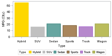
A simpler example is easier to understand. This works.
proc template;
define Style myStyle;
parent = styles.htmlBlue;
CLASS graphdata1 /
contrastColor=gold
color=gold;
CLASS graphdata2 /
contrastcolor=silver
color=silver;
end;
run;
ods html style=mystyle;
proc sgplot data=sashelp.cars;
vbar type / group=type response=mpg_city stat=mean;
run;
- Mark as New
- Bookmark
- Subscribe
- Mute
- RSS Feed
- Permalink
- Report Inappropriate Content
This paper (http://www.mwsug.org/proceedings/2013/HW/MWSUG-2013-HW05.pdf ) answers my question where style template has been created to override the default style. But when I make some changes in the style template, I can not see the effect in graph.
data heartSysDat;
	length BMI_MPDesc $12;
	length CHD_GrpDesc $6;
	length grpFreq $5;
	input BMI_MPDesc CHD_GrpDesc & GrpFreq YforN meanRvar_Sys lclm uclm;
	cards;
 Underweight No CHD     72  -5  124.42  119.00  129.83
 Underweight CHD         7  -5  122.86  91.10   154.62
 Normal      No CHD  1,905  -5  128.56  127.58  129.54
 Normal      CHD       551  -5  137.37  135.17  139.58
 Overweight  No CHD  1,357  -5  137.46  136.12  138.81
 Overweight  CHD       613  -5  144.71  142.55  146.86
 Obese       No CHD    419  -5  149.22  146.50  151.93
 Obese       CHD       275  -5  158.93  154.62  163.25
 run;
 /* STYLE TEMPLATE */
 proc template;
	define Style myStyle;
		parent = styles.default;
		CLASS GraphFonts
			"Fonts used in graph styles" /
			'GraphTitleFont' = (", ",12pt,bold)
			'GraphLabelFont' = (", ",11pt)
			'GraphValueFont' = (", ",11pt);
		CLASS graphBorderLines /
			linethickness = 0px;
		CLASS graphdata1 /
			contrastColor=black
			color=cx8CaEdF; /* No CHD -- LIGHT BLUE */
		CLASS graphdata2 /
		contrastcolor=black
		color=cx42659C; /* With CHD -- DARKER BLUE */
		CLASS graphAxisLines /
		contrastcolor=black;
		CLASS graphwalls /
			contrastcolor=black;
	end;
run;

ods listing style=myStyle image_dpi=300;

/* STATGRAPH TEMPLATE */
proc template;
	define statgraph myBChart;
		begingraph;
			entrytitle "CHD Status Related to Systolic Blood Pressure and BMI for SASHELP.Heart";
			entrytitle "Systolic BP Averages and Confidence Limits are Reported by BMI Category"
				/ textattrs=(size=11pt);
			layout overlay / xaxisopts=( label="Body Mass Index Category"
				labelAttrs=(weight=bold))
				yaxisopts=( label="Mean Systolic BP with 95CLM Half E-Bars"


				labelattrs=(weight=bold)
				offsetmin=0.02 offsetmax=0.1);

				/* FOR FILLED BARS IN THE BAR CHART */
				barchart X=BMI_MPDesc Y=MeanRvar_Sys / stat=sum BarLabel=FALSE
					group=CHD_GrpDesc name="barGroup"
					groupdisplay=cluster dataskin=pressed
					display=(fill)
					barwidth=0.9 fillattrs=(transparency=0.3);

				/* FOR BAR OUTLINES*/
				barchart X=BMI_MPDesc Y=MeanRvar_Sys / stat=sum BarLabel=FALSE
					group=CHD_GrpDesc
					groupdisplay=CLUSTER
					display=(OUTLINE)
					outlineattrs=(color=BLACK thickness=1PX)
					barwidth=0.9;
				discreteLegend "barGroup" / across=2 autoalign=(TOPLEFT) titleattrs=(size=10PT)
					valueattrs=(size=9PT)
					border=FALSE location=INSIDE
					title="Chronic Heart Disease Status:";

				/* OUTSIDE LABELS ARE MOVED INSIDE */
				scatterplot X=BMI_MPDesc Y=EVAL(MeanRvar_Sys - 6)/
					markercharacterattrs=(size=9PT color=BLACK)
					markercharacter=MeanRvar_Sys
					group=CHD_GrpDesc groupdisplay=CLUSTER
					clusterwidth=0.85;

				/* ERRORBAR: WHY IS SIZE=0? */
				scatterplot X=BMI_MPDesc Y=MeanRvar_Sys / markerattrs=(size=0)
					errorbarattrs=(thickness=1)
					yerrorlower=meanRvar_Sys yerrorupper=uclm
					group=CHD_GrpDesc groupdisplay=CLUSTER
					clusterwidth=0.85;

				/* *****
				DRAW THE LETTER 'N' WITH DRAWTEXT, AN ANNOTATE STATEMENT IN GTL.
				XSPACE IS SET TO WALLPERCENT IN DRAWTEXT, SINCE THE X-AXIS IS DISCRETE.
				THE X-COORD HERE IS 2% TO THE RIGHT OF THE WALL. (IT COULD BE 2.0791 - A REAL NUMBER).
				YSPACE IS SET TO DATAVALUE, BECAUSE THE Y AXIS IS LINEAR AND CAN SUPPORT FRACTIONS.
				***** */
				drawtext textattrs=(size=9pt style=ITALIC weight=BOLD) "n:" /
					width=5 widthunit=PERCENT
					xspace=WALLPERCENT yspace=DATAVALUE
					x=2 y=-4.5 justify=CENTER;

				/* ****
				PLOT ALL THE VALUES FOR 'N' WITH A SCATTERPLOT STATEMENT.
				TO GET COMMA FORMATTED OUTPUT FOR GRPFREQ, YOU MUST FORMAT AT THE DATA STEP LEVEL.
				(SEE PAPER). THE TRICK FOR THIS SCATTERPLOT CONCERNS THE Y PARAMETER WHERE Y=YFORN=-5.
				POINTS WITH VALUES EQUAL TO MINUS 5 BECOME VISIBLE BY EXTENDING OFFSET MIN FROM
				0 TO 0.02. IN OTHER WORDS, DATA CAN BE PLOTTED BY VALUE IN THE OFFSET REGION.
				***** */
				scatterplot y=YforN x=BMI_MPDesc /
					markercharacterattrs=(size=9PT color=BLACK)
					markercharacter=GRPFreq
					group=CHD_GrpDesc groupdisplay=CLUSTER
					clusterwidth=0.85;

				/* *****
				DRAWRECTANGLE PLACES AN OUTLINE AROUND THE COLOR SAMPLES IN THE LEGEND.
				WHY WOULD ANYONE DO THIS?
				THE ANCHOR=OPTION PLAYS AN IMPORTANT ROLE. WHAT IS IT? (SEE MANUAL)
				***** */
				drawrectangle x=40 y=94.25 width=5.6 height=3.5 /
					anchor=BOTTOMLEFT drawspace=WALLPERCENT
					display=(OUTLINE) outlineattrs=(color=BLACK thickness=1PX);
				drawrectangle x=57.5 y=94.25 width=5.6 height=3.5 /
					anchor=BOTTOMLEFT drawspace=WALLPERCENT
					display=(OUTLINE) outlineattrs=(color=BLACK thickness=1PX);
			endlayout;
		endgraph;
	end;
run;

proc sgrender data=work.heartSysDat template=myBchart;
 run;
quit;- Mark as New
- Bookmark
- Subscribe
- Mute
- RSS Feed
- Permalink
- Report Inappropriate Content
What specifically were you expecting to see change appearance in your myBarchart?
Have tried the HTML destination instead of Listing?
- Mark as New
- Bookmark
- Subscribe
- Mute
- RSS Feed
- Permalink
- Report Inappropriate Content
@ballardw I want to change the color graph. I will try it in html. Thanks !
- Mark as New
- Bookmark
- Subscribe
- Mute
- RSS Feed
- Permalink
- Report Inappropriate Content
A simpler example is easier to understand. This works.
proc template;
define Style myStyle;
parent = styles.htmlBlue;
CLASS graphdata1 /
contrastColor=gold
color=gold;
CLASS graphdata2 /
contrastcolor=silver
color=silver;
end;
run;
ods html style=mystyle;
proc sgplot data=sashelp.cars;
vbar type / group=type response=mpg_city stat=mean;
run;
Learn how use the CAT functions in SAS to join values from multiple variables into a single value.
Find more tutorials on the SAS Users YouTube channel.
SAS Training: Just a Click Away
Ready to level-up your skills? Choose your own adventure.


