- Home
- /
- Programming
- /
- Graphics
- /
- How to put two distribution curve together in Proc univariate
- RSS Feed
- Mark Topic as New
- Mark Topic as Read
- Float this Topic for Current User
- Bookmark
- Subscribe
- Mute
- Printer Friendly Page

- Mark as New
- Bookmark
- Subscribe
- Mute
- RSS Feed
- Permalink
- Report Inappropriate Content
I use proc univaraiate to draw the distribution curve and histogram of two different groups of data by the following code:
Proc univariate data=data noprint;
histogram money /cfill=ligr normal cframe=liy barwidth=8 cv=black;
BY location;
RUN;
I would like to know how to put curves generated in the by statement together in one graph.
Accepted Solutions

- Mark as New
- Bookmark
- Subscribe
- Mute
- RSS Feed
- Permalink
- Report Inappropriate Content
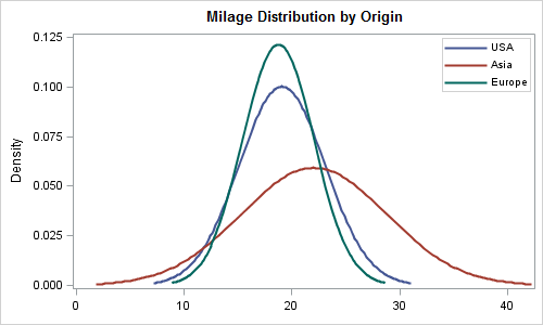
This solution uses PROC SGPLOT's DENSITY statements. Transform the data into multiple columns (one per class) and then use multiple density plots. I just used a data step with SASHELP.CARS to do that, but you can likely use proc transpose.
/*--Sort the data--*/
proc sort data=sashelp.cars out=cars;
by origin;
run;
/*--Separate the class data into multiple columns--*/
data cars1 cars2 cars3;
set cars (keep=mpg_city origin);
if origin='USA' then do; mpg_usa=mpg_city; output cars1; end;
if origin='Asia' then do; mpg_asia=mpg_city; output cars2; end;
if origin='Europe' then do; mpg_eur=mpg_city; output cars3; end;
run;
/*--Merge data into one data set--*/
data MpgByOrigin;
merge cars1(keep=mpg_usa) cars2(keep=mpg_asia) cars3(keep=mpg_eur);
run;
/*--Create graph using SGPLOT--*/
title 'Milage Distribution by Origin';
proc sgplot data=mpgbyorigin;
density mpg_usa / legendlabel='USA' lineattrs=(pattern=solid);
density mpg_asia / legendlabel='Asia' lineattrs=(pattern=solid);
density mpg_eur / legendlabel='Europe' lineattrs=(pattern=solid);
keylegend / location=inside position=topright across=1;
xaxis display=(nolabel);
run;

- Mark as New
- Bookmark
- Subscribe
- Mute
- RSS Feed
- Permalink
- Report Inappropriate Content
You can get a COMPARATIVE panel of histograms by using the CLASS stmt instead of the BY stmt: CLASS location;
If this isn't sufficient, then I ask whether you just want the normal curves by themselves (in a single plot), or whether you want the densities fpor each group overlaid on a histogram. If on a histogram, then are you asking for the histogram of ALL the data, across all groups?
- Mark as New
- Bookmark
- Subscribe
- Mute
- RSS Feed
- Permalink
- Report Inappropriate Content
Actually, I just want the normal curves, how can I put into one graph to do the comparison
- Mark as New
- Bookmark
- Subscribe
- Mute
- RSS Feed
- Permalink
- Report Inappropriate Content
You can do this using SGPLOT procedure. If this is what you need, I can attach the code.
- Mark as New
- Bookmark
- Subscribe
- Mute
- RSS Feed
- Permalink
- Report Inappropriate Content
yup
how to draw it?
- Mark as New
- Bookmark
- Subscribe
- Mute
- RSS Feed
- Permalink
- Report Inappropriate Content
This solution uses PROC SGPLOT's DENSITY statements. Transform the data into multiple columns (one per class) and then use multiple density plots. I just used a data step with SASHELP.CARS to do that, but you can likely use proc transpose.
/*--Sort the data--*/
proc sort data=sashelp.cars out=cars;
by origin;
run;
/*--Separate the class data into multiple columns--*/
data cars1 cars2 cars3;
set cars (keep=mpg_city origin);
if origin='USA' then do; mpg_usa=mpg_city; output cars1; end;
if origin='Asia' then do; mpg_asia=mpg_city; output cars2; end;
if origin='Europe' then do; mpg_eur=mpg_city; output cars3; end;
run;
/*--Merge data into one data set--*/
data MpgByOrigin;
merge cars1(keep=mpg_usa) cars2(keep=mpg_asia) cars3(keep=mpg_eur);
run;
/*--Create graph using SGPLOT--*/
title 'Milage Distribution by Origin';
proc sgplot data=mpgbyorigin;
density mpg_usa / legendlabel='USA' lineattrs=(pattern=solid);
density mpg_asia / legendlabel='Asia' lineattrs=(pattern=solid);
density mpg_eur / legendlabel='Europe' lineattrs=(pattern=solid);
keylegend / location=inside position=topright across=1;
xaxis display=(nolabel);
run;
- Mark as New
- Bookmark
- Subscribe
- Mute
- RSS Feed
- Permalink
- Report Inappropriate Content
One way is to transpose the data so that each category become a variable, and then use the SGPLOT DENSITY stmt.
To transpose the data, see http://blogs.sas.com/content/iml/2011/11/04/reshape-data-so-that-each-category-becomes-a-new-variabl...
Here's an example:
data combo;
keep Females Males;
merge sashelp.class(where=(sex="F") rename=(height=Females))
sashelp.class(where=(sex="M") rename=(height=Males));
run;
proc sgplot data=combo;
density Females / legendlabel="Female";
density Males / legendlabel="Male";
xaxis label="Height";
run;
.jpg")
Catch up on SAS Innovate 2026
Nearly 200 sessions are now available on demand with the SAS Innovate Digital Pass.
Explore Now →Learn how use the CAT functions in SAS to join values from multiple variables into a single value.

Find more tutorials on the SAS Users YouTube channel.
SAS Training: Just a Click Away
Ready to level-up your skills? Choose your own adventure.
-
6 replies
-
02-02-2012 09:08 AM
-
5058 views
-
6 likes
-
3 in conversation
-
