- Home
- /
- Programming
- /
- Graphics
- /
- How do I use the axis table statement to add n's to bar chart?
- RSS Feed
- Mark Topic as New
- Mark Topic as Read
- Float this Topic for Current User
- Bookmark
- Subscribe
- Mute
- Printer Friendly Page
- Mark as New
- Bookmark
- Subscribe
- Mute
- RSS Feed
- Permalink
- Report Inappropriate Content
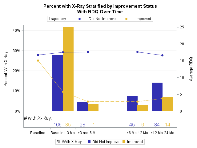
Hi, I am using proc template in SAS 9.4 to create a bar chart with a line overlaid. The graph has percentages on the left y-axis and I would like to write the n’s (the variable COUNT, from which the percentages are derived) near the bars of the graph.
My data look like this:
|
Better_or_Not |
COUNT |
Percent_Xray |
Month |
RDQ |
|
0 |
. |
. |
0 |
17 |
|
0 |
166 |
28 |
3 |
18 |
|
0 |
28 |
5 |
6 |
18 |
|
0 |
. |
. |
9 |
. |
|
0 |
45 |
8 |
12 |
18 |
|
0 |
. |
. |
15 |
. |
|
0 |
. |
. |
18 |
. |
|
0 |
. |
. |
21 |
. |
|
0 |
84 |
14 |
24 |
17 |
|
1 |
. |
. |
0 |
15 |
|
1 |
85 |
42 |
3 |
6 |
|
1 |
7 |
3 |
6 |
3 |
|
1 |
. |
. |
9 |
. |
|
1 |
6 |
3 |
12 |
3 |
|
1 |
. |
. |
15 |
. |
|
1 |
. |
. |
18 |
. |
|
1 |
. |
. |
21 |
. |
|
1 |
14 |
7 |
24 |
4 |
And here is the code I used:
proc template;
define statgraph dashboard.trend;

begingraph/attrpriority=none datacolors=(bib bioy) datacontrastcolors=(bib bioy) datalinepatterns=(1 9);

 entrytitle 'Figure 2A. Percent with X-Ray Stratified by Improvement Status';

 layout overlay /cycleattrs=true

yaxisopts=(griddisplay=on label='Percent With X-Ray' linearopts=(viewmin=0))

y2axisopts=(label='Average RDQ'  labelfitpolicy=split linearopts=(viewmin=0 viewmax=24))

xaxisopts =(label='Interview' labelposition=right display=(ticks tickvalues line)discreteopts=(TICKTYPE=INBETWEEN))

x2axisopts=(display=none);

barchart x=Month y=percent_Xray/group=BETTER_OR_NOT groupdisplay=cluster name='bar1' xaxis=x PRIMARY=TRUE yaxis=y;

seriesplot x=Month y=RDQ/ group=BETTER_OR_NOT display=(markers) MARKERATTRS=(symbol=circlefilled) yaxis=y2 name='line'  ;

innermargin/align=bottom ;

axistable x=Month value=Count/classdisplay=cluster
class=BETTER_OR_NOT Title='# with X-Ray:' titleATTRS=(size=12)
titlehalign=auto display=(values) colorgroup=BETTER_OR_NOT
valueattrs=(size=12) showmissing=false ;
 endinnermargin;

discretelegend 'bar1'   /title='% With X-Ray' location=outside valign=bottom halign=center;
discretelegend  'line'  /title=’Trajectory' location=outside valign=top halign=center;

    endlayout;
	 entrytitle "With RDQ Over Time" ;
  endgraph;
  end;
run;


 proc sgrender data=xrayfreqsandmeans template=dashboard.trend ;
 format Month Monthf.;
 format BETTER_OR_NOT BETTER_OR_NOTf.;
 run;
And here is the graph that results.
It’s very close to what I want, but does anyone know if there’s a way to move the numbers below the bars (166, 85, 28, 7, etc) up so they are directly under the bars? Or at least move the axis table title (“# with X-Ray) down so it lines up with those numbers? Thanks so much in advance.
Accepted Solutions
- Mark as New
- Bookmark
- Subscribe
- Mute
- RSS Feed
- Permalink
- Report Inappropriate Content
I see. YOu got that behavior because the axis table is in the inner margin. But, there is still a way 🙂
Use the DRAWTEXT statement:
drawtext "# with X-RAY" / drawspace=wallpercent anchor=bottomleft x=0 y=0;
You can tweak the X and Y values slightly to get it just where you want it. Give that a try and see if it works for you.
- Mark as New
- Bookmark
- Subscribe
- Mute
- RSS Feed
- Permalink
- Report Inappropriate Content
Use LABEL instead of TITLE on the AXISTABLE, and the label should line up with your values.
- Mark as New
- Bookmark
- Subscribe
- Mute
- RSS Feed
- Permalink
- Report Inappropriate Content
I think using "Label="string" doesn't work because I need to have a class statement. When I tried it just now, I lost the "# with X-Ray" altogether. Thanks for the idea though!
- Mark as New
- Bookmark
- Subscribe
- Mute
- RSS Feed
- Permalink
- Report Inappropriate Content
Ah, that's right. Well, another alternative would be to turn off the AXISTABLE title and use an ENTRY statement to position the title at the bottom-left of the LAYOUT OVERLAY (halign=left valign=bottom), Give that a try, and see if that works for you.
- Mark as New
- Bookmark
- Subscribe
- Mute
- RSS Feed
- Permalink
- Report Inappropriate Content
Thanks Dan! It's so close but still not quite. I tried using Entryfootnote too but that just put the text all the way on the bottom left even below the legend. I used this code, right after my barchart statement but before my innermargin code:
entry halign=left "# with X-Ray"/valign=bottom ;
!
- Mark as New
- Bookmark
- Subscribe
- Mute
- RSS Feed
- Permalink
- Report Inappropriate Content
I see. YOu got that behavior because the axis table is in the inner margin. But, there is still a way 🙂
Use the DRAWTEXT statement:
drawtext "# with X-RAY" / drawspace=wallpercent anchor=bottomleft x=0 y=0;
You can tweak the X and Y values slightly to get it just where you want it. Give that a try and see if it works for you.
- Mark as New
- Bookmark
- Subscribe
- Mute
- RSS Feed
- Permalink
- Report Inappropriate Content
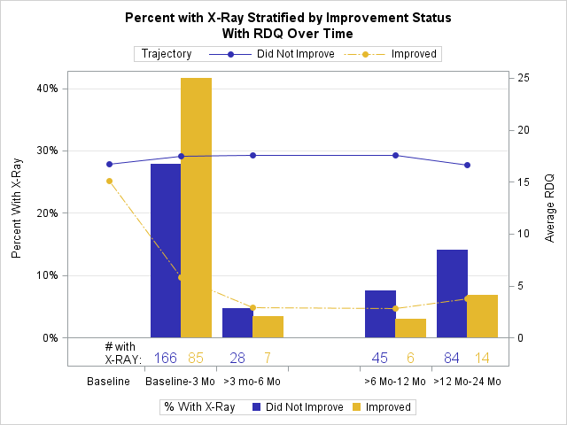
Success!! I so appreciate it, thank you! I wound up with x=8 and y=-1 to get the text where it is in this graph. Thank you again!
Learn how use the CAT functions in SAS to join values from multiple variables into a single value.
Find more tutorials on the SAS Users YouTube channel.
SAS Training: Just a Click Away
Ready to level-up your skills? Choose your own adventure.


