- Home
- /
- Programming
- /
- Graphics
- /
- How Can I Specify Line Colors per Group in SG Plot?
- RSS Feed
- Mark Topic as New
- Mark Topic as Read
- Float this Topic for Current User
- Bookmark
- Subscribe
- Mute
- Printer Friendly Page
- Mark as New
- Bookmark
- Subscribe
- Mute
- RSS Feed
- Permalink
- Report Inappropriate Content
Hi, there:
Submitting the following code, I got this result.
data test;
    input usubjid$ trta$ avisit$ aval;
    datalines;
    xx-01 A Day1 10
    xx-01 A Day5 11
    xx-02 A Day1  9
    xx-02 A Day5 10
    xx-03 B Day1 20
    xx-03 B Day5 17
    xx-04 B Day1 19
    xx-04 B Day5 21
    ;
run;
proc sgplot data=test;
    series x=avisit y=aval / group=usubjid;
run;
This result is displayed with different colors per subject (ex. Red for Subject XX-02),
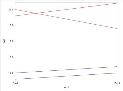
but I want to specify colors per Variable TRTA (ex. if TRTA eq "A" then Red, in other words, Subject XX-01 & XX-02 are displayed with Red Line).
I surfed the net, but haven't found how to do it.
Please help me. Thank you in advance.
Accepted Solutions
- Mark as New
- Bookmark
- Subscribe
- Mute
- RSS Feed
- Permalink
- Report Inappropriate Content
Hi @KentaMURANAKA,
You could use line colors to distinguish between treatment groups and line patterns to distinguish between patients within a treatment group. (Limitation: You may run out of line patterns if you have too many patients per group.)
Example using your dataset TEST:
data myattrmap;
set test(keep=usubjid trta);
by trta usubjid;
if first.usubjid;
if first.trta then linepattern=1;
else linepattern+1;
if trta='A' then linecolor='Blue';
else if trta='B' then linecolor='Red';
id='myid';
rename usubjid=value;
run;

proc sgplot data=test dattrmap=myattrmap;
    series x=avisit y=aval / group=usubjid attrid=myid;
run;
Result (maybe an additional legend regarding the groups should be inserted):
- Mark as New
- Bookmark
- Subscribe
- Mute
- RSS Feed
- Permalink
- Report Inappropriate Content
It doesn't make sense. If you have 10 subjects, 5 of which are in trta and 5 in trtb, and you color all the lines in red, then the legend will not help any reviewer as you will not be able to tell which subject is which as they will always be the same color. So you either make the choice of displaying the data based on subject, or on treatment. In my experience these tyeps of graphs are generally displayed by treatment, with all the lines in the treatment the same color, so you can see treatment effect difference. So you would change
group=usubjid;
to
group=trt;
Alternatively if you need to see each usubjid, then you would keep the output as you have it.
- Mark as New
- Bookmark
- Subscribe
- Mute
- RSS Feed
- Permalink
- Report Inappropriate Content
RW9:
Thank you for your response.
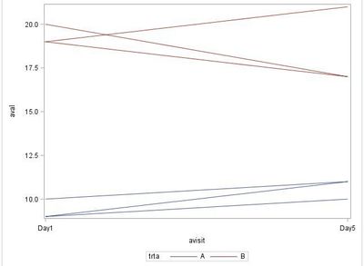
I changed GROUP=USUBJID to GROUP=TRTA, and I got the following result.
It has the lines I don't want. Do you know how to delete them?
- Mark as New
- Bookmark
- Subscribe
- Mute
- RSS Feed
- Permalink
- Report Inappropriate Content
It depends on what you want out. You could for instance take a mean of the two groups and plot the mean, hence one line per treatment group.
You can find examples and code for any graph here:
- Mark as New
- Bookmark
- Subscribe
- Mute
- RSS Feed
- Permalink
- Report Inappropriate Content
Hi @KentaMURANAKA,
You could use line colors to distinguish between treatment groups and line patterns to distinguish between patients within a treatment group. (Limitation: You may run out of line patterns if you have too many patients per group.)
Example using your dataset TEST:
data myattrmap;
set test(keep=usubjid trta);
by trta usubjid;
if first.usubjid;
if first.trta then linepattern=1;
else linepattern+1;
if trta='A' then linecolor='Blue';
else if trta='B' then linecolor='Red';
id='myid';
rename usubjid=value;
run;

proc sgplot data=test dattrmap=myattrmap;
    series x=avisit y=aval / group=usubjid attrid=myid;
run;
Result (maybe an additional legend regarding the groups should be inserted):
- Mark as New
- Bookmark
- Subscribe
- Mute
- RSS Feed
- Permalink
- Report Inappropriate Content
Hi, FreelanceReinhard:
Thank you for your reply.
Thanks to your advice, I accomplished my objective.
data test;
    input usubjid$ trta$ avisit$ aval;
    datalines;
    xx-01 A Day1 10
    xx-01 A Day5 11
    xx-02 A Day1  9
    xx-02 A Day5 10
    xx-03 B Day1 20
    xx-03 B Day5 17
    xx-04 B Day1 19
    xx-04 B Day5 21
    ;
run;
data myattrmap;
set test(keep=usubjid trta);
by trta usubjid;
if first.usubjid;
linepattern=1;
if trta='A' then linecolor='Blue';
else if trta='B' then linecolor='Red';
id='myid';
rename usubjid=value;
run;
proc sgplot data=test dattrmap=myattrmap noautolegend;
    series x=avisit y=aval / group=usubjid attrid=myid;
run;
Thanks a lot, All!!
Learn how use the CAT functions in SAS to join values from multiple variables into a single value.
Find more tutorials on the SAS Users YouTube channel.
SAS Training: Just a Click Away
Ready to level-up your skills? Choose your own adventure.


