- Home
- /
- Programming
- /
- Graphics
- /
- HBAR with min value greater than zero
- RSS Feed
- Mark Topic as New
- Mark Topic as Read
- Float this Topic for Current User
- Bookmark
- Subscribe
- Mute
- Printer Friendly Page
- Mark as New
- Bookmark
- Subscribe
- Mute
- RSS Feed
- Permalink
- Report Inappropriate Content
I need to create a plot that uses a bar to represent a range. I am trying to do this using the HBAR statement in sgplot.
For example, I need the maximum value of the bar to be 5.1 and the minimum value of the bar to be 4.45.
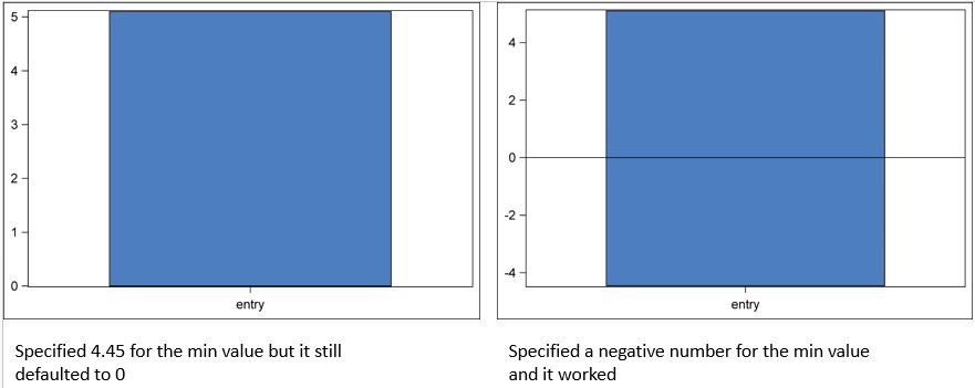
When I generate the plot using these specs, the maximum value is 5.1, but the minimum value is 0.
If I specify a negative number for the minimum, then it works and the minimum value of the bar is the minimum value that I specified.
Is there an option that I need to specify that will allow me to craeate a bar with a minmum value greater than zero?
Code below and example output attached.
Thank you.
data quant;
analyte = 'entry';
pct_5 = 4.45;
pct_95 = 5.1;
run; quit;
ODS LISTING STYLE=ceafigstyle GPATH = 'C:\ILSI.Publication' IMAGE_DPI=500;
ods graphics / reset width=600px height=400px imagefmt=png;
proc sgplot data=quant noautolegend;
vbar analyte / response=pct_5
fillattrs= (color = bigb) transparency=0
legendlabel="lit_min" name="lit_min" ;
vbar analyte / response=pct_95
fillattrs= (color = bigb) transparency=0
legendlabel="lit_max" name="lit_max" ;
xaxis display=(nolabel);
yaxis display=(nolabel) discreteorder=data;
run;

Accepted Solutions
- Mark as New
- Bookmark
- Subscribe
- Mute
- RSS Feed
- Permalink
- Report Inappropriate Content
Use HIGHLOW plot statement with TYPE=BAR.
You can make is horizontal or vertical by using Y= or X= role with the LOW and HIGH roles.
- Mark as New
- Bookmark
- Subscribe
- Mute
- RSS Feed
- Permalink
- Report Inappropriate Content
Use HIGHLOW plot statement with TYPE=BAR.
You can make is horizontal or vertical by using Y= or X= role with the LOW and HIGH roles.
- Mark as New
- Bookmark
- Subscribe
- Mute
- RSS Feed
- Permalink
- Report Inappropriate Content
Perfect; thank you Sanjay!
- Mark as New
- Bookmark
- Subscribe
- Mute
- RSS Feed
- Permalink
- Report Inappropriate Content
Note: HIGHLOW bar does not summarize the response values for the same category (or gategory+group). If multiple observations are found with same category (or gategory+group), each observation is drawn independently.
Catch up on SAS Innovate 2026
Dive into keynotes, announcements and breakthroughs on demand.
Explore Now →Learn how use the CAT functions in SAS to join values from multiple variables into a single value.
Find more tutorials on the SAS Users YouTube channel.
SAS Training: Just a Click Away
Ready to level-up your skills? Choose your own adventure.


