- Home
- /
- Programming
- /
- Graphics
- /
- Re: GPLOT Plotting only vaues in the dataset
- RSS Feed
- Mark Topic as New
- Mark Topic as Read
- Float this Topic for Current User
- Bookmark
- Subscribe
- Mute
- Printer Friendly Page
- Mark as New
- Bookmark
- Subscribe
- Mute
- RSS Feed
- Permalink
- Report Inappropriate Content
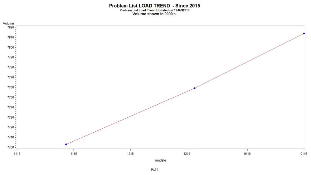
I have 3 numbers representing volume captured on these dates :
volume: 7703, 7759, 7814
rundate : 1115, 1215, 0116
Volume is the Xaxis and Date is the Yaxis.
I have the following GPLOT statements:
goptions reset=symbol;
SYMBOL1 CV=BLUE VALUE=DOT H=1
I=JOIN CI=RED LINE=1 W=1;
*Write the plot;
proc gplot data= WORK.QC_TREND_WORKING;
plot volume * rundate ;
run;
quit;
When I run this I get the attached graph.
How do I get the dates/plots from spacing so far apart ?
Thanks
Cappertan

- Mark as New
- Bookmark
- Subscribe
- Mute
- RSS Feed
- Permalink
- Report Inappropriate Content
That is the default spacing. You haven't provied any options, so it uses the default.
http://support.sas.com/documentation/cdl/en/graphref/63022/HTML/default/viewer.htm#goptionschap.htm
You can change a lot of the options with the above. I would suggest though that you move to sgplot or Graph Template Language. Its far more robust and flexible, here you can find many examples:
- Mark as New
- Bookmark
- Subscribe
- Mute
- RSS Feed
- Permalink
- Report Inappropriate Content
If the issue is spacing between your 'dates', it might help to actually use date values and date formats.
GPLOT will fill the amount of space set to create graphs. If your data is sparse and you do not want the graph to be so wide then use goptons to either change the HSIZE or HPIXELS values. Or specify a LENGTH for your Xaxis using an AXIS statement and associating the HAXIS gplot option with that defined axis.
Learn how use the CAT functions in SAS to join values from multiple variables into a single value.
Find more tutorials on the SAS Users YouTube channel.
SAS Training: Just a Click Away
Ready to level-up your skills? Choose your own adventure.


