- Home
- /
- Programming
- /
- Graphics
- /
- Assign Specific Colors to Scatterplot in PROC SGPLOT
- RSS Feed
- Mark Topic as New
- Mark Topic as Read
- Float this Topic for Current User
- Bookmark
- Subscribe
- Mute
- Printer Friendly Page
- Mark as New
- Bookmark
- Subscribe
- Mute
- RSS Feed
- Permalink
- Report Inappropriate Content
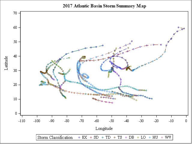
I have written a macro that takes storm data from a particular year and then plots points of latitude and longitude for the storms colored by what type they were (status variable). Many years do not have every type of storm, so when I change the year in the macro, the legend and scatter plot colors are almost always different.
Ideally, I would like to be able to assign a color to each level of the "status" variable and have it be consistent from year to year (for example, I want to keep that bright blue for all graphs that have "HU").
Below is my code and a picture of the plot for the year 2017. I'm using a version of SAS 9.4 available through my university (it is limited and missing several libraries).
%macro hurricaneMap(year=2017);
proc sgplot data=weather3;
	series x=long y=lat / group=cyclone_num lineattrs=(pattern=Solid color=grey);
	scatter x=long y=lat / group=status markerattrs=(size=6 symbol=Circle);
	keylegend / title="Storm Classification" exclude=("01" "02" "03" "04"
	"05" "06" "07" "08" "09" "10" "11" "12" "13" "14" "15" "16" "17" "18" "19"
        "20" "21" "22" "23" "24" "25" "26" "27" "28" "29" "30" "31");
	xaxis label="Longitude" values=(-110 to 0 by 10);
	yaxis label="Latitude" values=(0 to 70 by 10);
	title "&year. Atlantic Basin Storm Summary Map";
	where year=&year.;
run;

%mend;

%hurricaneMap(year=2017);
Accepted Solutions
- Mark as New
- Bookmark
- Subscribe
- Mute
- RSS Feed
- Permalink
- Report Inappropriate Content
You need a data attribute map, essentially, you create a data set with the status and colours you'd like them and provide that to SGPLOT.
Examples and specifications are here:
@sagendtj wrote:
I have written a macro that takes storm data from a particular year and then plots points of latitude and longitude for the storms colored by what type they were (status variable). Many years do not have every type of storm, so when I change the year in the macro, the legend and scatter plot colors are almost always different.
Ideally, I would like to be able to assign a color to each level of the "status" variable and have it be consistent from year to year (for example, I want to keep that bright blue for all graphs that have "HU").
Below is my code and a picture of the plot for the year 2017. I'm using a version of SAS 9.4 available through my university (it is limited and missing several libraries).
%macro hurricaneMap(year=2017);
proc sgplot data=weather3;
	series x=long y=lat / group=cyclone_num lineattrs=(pattern=Solid color=grey);
	scatter x=long y=lat / group=status markerattrs=(size=6 symbol=Circle);
	keylegend / title="Storm Classification" exclude=("01" "02" "03" "04"
	"05" "06" "07" "08" "09" "10" "11" "12" "13" "14" "15" "16" "17" "18" "19"
        "20" "21" "22" "23" "24" "25" "26" "27" "28" "29" "30" "31");
	xaxis label="Longitude" values=(-110 to 0 by 10);
	yaxis label="Latitude" values=(0 to 70 by 10);
	title "&year. Atlantic Basin Storm Summary Map";
	where year=&year.;
run;

%mend;

%hurricaneMap(year=2017);
- Mark as New
- Bookmark
- Subscribe
- Mute
- RSS Feed
- Permalink
- Report Inappropriate Content
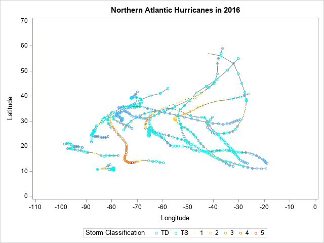
Here's one way to do it, using an attribute map, a user-defined format, and also adding 'fake' data to guarantee it always has all the categories in the legend (even if there aren't any hurricanes of that category that year) ...
libname storms "D:\public\noaa";
data fake;
input wind_mph;
datalines;
30
40
75
100
115
135
160
;
run;
%macro hurricaneplot(year);
proc format;
value cat
low - < 38 = 'TD'
38 - < 73 = 'TS'
73 - < 95 = '1'
95 - < 110 = '2'
110 - < 129 = '3'
129 - < 156 = '4'
156 - high = '5'
;
run;
data myattrs;
id="some_id";
value='TD'; markercolor="cx52b1ff"; output;
value='TS'; markercolor="cx00f8f1"; output;
value='1'; markercolor="cxffffc6"; output;
value='2'; markercolor="cxffe369"; output;
value='3'; markercolor="cxffb935"; output;
value='4'; markercolor="cxff8318"; output;
value='5'; markercolor="cxff290a"; output;
run;
data temp; set fake storms.noaa_allstorms (where=(basin='NA' and year=&year));
run;
title1 "Northern Atlantic Hurricanes in &year";
proc sgplot data=temp dattrmap=myattrs noautolegend;
format wind_mph cat.;
series x=long y=lat / group=unique_id break lineattrs=(color=grey);
scatter x=long y=lat / group=wind_mph attrid=some_id
markerattrs=(size=6 symbol=Circle) name='markers';
keylegend 'markers' / title="Storm Classification";
xaxis label="Longitude" values=(-110 to 0 by 10);
yaxis label="Latitude" values=(0 to 70 by 10);
run;
%mend;
%hurricaneplot(2016);
- Mark as New
- Bookmark
- Subscribe
- Mute
- RSS Feed
- Permalink
- Report Inappropriate Content
If you have a situation like @GraphGuy , where you want a consistent legend of your attrmap, even when data is not present, you can set SHOW=ATTRMAP in your attrmap dataset. This will override the legend normally generated from the plot content, and you will not have to create any "placeholder" data.
Hope this helps!
Dan
Catch up on SAS Innovate 2026
Dive into keynotes, announcements and breakthroughs on demand.
Explore Now →Learn how use the CAT functions in SAS to join values from multiple variables into a single value.
Find more tutorials on the SAS Users YouTube channel.
SAS Training: Just a Click Away
Ready to level-up your skills? Choose your own adventure.


