- Home
- /
- Programming
- /
- Graphics
- /
- Adding significance star on VBAR in SGPLOT
- RSS Feed
- Mark Topic as New
- Mark Topic as Read
- Float this Topic for Current User
- Bookmark
- Subscribe
- Mute
- Printer Friendly Page
- Mark as New
- Bookmark
- Subscribe
- Mute
- RSS Feed
- Permalink
- Report Inappropriate Content
Hello,
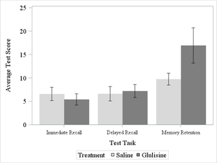
I'm attempting to avoid my instinct to switch to R when doing something graphical. Is there a way to add a significance star, p-value and/or connector above my clustered vertical bars to show a statistical difference between groups?
Current code:
proc sgplot data=cog_long;
	where test = "Rivermead";
	styleattrs datacolors=(%RGB(217,217,217) %RGB(127,127,127));
	vbar testnum / response=score stat=mean limitstat=stderr
		limitattrs=(color=black) group=trt groupdisplay=cluster
		nooutline;
	xaxis valueattrs=(size=12pt family="Times New Roman")
		labelattrs  =(size=14pt family="Times New Roman");
	yaxis min=0 max=25 valueattrs=(size=14pt family="Times New Roman")
		labelattrs=(size=14pt family="Times New Roman");
	keylegend / titleattrs=(size=14pt family="Times New Roman")
		valueattrs=(size=14pt family="Times New Roman");
	title;
run;
Current graph:

The desired graph would have connecting line with ** above the Memory Retention tests similar to this graph produced in R:

- Mark as New
- Bookmark
- Subscribe
- Mute
- RSS Feed
- Permalink
- Report Inappropriate Content
You could use
BARPARM statement + SCATTER statement (plot a big Star symbol)
Catch up on SAS Innovate 2026
Dive into keynotes, announcements and breakthroughs on demand.
Explore Now →Learn how use the CAT functions in SAS to join values from multiple variables into a single value.
Find more tutorials on the SAS Users YouTube channel.
SAS Training: Just a Click Away
Ready to level-up your skills? Choose your own adventure.


