- Home
- /
- Programming
- /
- Graphics
- /
- A simple histogram - how hard can it be?
- RSS Feed
- Mark Topic as New
- Mark Topic as Read
- Float this Topic for Current User
- Bookmark
- Subscribe
- Mute
- Printer Friendly Page
- Mark as New
- Bookmark
- Subscribe
- Mute
- RSS Feed
- Permalink
- Report Inappropriate Content
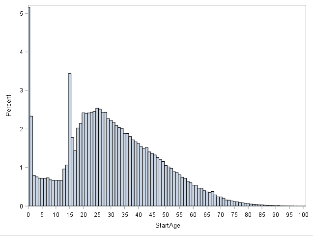
I have been tearing my hair out with frustration for the last hour. I just want a histogram for my age distribution, in bins of 1 bar per age category (age in years, no decimals in the data), showing values 0, 5, 10 etc in the x-axis.
I am working from Enterprise Guide.
I cannot believe how many different procs there are to make histograms, each with different syntax. There is the
proc univairate data=mydate;
histogram age;
run;
or
proc gchart data=mydata;
vbar age /discrete;
run;
or
PROC SGPLOT DATA = mydata;
 HISTOGRAM age/binwidth=1 binstart=0;
 TITLE "Age";
 xaxis values=(0 to 100 by 1);
RUN;
etc.
The closest I have come is with the SGPLOT, but the first bar is halvway hidden behind the Y axis. Does anyone know how to make the first bar visible?
Also, which command would you use to generate a simple histogram like this? Is there something like a best practice? Are some of these older procs getting faded out?
Accepted Solutions
- Mark as New
- Bookmark
- Subscribe
- Mute
- RSS Feed
- Permalink
- Report Inappropriate Content
You're correct that there are many ways to create a histogram -- you touched only on a few of them!
I think the simplest method is the one you tried last: PROC SGPLOT. Since you have 100 bins and the graph is only so wide, the algorithm to make everything fit might make your left-most extreme value seem very tight against the axis. You can use the OFFSETMIN= option to give a little more space. Try this:
data sample (keep=age);
 do i = 1 to 100000;
   age = abs ( floor ( rand('triangle',0.1) * 100 ) );
   output;
 end;
run;

ods graphics / width=1000px height=400px;
proc sgplot data=sample;
 HISTOGRAM age / binwidth=1 binstart=0 ;
 TITLE "Age";
 xaxis values=(0 to 100 by 1) offsetmin=.01 offsetmax=.01 ;
RUN; - Mark as New
- Bookmark
- Subscribe
- Mute
- RSS Feed
- Permalink
- Report Inappropriate Content
Thank you! Don't think I would have found that sollution on my own.
Is there a simple way to split this chart by say gender? So that I get a stacked histogram?
- Mark as New
- Bookmark
- Subscribe
- Mute
- RSS Feed
- Permalink
- Report Inappropriate Content
Of course! Again, multple methods, but now it sounds like you're more interested in a VBAR with a grouping variable than a classic histogram of statistical distribution.
You could try PROC SGPANEL with a HISTOGRAM statement and PANELBY for gender (that would yield two histograms). Or you could use PROC FREQ to calc the percentages into a data set, then use a step like:
proc sgplot data=freq_output;
 vbar age / response=percent group=gender grouporder=data;
run;
- Mark as New
- Bookmark
- Subscribe
- Mute
- RSS Feed
- Permalink
- Report Inappropriate Content
Building on Chris' example, here are three variations you do with your grouping variable
proc format;
value gender 1="Male"
             2="Female"
;
run;

data sample (keep=age g);
 do g = 1 to 2;
 do i = 1 to 100000;
   age = abs ( floor ( rand('triangle',0.1) * 100 ) );
   output;
 end;
 end;
run;

ods graphics / width=1000px height=400px;
proc sgplot data=sample;
format g gender.;
 by g;
 HISTOGRAM age / binwidth=1 binstart=0 ;
 TITLE "Age";
 xaxis values=(0 to 100 by 1) offsetmin=.01 offsetmax=.01 ;
RUN;

proc sgplot data=sample;
format g gender.;
 HISTOGRAM age / binwidth=1 binstart=0 group=g transparency=0.5;
 TITLE "Age";
 xaxis values=(0 to 100 by 1) offsetmin=.01 offsetmax=.01 ;
RUN;

proc sgpanel data=sample;
format g gender.;
 panelby g / layout=rowlattice novarname;
 HISTOGRAM age / binwidth=1 binstart=0 ;
 TITLE "Age";
 colaxis values=(0 to 100 by 1) offsetmin=.01 offsetmax=.01 ;
RUN;
Learn how use the CAT functions in SAS to join values from multiple variables into a single value.
Find more tutorials on the SAS Users YouTube channel.
SAS Training: Just a Click Away
Ready to level-up your skills? Choose your own adventure.


