- Home
- /
- SAS Viya
- /
- Visual Analytics
- /
- 100% Stacked Bar Charts
- RSS Feed
- Mark Topic as New
- Mark Topic as Read
- Float this Topic for Current User
- Bookmark
- Subscribe
- Mute
- Printer Friendly Page

- Mark as New
- Bookmark
- Subscribe
- Mute
- RSS Feed
- Permalink
- Report Inappropriate Content
Hi Justin,
Do you know what release the 100% stacked bar chart will be in?
Also I was wondering whether having this aggregation would also provide a 100% within a category group for a cross tab so that rather than a percent of total measure all adding up to 100% in a crosstab it will be 100% within each column for instance. (I think I had raised a tech support feature request for this in the past.)
Thanks,
Michelle

- Mark as New
- Bookmark
- Subscribe
- Mute
- RSS Feed
- Permalink
- Report Inappropriate Content
Stacked bar charts can be done in VA, even with 6.2. (Without custom chart types).
What you need to do is convert your variables in to aggregated measures in VA (as percentages).
So if I have measures called A, B, C and "total" measure, create "New Aggregated Measure" for A/B/C.
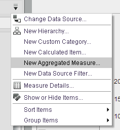
THEN
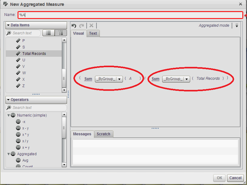
This creates a new "aggregated measure" which I called %A. If I do B and C, I can drop them onto a bar chart with "stacked" chosen to get a graph like this:
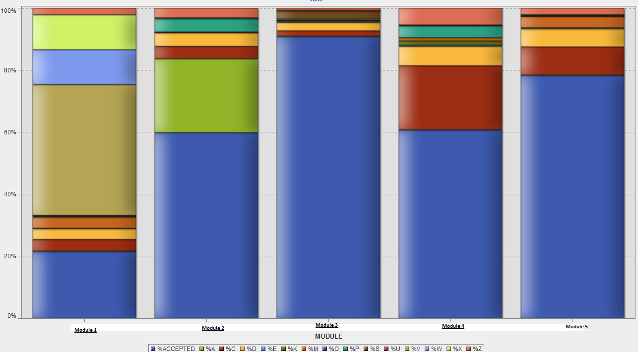
We recently upgraded to VA 6.4, but the above screenshot was actually taken from 6.2. The category at the bottom that I call module can be anything that the data supports.

- Mark as New
- Bookmark
- Subscribe
- Mute
- RSS Feed
- Permalink
- Report Inappropriate Content
I really like it! It's much simpler than my approach.
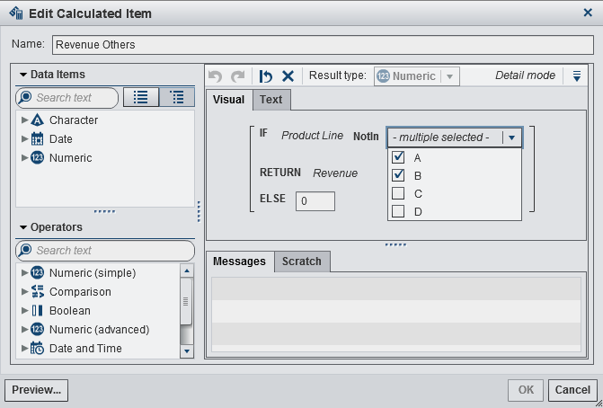
Just expanding on your solution, I'd like to show how to derive A,B,C, etc. as mentioned in your example (in case they don't exist) for any existing measure, which makes this solution even more flexible.
I have 3 columns of interest:
- Facility Region
- Product Line (four distinct values that I'll use to derive four new calculated items equivalent to A,B,C,D)
- Revenue (that's the reference measure)
I want to show % Revenue for Product Lines per Facility Region.
To calculate Revenue for Product Line A:
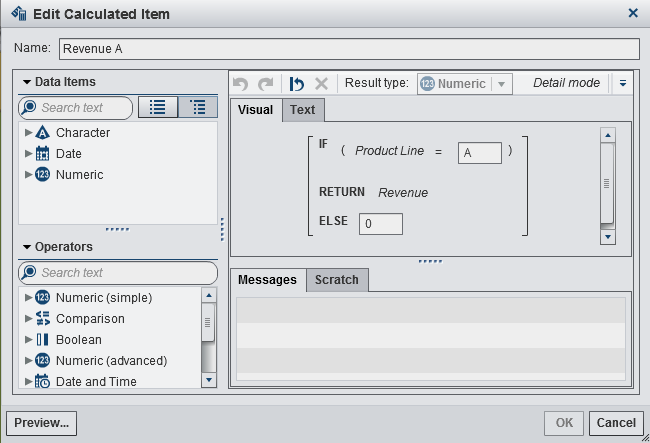
Repeat that for all Product Lines, and then calculate their respective percentages (aggregated measures) as indicated before:

And that's the final chart:
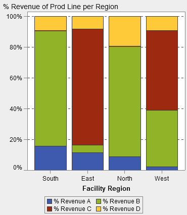
The same approach can be used to combine multiple Product Lines (and call them Others), if we are mostly interested on A and B only:
Thanks EO13!

- Mark as New
- Bookmark
- Subscribe
- Mute
- RSS Feed
- Permalink
- Report Inappropriate Content
Hi,
Thanks for both of these notes, it is useful to see this solution I can see how it will work when you have a distinct set of values (product lines) in the above example, however if you have a dynamic set of values you need to create an aggregated measure for each one, which will require constant maintenance to completely add up to 100% for each if you are interested in the detail.
The limitation to this is you need to repeat this process for each individual measure you choose which can become quite time consuming and prone to error!
Cheers,
Alex
- Mark as New
- Bookmark
- Subscribe
- Mute
- RSS Feed
- Permalink
- Report Inappropriate Content
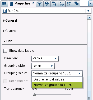
Just an update... VA 7.1 released in the beginning of October supports 100% Stacked Bar Charts. It is just a Bar Chart property called Grouping Scale and the option is called "Normalize groups to 100%", like the screenshot.
Thanks,
Renato
- « Previous
-
- 1
- 2
- Next »
.jpg")
Catch up on SAS Innovate 2026
Nearly 200 sessions are now available on demand with the SAS Innovate Digital Pass.
Explore Now →See how to use one filter for multiple data sources by mapping your data from SAS’ Alexandria McCall.

Find more tutorials on the SAS Users YouTube channel.
-
19 replies
-
11-22-2013 04:36 AM
-
41096 views
-
15 likes
-
10 in conversation
-
