- Home
- /
- Programming
- /
- Graphics
- /
- Re: sg template and colors, conditioning logic
- RSS Feed
- Mark Topic as New
- Mark Topic as Read
- Float this Topic for Current User
- Bookmark
- Subscribe
- Mute
- Printer Friendly Page

- Mark as New
- Bookmark
- Subscribe
- Mute
- RSS Feed
- Permalink
- Report Inappropriate Content
Hello all-
I am using SG template to create a bar graph in SAS 9.2.3
Right now I have the colors designated in a template that changes the colors of the bars (barchart) successfully based on a facility but when I attempt to use the color grouping in the scatterplot, it simply makes them all black. I realize that each graphing component has their own line per se. Any way to use the same formatting?
Or there a way then to simply put in conditional logic as there are only two colors which I prefer anyway to designate colors.
Entire template falls below.
Thank you for your time.
Best,
Lawrence
proc template;
define style Styles.X2;
parent=STYLES.Printer;
style Graphdata1 /Color=lightblue;
style Graphdata2 /Color=lightgreen;
*style Graphdata3 /Color=lightgreen;
end;
define statgraph BarLineMulti;
begingraph;
entrytitle halign=center TEXTATTRS=(color=black size=13pt) "HAP RATE FOR ALL MEDICAL FACILITIES";
entrytitle halign=center TEXTATTRS=(color=black size=13pt) "October 2011 to September 2012";
layout overlay / xaxisopts=(display=(line ticks tickvalues )) cycleattrs=true yaxisopts=(LABEL=('HAP RATE per 1000 admits') griddisplay=on linearopts=(tickvaluesequence=(start=0 end=15 increment=.5))) ;
barchart x=FAC_ID y=RATE /skin=modern /*FILLATTRS =(color=lightblue)*/ GROUP=COLOR_SCHEME;
scatterplot x=FAC_ID y=RATE_FOR_G /skin=modern markerattrs=(symbol=circlefilled size=22 GROUP=COLOR_SCHEME) name="# of HAPS" legendlabel="# of HAPS";
*scatterplot x=FAC_ID y=RATE_FOR_G /skin=modern markerattrs=(symbol=circle size=31 color=BIBG) ;
scatterplot x=FAC_ID y=RATE_FOR_G / DISCRETEOFFSET=-.2 markercharacter=RATE markercharacterattrs=(color=black weight=bold);
/* discretelegend "# of HAPS"/
location=outside halign=right valign=bottom;*/
endlayout;
endgraph;
end;
run;
Accepted Solutions

- Mark as New
- Bookmark
- Subscribe
- Mute
- RSS Feed
- Permalink
- Report Inappropriate Content
You are right, there are no special options for index in sgrender. You have the right option in one of the scatter plot statements. I assume you are using index values of 1, 2, and 3. If you use different index values in the data, do you at least see the different colors used?
Are you sure you are using the new derived style in the destination? If you see my example, all you should need is another variable that provides the index into the list of Graph Data elements with each observation.
Your code to Dan does not have the full code and data. WORK.HAPS4 is not found. Need the full code and data to help debug.
- Mark as New
- Bookmark
- Subscribe
- Mute
- RSS Feed
- Permalink
- Report Inappropriate Content
You really need to look at the supported syntax for the statements. There is no option called GROUP= inside the MARKERATTRS option.
If you want both the bar and the scatter to use the same three colors from your custom style, remove the CYCLEATTRS option on the LAYOUT OVERLAY statement and use GROUP=COLOR_SCHEME on the scatterPlot. I think that will work.
- Mark as New
- Bookmark
- Subscribe
- Mute
- RSS Feed
- Permalink
- Report Inappropriate Content
Sanjay;
I have been hunting around and I did notice the syntax group= does not follow the MARKERATTRS option. However I have seen it listed as a general option listed in some of the other white papers I have seen, so is this a viable option?
I have also figured out that if I list style Graphdata3 /contrastcolor=lightgreen for example instead of color it does control the background color of the scatterplot. However when I use the group function in conjunction with a Graphdata4 element it is moot and I get a black circle again.
Removing the CYCLEATTRS option on the overlay has no effect w/ or without the added graphdata elements.
Thanks again for your help.
Lawrence
- Mark as New
- Bookmark
- Subscribe
- Mute
- RSS Feed
- Permalink
- Report Inappropriate Content
I assume you are using GTL because you want to overlay scatters on bars. Else you could use SGPLOT.
If the statement does not have a GROUP option, all elements use the GRAPHDATADEFAULT style element. So, all bars will be light blue, and all markers will be black (for style=LISTING). If the statement uses the GROUP option, then the colors are derived from the GraphData1-N style elements. Plots with large filled areas (bars, bands) use the COLOR attribute from the style element. The Markers and Lines use the CONTRASTCOLOR attributes.
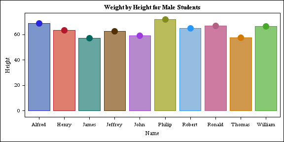
proc template;
define statgraph class;
begingraph;
entrytitle 'Weight by Height for Male Students';
layout overlay;
barchart x=name y=height / group=name;
scatterplot x=name y=height / group=name markerattrs=(symbol=circlefilled size=15);
endlayout;
endgraph;
end;
run;
ods html close;
ods listing;
ods graphics / reset width=6in height=3in imagename='class';
proc sgrender data=sashelp.class(where=(sex='M')) template=class;
run;
- Mark as New
- Bookmark
- Subscribe
- Mute
- RSS Feed
- Permalink
- Report Inappropriate Content
Sanjay & Reeza-
Many Thanks. I will take a look.
Lawrence
- Mark as New
- Bookmark
- Subscribe
- Mute
- RSS Feed
- Permalink
- Report Inappropriate Content
Sanjay;
IS there a way to actually figure out what GraphData1-N style elements apply to what?
In the section below, the colors are rendered, but I can't seem to control them-they come out blue,red, and green.
Thanks
Lawrence
layout overlay / xaxisopts=(display=(line ticks tickvalues ) offsetmin=0.03 offsetmax=0.03
timeopts=( tickvaluefitpolicy=rotatethin interval=month /*viewmin= &graphdate* viewmax='01DEC12'D*/)) yaxisopts=(LABEL=('HAP RATE PER 1000 Admits') offsetmin=0.05 offsetmax=0.05 griddisplay=on) ;
referenceline y=5.3 /lineattrs=graphdatadefault(thickness=3 color=black);
seriesplot x=month y=trendhat / lineattrs=graphdatadefault(thickness=3 color=purple) name="TREND LINE" LEGENDLABEL="TREND LINE" ;
seriesplot x=month y=RATE / lineattrs=graphdatadefault(thickness=3 color=black) name="xxx RATE PER 1000 ADMITS" LEGENDLABEL="xxx RATE PER 1000 ADMITS" ;
scatterplot x=month y=RATE / GROUP=grp_color includemissinggroup=false markerattrs=(symbol=circlefilled size=23);
scatterplot x=month y=RATE /includemissinggroup=false markerattrs=(symbol=circle size=24 color=black) ;
scatterplot x=month y=RATE /discreteoffset= -0.1 includemissinggroup=false markercharacter=rpt_pbl markercharacterattrs=(color=white weight=bold );

- Mark as New
- Bookmark
- Subscribe
- Mute
- RSS Feed
- Permalink
- Report Inappropriate Content
Since you are using SAS 9.2, your best option is to use the INDEX=<numeric-column> option on the SCATTERPLOT statement to control the style element assignement. The column should contain values 1 to N, corresponding to the GraphData style element you want for that observation.
Hope this helps!
Dan
- Mark as New
- Bookmark
- Subscribe
- Mute
- RSS Feed
- Permalink
- Report Inappropriate Content
I will try the indexing option, but then if I set the
style Graphdata1 /Color=orange for example, then if index=1 it should correlate to orange then?
I will give it a go. Thanks
Lawrence
- Mark as New
- Bookmark
- Subscribe
- Mute
- RSS Feed
- Permalink
- Report Inappropriate Content
For plot lines and markers, you will need to set CONTRASTCOLOR=orange. The COLOR affects filled areas, like bar charts.
- Mark as New
- Bookmark
- Subscribe
- Mute
- RSS Feed
- Permalink
- Report Inappropriate Content
OK Dan-
I think I am doing something wrong wrong here as the colors don't render as desired.
Here is the snippet of the data set to create the index. It creates three values depending on if the rate is above,below, or the last month of interest- I essentially render the grp_colors the same values.
proc sql;
create table HAPG as select fac_id,rate,month,
case when month='01DEC12'D then 3
when rate<=5.3 then 1
when rate>5.3 then 2 end as grp_color,
case when month='01DEC12'D then 3
when rate<=5.3 then 1
when rate>5.3 then 2 end as index,
case when month='01DEC12'D then left(put(rate,8.1)||'*') else left(put(rate,8.1)) end as rpt_pbl
from HAPS4
ORDER BY FAC_ID,month;
QUIT;
Below is the template-I used wild colors just to help me learn this-
The statements in green are the graphdata elements and the scatterplot element I am trying to code accordingly.
Many thanks again.
Lawrence
proc template;
define style Styles.XCL;
parent=STYLES.Printer;
replace GraphFonts /
'GraphDataFont' = ("arial",6pt)
'GraphUnicodeFont' = ("arial",6pt)
'GraphValueFont' = ("arial",6pt)
'GraphLabelFont' = ("arial",6pt,bold)
'GraphFootnoteFont' = ("arial",6pt)
'GraphTitleFont' = ("garamond",8pt,bold)
'GraphAnnoFont' = ("arial",10pt);
class LayoutContainer /
padding = 0
borderspacing = 4
borderwidth = 0
frame = void
rules = none
background=white;
style Header /
font = fonts('HeadingFont')
/*backgroundcolor = white */
bordercolor = cxC1C1C1
bordertopwidth = 0px
borderleftwidth = 0px
borderbottomwidth = 1px
borderrightwidth = 1px;
class systemTitle, systemfooter /
/*foreground=white*/
background = white;
style sysTitleAndFooterContainer from sysTitleAndFooterContainer /
cellspacing=0;
style Graphdata1 /contrastColor=pink;
style Graphdata2 /contrastColor=orange;
style Graphdata3 /contrastColor=blue;
/*style Graphdata3 /Color=orange;*/
end;
define statgraph BarLineMultC;
begingraph;
/*entrytitle halign=right TEXTATTRS=(size=11pt color=&COLOR1) " " ;
entrytitle halign=right TEXTATTRS=(size=9pt) " " ;
entrytitle halign=right TEXTATTRS=(size=9pt) " " ;*/
layout overlay / xaxisopts=(display=(line ticks tickvalues ) offsetmin=0.03 offsetmax=0.03
timeopts=( tickvaluefitpolicy=rotatethin interval=month /*viewmin= &graphdate* viewmax='01DEC12'D*/)) yaxisopts=(LABEL=('HAP RATE PER 1000 Admits') offsetmin=0.05 offsetmax=0.05 griddisplay=on) ;
referenceline y=5.3 /lineattrs=graphdatadefault(thickness=3 color=black);
seriesplot x=month y=trendhat / lineattrs=graphdatadefault(thickness=3 color=purple) name="TREND LINE" LEGENDLABEL="TREND LINE" ;
seriesplot x=month y=RATE / lineattrs=graphdatadefault(thickness=3 color=black) name="HAP RATE PER 1000 ADMITS" LEGENDLABEL="HAP RATE PER 1000 ADMITS" ;
scatterplot x=month y=RATE / GROUP=grp_color index=index includemissinggroup=false markerattrs=(symbol=circlefilled size=23);
scatterplot x=month y=RATE /includemissinggroup=false markerattrs=(symbol=circle size=24 color=black) ;
scatterplot x=month y=RATE /discreteoffset= -0.1 includemissinggroup=false markercharacter=rpt_pbl markercharacterattrs=(color=white weight=bold );
discretelegend "HAP RATE PER 1000 ADMITS" "TREND LINE" "Prelim" /
location=outside valign=bottom;
endlayout;
endgraph;
end;
run;
- Mark as New
- Bookmark
- Subscribe
- Mute
- RSS Feed
- Permalink
- Report Inappropriate Content
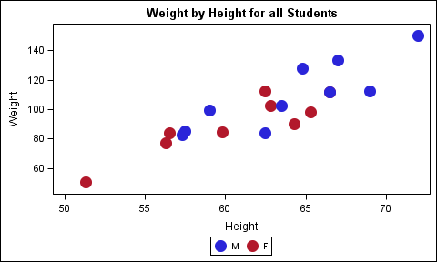
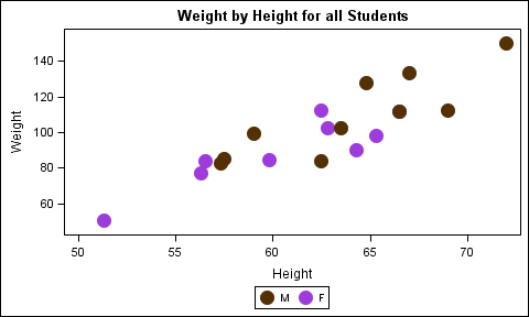
I do not see yourSGRENDER step or your data. Here is example and output. First example uses INDEX= INDEX1 with 1 & 2 for M & F. Second one uses INDEX2 with graphdata 4 & 5
data class;
set sashelp.class;
if sex eq 'M' then do; index1=1; index2=4; end;
else do; index1=2; index2=5; end;
run;
proc template;
define statgraph class;
dynamic _index;
begingraph;
entrytitle 'Weight by Height for all Students';
layout overlay;
scatterplot x=height y=weight / group=sex index=_index
markerattrs=(symbol=circlefilled size=15) name='a';
discretelegend 'a';
endlayout;
endgraph;
end;
run;
ods html close;
ods listing;
ods graphics / reset width=5in height=3in imagename='class1';
proc sgrender data=class template=class;
dynamic _index='index1';
run;
ods graphics / reset width=5in height=3in imagename='class2';
proc sgrender data=class template=class;
dynamic _index='index2';
run;

- Mark as New
- Bookmark
- Subscribe
- Mute
- RSS Feed
- Permalink
- Report Inappropriate Content
Here's a good post that might help with what you're trying to do in terms of colouring your graphs consistently.
http://blogs.sas.com/content/graphicallyspeaking/2012/02/27/roses-are-red-violets-are-blue/
Look at the 2 trackbacks on the links at the bottom.
- Mark as New
- Bookmark
- Subscribe
- Mute
- RSS Feed
- Permalink
- Report Inappropriate Content
Reeza;
The link is interesting. However, does this apply to SAS 9.2? It seems to fail to recognize the directives for the GTL language.
Thanks.
Lawrence
- Mark as New
- Bookmark
- Subscribe
- Mute
- RSS Feed
- Permalink
- Report Inappropriate Content
GTL applies to 9.2 but some of the options are only available in 9.3, specifically the attribute maps I believe.
- Mark as New
- Bookmark
- Subscribe
- Mute
- RSS Feed
- Permalink
- Report Inappropriate Content
I was just reading the comments in his blog. Yes the attribute maps only applies in 9.3 unfortunately.
Aaargh. I still cannot control the markercharacterattrs to my liking.
Thanks.
Lawrence
SAS Innovate 2025: Call for Content
Are you ready for the spotlight? We're accepting content ideas for SAS Innovate 2025 to be held May 6-9 in Orlando, FL. The call is open until September 25. Read more here about why you should contribute and what is in it for you!
Learn how use the CAT functions in SAS to join values from multiple variables into a single value.

Find more tutorials on the SAS Users YouTube channel.
 Click image to register for webinar
Classroom Training Available!
Select SAS Training centers are offering in-person courses. View upcoming courses for:
-
17 replies
-
01-09-2013 01:43 PM
-
2545 views
-
6 likes
-
4 in conversation
-
