- Home
- /
- Programming
- /
- Graphics
- /
- Re: SAS GRAPHS
- RSS Feed
- Mark Topic as New
- Mark Topic as Read
- Float this Topic for Current User
- Bookmark
- Subscribe
- Mute
- Printer Friendly Page
- Mark as New
- Bookmark
- Subscribe
- Mute
- RSS Feed
- Permalink
- Report Inappropriate Content
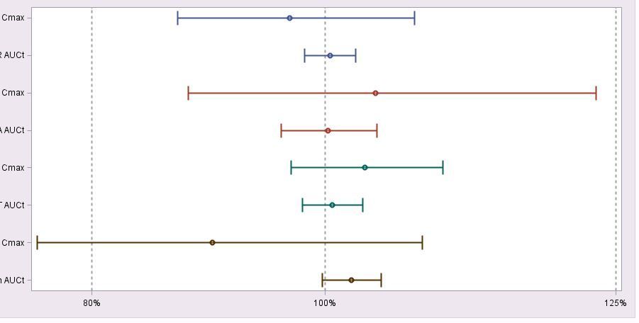
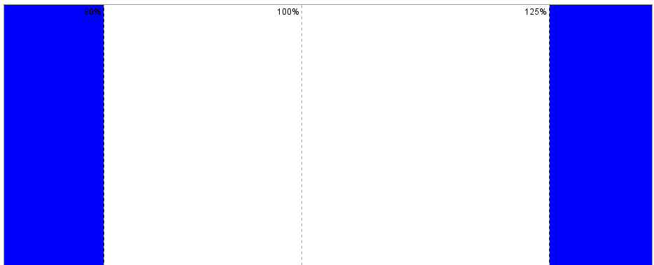
Hi, I need some changes in my template for adding colours before 80% and after 125% and change labels from bottom to up.
proc template;
define statgraph sgdesign;
dynamic _MEAN _PARLB _PAR1A _HIGHT _LOW;
begingraph / designwidth=950px designheight=450px backgroundcolor=CXE8E6E8;
layout lattice / rowdatarange=data columndatarange=data rowgutter=10 columngutter=10;
layout overlay / wallcolor=CXFFFFFF walldisplay=(OUTLINE FILL)
xaxisopts=( display=(TICKS TICKVALUES LINE ) griddisplay=on gridattrs=GraphAxisLines(pattern=2 thickness=2 ) linearopts=( tickvaluepriority=TRUE tickvalueformat=BEST6. tickvaluelist=(80.0 100.0 125.0) tickdisplaylist=("80%" "100%" "125%")))
yaxisopts=( reverse=true display=(TICKS LINE TICKVALUES ) griddisplay=off gridattrs=(color=CX848284 pattern=2 thickness=1 ) discreteopts=( tickvaluefitpolicy=none));
scatterplot x=_MEAN y=_PARLB / group=_PAR1A xerrorupper=_HIGHT xerrorlower=_LOW name='scatter' grouporder=ascending markerattrs=(weight=bold ) errorbarattrs=(thickness=2 );
endlayout;
endlayout;
endgraph;
end;
run
Vahe
- Mark as New
- Bookmark
- Subscribe
- Mute
- RSS Feed
- Permalink
- Report Inappropriate Content
Search here:
- Mark as New
- Bookmark
- Subscribe
- Mute
- RSS Feed
- Permalink
- Report Inappropriate Content
You will have to describe what this means: "change labels from bottom to up."
If you want the 80%, 100% etc displayed at the top of the graph then the scatterplot should have the option: xaxis=x2
- Mark as New
- Bookmark
- Subscribe
- Mute
- RSS Feed
- Permalink
- Report Inappropriate Content
Hi,
maybe you could add 2 thick reference lines before 80 and after 120 before the scatterplot statement:
referenceline x=75 / lineattrs=(thickness=60 color=blue);
referenceline x=130 / lineattrs=(thickness=60 color=blue);
you will need to play with the x and the thickness to find the values that match your graphic at best
- Cheers -
- Mark as New
- Bookmark
- Subscribe
- Mute
- RSS Feed
- Permalink
- Report Inappropriate Content
Vahe
- Mark as New
- Bookmark
- Subscribe
- Mute
- RSS Feed
- Permalink
- Report Inappropriate Content
Hi,
I think you can reach this with a blockplot overlaid statement like described in Example 1: BlockPlot Overlaid with SeriesPlot
In the example the variable 'release' marks the end of the color strip.
         blockplot x=date block=release /
           datatransparency=0.3 valuevalign=top
           labelposition=top display=(fill values label)
extendblockonmissing=true ;- Cheers -
SAS Innovate 2025: Call for Content
Are you ready for the spotlight? We're accepting content ideas for SAS Innovate 2025 to be held May 6-9 in Orlando, FL. The call is open until September 25. Read more here about why you should contribute and what is in it for you!
Learn how use the CAT functions in SAS to join values from multiple variables into a single value.
Find more tutorials on the SAS Users YouTube channel.
 Click image to register for webinar
Classroom Training Available!
Select SAS Training centers are offering in-person courses. View upcoming courses for:


