- Home
- /
- Programming
- /
- Graphics
- /
- Re: Help! Overlapping barlabels
- RSS Feed
- Mark Topic as New
- Mark Topic as Read
- Float this Topic for Current User
- Bookmark
- Subscribe
- Mute
- Printer Friendly Page
- Mark as New
- Bookmark
- Subscribe
- Mute
- RSS Feed
- Permalink
- Report Inappropriate Content
Hi Communitie,
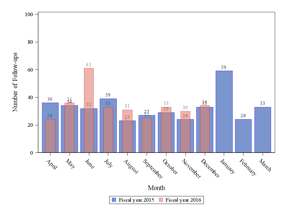
I build now for a couple of hours the necessary data and graphic --> i am almost confident EXCEPT of the overlapping Barlabels (see attached pictures)
The code is following:
PROC SGPLOT DATA= section_1_2;
  VBAR month / RESPONSE= count1 DATALABEL LEGENDLABEL = "Fiscal year &fiscalyear2.";
  VBAR month / RESPONSE= count2 DATALABEL barwidth=0.5 transparency=0.4  LEGENDLABEL = "Fiscal year &fiscalyear1.";
  YAXIS VALUES= &yaxis OFFSETMIN= 0 LABEL= "Number of Follow-ups";
  XAXIS LABEL= "Month" DISCRETEORDER=DATA ;
RUN;
I did previously some GTL stuff for other projects....but i dont have an idea how to solve this overlapping problem.
...Maybe i am lacking of creativity --> does someone has a solution?
Best regards & thanks in advance,
Felix S.
Accepted Solutions
- Mark as New
- Bookmark
- Subscribe
- Mute
- RSS Feed
- Permalink
- Report Inappropriate Content
Well, you have two bars with bar labels. So, if the values are close, the labels will overlap. There are multiple solutions:
If your data is presummarized (does not have multiple observations for same month), you could move one of the labels to the bottom of the bar. If you have SAS 9.40M3, use VBARPARM to display the summarized bars, and overlay a TEXT plot to display the label at the bottom (y=0). If earlier version, use SCATTER with MARKERCHAR. Just create a variable y=0 in the data and use that with the scatter or text plot. Use appropriate color.
Or, you can use a XAXISTABLE to put both bar values under the bars.
- Mark as New
- Bookmark
- Subscribe
- Mute
- RSS Feed
- Permalink
- Report Inappropriate Content
Thank you for your quick Response and suggestions. I will try the Options soon !
Available on demand!
Missed SAS Innovate Las Vegas? Watch all the action for free! View the keynotes, general sessions and 22 breakouts on demand.
Learn how use the CAT functions in SAS to join values from multiple variables into a single value.
Find more tutorials on the SAS Users YouTube channel.
 Click image to register for webinar
Classroom Training Available!
Select SAS Training centers are offering in-person courses. View upcoming courses for:


