- Home
- /
- SAS Communities Library
- /
- SAS Customer Intelligence 360: A look inside the black box of machine ...
- RSS Feed
- Mark as New
- Mark as Read
- Bookmark
- Subscribe
- Printer Friendly Page
- Report Inappropriate Content
SAS Customer Intelligence 360: A look inside the black box of machine learning
- Article History
- RSS Feed
- Mark as New
- Mark as Read
- Bookmark
- Subscribe
- Printer Friendly Page
- Report Inappropriate Content
As machine learning takes its place in numerous advances within the marketing ecosystem, the interpretability of these modernized algorithmic approaches grows in importance. According to my SAS peer Ilknur Kaynar Kabul:
“We are surrounded with applications powered by machine learning, and we’re personally affected by the decisions made by machines more and more every day.”
Her writing has inspired me to consider how machine learning is used for customer analytics and personalized marketing. Emerging machine learning applications for business-to-consumer (B2C) use cases range from:
- Customer journey optimization.
- Acquisition marketing (or lead scoring).
- Upsell and cross-sell propensity models.
- Pricing optimization.
- Traffic and demand forecasting.
- Retention (or decreasing churn).
- Ad targeting.
These uses should sound familiar to any data-driven marketer. However, machine learning grabs the baton from classical statistical analysis by increasing accuracy, context and precision. A wide variety of business problems can incrementally benefit from algorithms like forests, gradient boosting or support vector machines that most users know very little about. When it comes to influencing stakeholders, marketing analysts often put emphasis on the prediction accuracy of their models – not on understanding how those predictions are actually made.
For example, do you really care why individuals click on a display media ad? As long as you get more clicks, some might be satisfied because key performance indicators are trending positively. Give me the algorithm that maximizes media performance and spare me the details. Black box, white box, it doesn’t matter. I got things to do.
However, others genuinely care about both analytical precision and explanatory insights that reveal why some tactics work better than others. If you have a conversion goal on your website, then identifying individuals who have higher propensities to meet that objective is part of the recipe, but understanding the drivers of that behavior could inform:
- Look-a-like segmentation to acquire higher quality leads.
- A/B, MAB, and MVT testing strategies like call-to-action tactical optimization.
- Channel and journey attribution measurement for conversion goal insights.
Are complex models impossible to understand?
Interpretability of machine learning models is a multifaceted and evolving topic. Some applications are easy to understand, commonly referred to as white box (transparent) models. They provide us the opportunity to explain a model’s mechanisms and predictions in understandable terms. In other words, we are removing the unanswerable question of “why this” or “why that” from the conversation.
Imagine a scenario where analysts can tell a data story about how changing the strategic levers (inputs) will affect the predicted outcome, as well as provide the justifications. It’s a beautiful outcome when technical and non-technical audiences can walk away with a clear understanding of a refinement in marketing strategy at the end of a meeting.
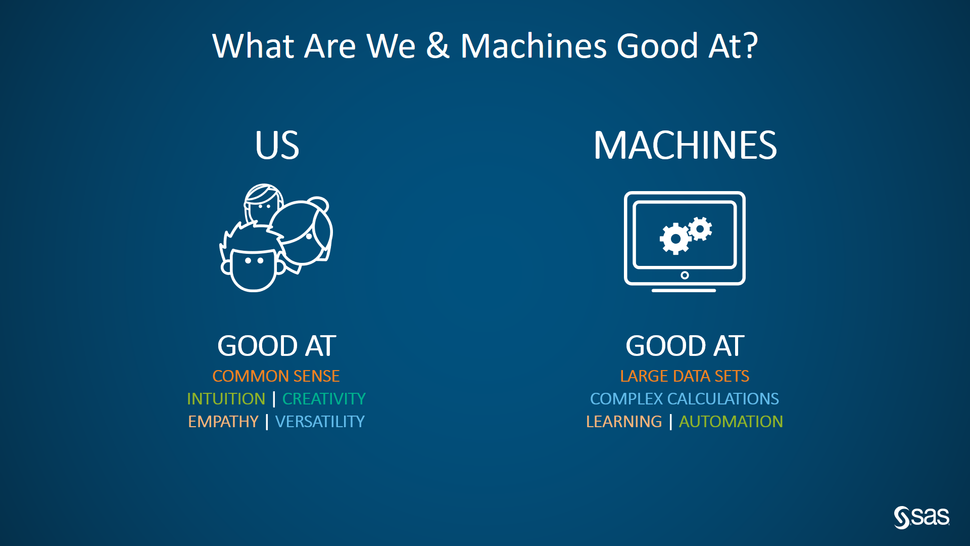
(Figure 1: What are we and machines good at)
However, with the recent advances in machine learning and artificial intelligence, models have become very complex, including deep neural networks or ensembles of different models. We refer to these specific examples as black box models.
Unfortunately, the complexity that gives extraordinary predictive abilities also makes black box models challenging to understand and trust. They generally don’t provide a clear explanation of why they made a certain prediction. They give us a probability that is actionable, yet hard to determine how we arrived at that score. Here are a few examples:
- Digital data such as website clickstream and offsite ad-serving are some of the original inspirations for the heavily-used term: “big data”. There can be thousands (even millions) of features in machine learning models for marketing use cases.
- There’s no one-to-one relationship between input features and estimated parameters.
- Often, the combinations of multiple models affect the prediction.
- Machine learning algorithms are data-hungry. Some need enormous amounts to achieve high accuracy.
Brands experimenting with machine learning are questioning whether they can trust the models, and if fair decisions can be made using them.
If an analyst cannot figure out what they learned from those data sets, and which of those data points have more influence on the outcome than the others, how can they tell a practical story to the broader business, and recommend taking action? I don’t know the sort of presentations you give, but if I’m encouraging a senior leader to alter their direction, I want them to be able to explain why specific outcomes end positively or negatively to their leadership team. Shrugging one’s shoulder and saying “I don’t know why we made or lost an additional $5 million dollars” just feels dangerous.
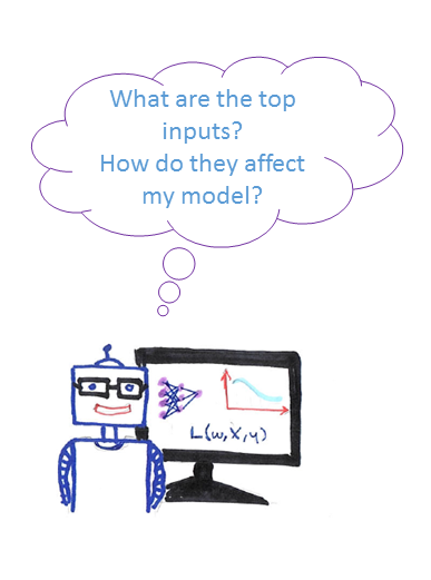
(Figure 2: Analysts and black box models)
What happens if the algorithm learns the wrong thing? What happens if they are not ready for deployment within your channel touchpoint technology? There is a risk of misrepresentation, oversimplification or overfitting. That’s why you need to be careful when using them, or the promise of consumer hyper-personalization may never be fulfilled.
Isn’t being accurate good enough?
In machine learning, accuracy is measured by comparing predictions to the known actual values from the input data set. The higher the accuracy, the better, right? Not exactly. In marketing, classification models are very popular. Who is likely to convert, and who isn’t? This question begs more questions:
- Does leadership want to be as accurate as possible in predicting both conversion and non-conversion behavior?
- Do they care more about precision and maximizing conversion behavior only on their targeting efforts, while accepting more errors on non-conversion predictability?
Based on your brand’s business drivers, these can suddenly become tricky questions to answer. The choice made will impact the financial profitability (or loss) based on the approach chosen.
Those of you reading this who have built models before will quickly recognize that I am referring to model assessment through diagnostics such as lift curves, ROC plots, misclassification charts and confusion matrices.
In the world of machine learning, it isn’t enough.
A machine learning model can achieve high accuracy by memorizing the seemingly unimportant features or patterns in your data. If there is a bias in your input data, this can lead to a poor representation of the predictions in a production environment in which the insights are deployed. How many of you want to target incorrect segments, provide irrelevant offers, or misrepresent your brand at customer touchpoints? Not me.
You cannot rely only on prediction accuracy. You need to know more. You need to demystify the black box and improve transparency to make machine learning models trustworthy and reliable.
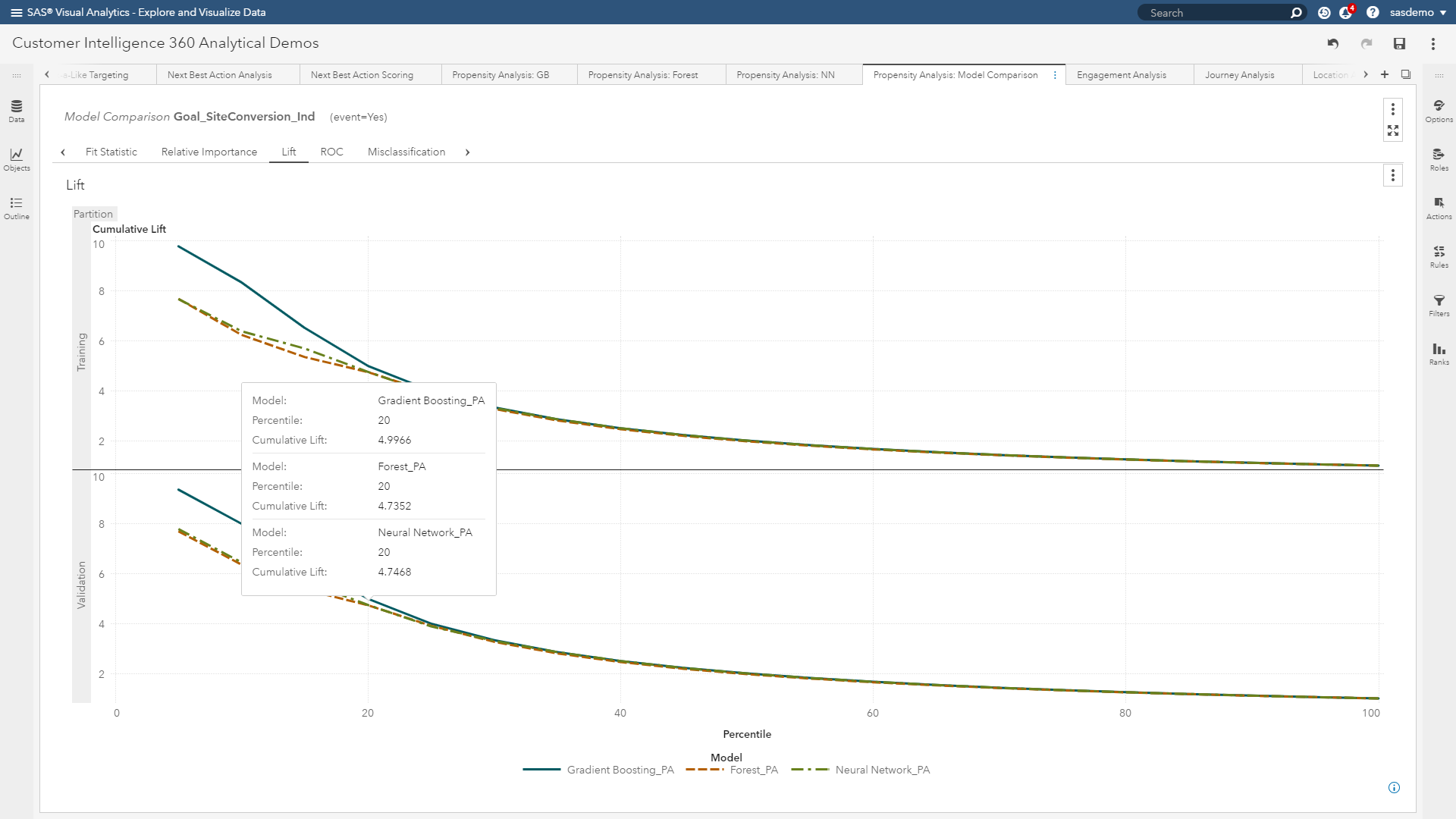
(Figure 3: Lift curves are helpful, but machine learning requires more diagnostics)
Defining interpretability
What exactly does interpretability mean? First, it is not about understanding every detail about how a model works for each training data point. Interpretability enables analysts to explain to campaign managers, creative designers, A/B testers and marketing technologists why a particular decision is being made. More specifically, in the context of journey conversion analysis, it encapsulates:
Understanding the main drivers that affect why customers convert.
- Explaining the decisions that are made by an algorithm to classify a customer as highly probable of converting (or not converting).
- Finding out the patterns/rules/features that are learned by an algorithm to help explain consumer decisions.
- Being critical by helping analysts to challenge the results and ensure robustness and unbiased decisions.

(Image 4: Interpretability robots)
Do marketers and consumers really need interpretability from machine learning?
If your initial reaction is “no” to this question, here is an alternative perspective.
Marketing analysts want to build and deploy offer recommendations with high accuracy. They want to understand the model’s underpinnings and pick the best algorithm for the problem. If they can influence others to use their derived insights, and key performance indicators improve, who’s getting that promotion sooner than expected?
End users who serve as the recipients of the analyst’s recommendations want to know why a model gives a certain prediction. They want to know how they will be affected by those decisions - for better or worse. These users have emotional desires to trust the model because they rely on them for job security.
Consumers, in exchange for their valued attention, want to be treated fairly, and with personalized relevance. If they are mistreated, they may reject the brand and switch to a competitor. They expect a certain measure of trust when they are shopping online or clicking ads.
Regulators and lawmakers want to make the system fair and transparent. They want to protect consumers. With the inevitable rise of machine learning algorithms, they are becoming more concerned about the decisions made by models.
All those segments want similar things from black box models. They want the models to be:
- Transparent: The system can explain how it works and/or why it gives certain predictions.
- Trustworthy: The system can handle different scenarios in the real world without continuous control.
- Explainable: The system can convey useful information about its inner workings, for the patterns that it learns and for the results that it gives.
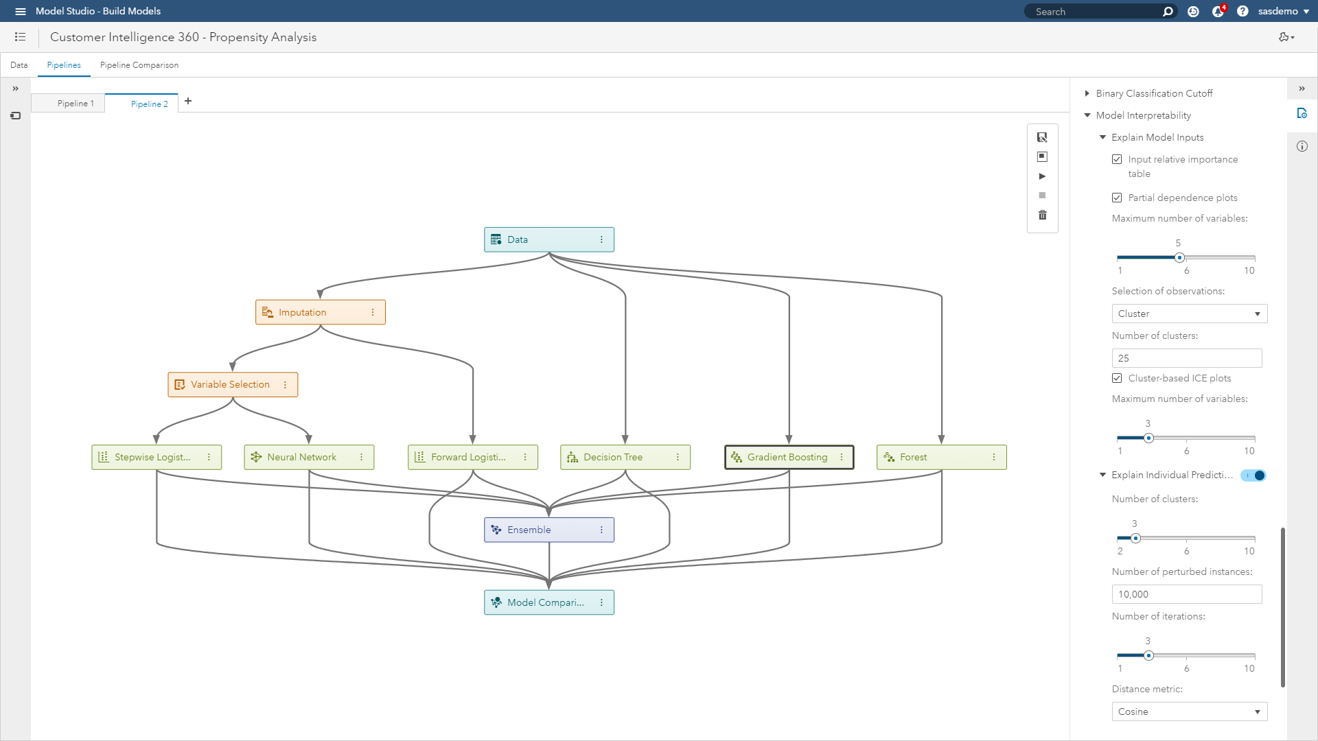
Within SAS Customer Intelligence 360 using SAS Visual Data Mining & Machine Learning, you have control over:
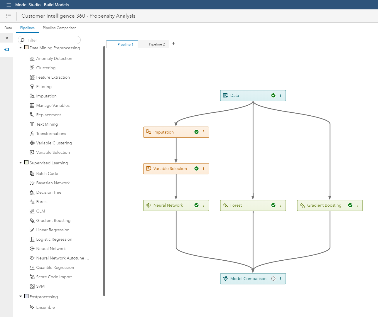 (Image 5: SAS Customer Intelligence 360 & SAS Visual Data Mining & Machine Learning - Model studio)
When is interpretability needed within a brand’s adoption curve of analytics?
In which stage of the analytical process do you need interpretability? It may not be necessary to understand how a model makes its predictions for every application. However, the higher the stakes, the more likely accuracy, as well as transparency, is necessary. After you define your mission, you should focus on which techniques you need in each stage of the workflow.
Stage one: Interpretability in pre-modeling
Understanding your data set is very important before you start building. Exploratory data analysis and visualization techniques immediately come into play. This can include summarizing the main characteristics, finding critical points and surfacing the relevant features from your data.
After you have an overall understanding, you need to think about which features you are going to use. If you intend on explaining the input-output relationship of your predictors, you need to start with meaningful inputs. While highly engineered features can boost the accuracy of your model, they will not be interpretable when you put the model to use.
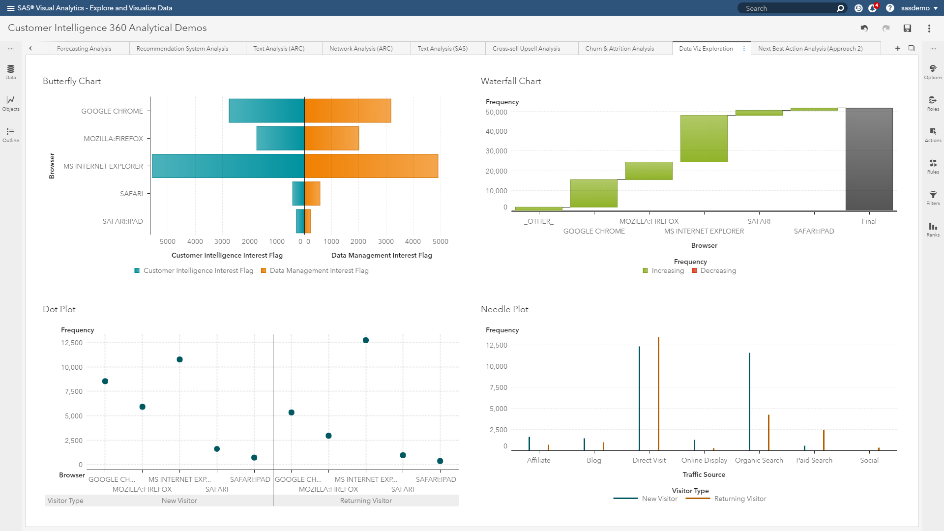 (Image 6: SAS Customer Intelligence 360 & SAS Visual Data Mining & Machine Learning - Visual exploration)
Stage two: Interpretability in modeling.
In general, white box approaches are models that focus on predicting average behavior. In contrast, black box approaches often make more accurate predictions for the finer details (or localized aspects) of modeled behaviors.
In a sense, white box models approximate their fit of data while creating a way for analysts to extract precise stories. Black box methods can train sharper models, but only allow analysts to express approximated stories.
White box models: Decision trees and regression algorithms are the traditional tools here. They are easy to understand when used with few predictors. They use interpretable transformations and give you global intuition about how things work, which helps you understand what’s going on anywhere in the model. On the flip side, if you have hundreds of features and build a very deep, large decision tree, things can become complicated rapidly for digital marketing execution.
Black box models: Deep neural networks, forests and gradient boosting can be considered here. They provide countless predictors, form complex transformations, and detect localized patterns in training making comprehensive interpretation tricky. It’s typically hard to visualize and understand what is going on inside these models. They are even harder to communicate to a target audience. However, their prediction accuracy can be much better.
Stage three: Interpretability in post-modeling
Interpretability in the model predictions helps you inspect the relationships between input features and output predictions. Adding transparency at this phase can help you understand the most important features for a model, how those features affect the predictions and how sensitive your model is to certain features.
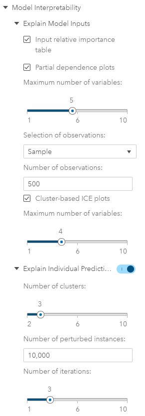
(Image 7: SAS Customer Intelligence 360 & SAS Visual Data Mining and Machine Learning - Post-model interpretability options)
Interpretability techniques
Using data captured by SAS Customer Intelligence 360 from our website, sas.com, let’s discuss techniques that dig deeper into this interpretability obstacle. Anyone who has ever used machine learning in a real application can attest that metrics such as misclassification rate or average square error, and plots like lift curves and ROC charts are helpful but can be misleading if used without additional diagnostics.

(Image 8: Machine learning interpreter)
Why? Sometimes data that shouldn't be available accidentally leaks into the training and validation data of the analysis. Sometimes the model makes mistakes that are unacceptable to the business. These and other tricky problems underline the importance of understanding the model's predictions when deciding if it is trustworthy or not, because humans often have good intuition that is hard to capture in traditional evaluation metrics. Practical approaches worth highlighting are:
Proxy Methods
Surrogate model approach: Interpretable models used as a proxy to explain complex models. For example, fit a machine learning (black box) model to your training data. Then train a traditional, interpretable (white box) model on the original training data, but instead of using the actual target in the training data, use the predictions of the more complex algorithm as the target for this interpretable model.
Machine learning as benchmark: Use a complex model to set the goal for potential accuracy metrics (like misclassification rate) that could be achieved, then use that as the standard against which you compare the outputs of more interpretable model types.
Machine learning for feature creation: Use a machine learning model to extract the features, then use those transformed predictors as inputs to a more explainable model type. This method is an ongoing topic of research by SAS to continue improving interpretability.
Post-modeling diagnostics
Variable importance: This visualization (see figure below) assists with answering the question: “What are the top inputs of my model?” Importance is calculated as the sum of the decrease in error when split by a variable. The more influential the feature, the higher it rises.
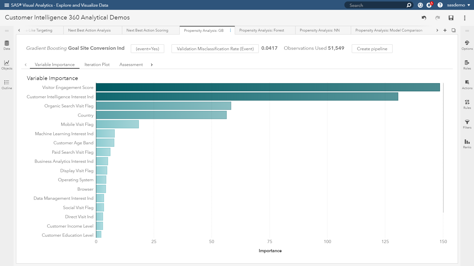
(Image 9: SAS Customer Intelligence 360 & SAS Visual Data Mining and Machine Learning - Variable importance plot)
In the figure above, the variable importance plot of a gradient boosting analysis focused on visitor conversion propensity quickly shows you what to pay attention to and what is noise. Attributes like visitor engagement, viewing the SAS Customer Intelligence solution page, originating from organic search, visitor location and interactions from mobile devices are topping the list.
Partial dependence (PD) plots: Illustrate the relationships between one or more input variables and the predictions of a black-box model. It is considered a visual, model-agnostic technique applicable to a variety of machine learning algorithms. By depicting how the predictions depend (in part) on values of the input variables of interest, PD plots look at the variable of interest across a specified range. At each value of the variable, the model is evaluated for all observations of the other model inputs, and the output is then averaged.
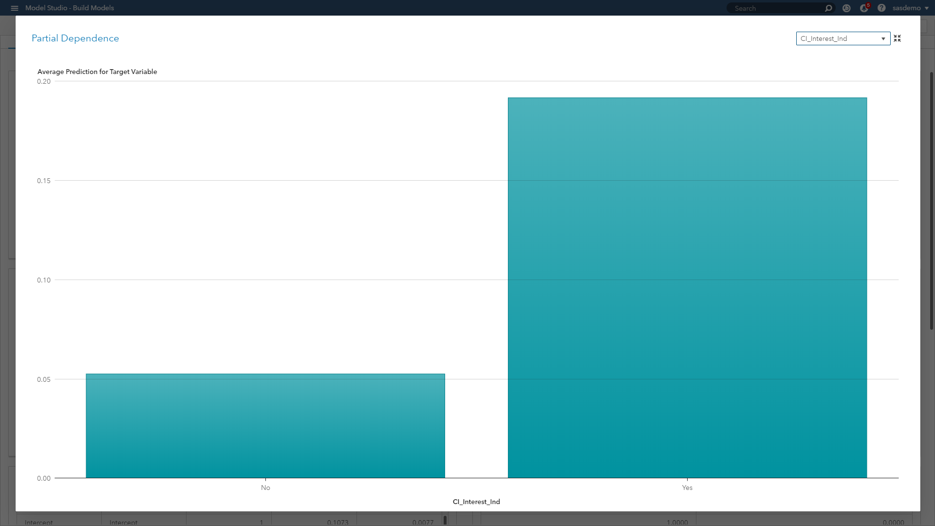 (Image 10: SAS Customer Intelligence 360 & SAS Visual Data Mining and Machine Learning - Partial dependence plot)
In the figure above, the PD plot shows that the probability of a conversion event on sas.com increases when a visitor views the SAS Customer Intelligence product page, as opposed to not viewing it along a journey. In the case of numeric features, PD plots can also show the type of relationship through step functions, curvilinear, linear and more.
Individual conditional expectation (ICE) plots: Also considered a visual, model-agnostic technique, they enable you to drill down to the level of individual observations and segments. ICE plots help explore individual differences, identify subgroups and detect interactions between model inputs. You can think of ICE as a simulation that shows what would happen to the model’s prediction if you varied one characteristic of a particular observation.
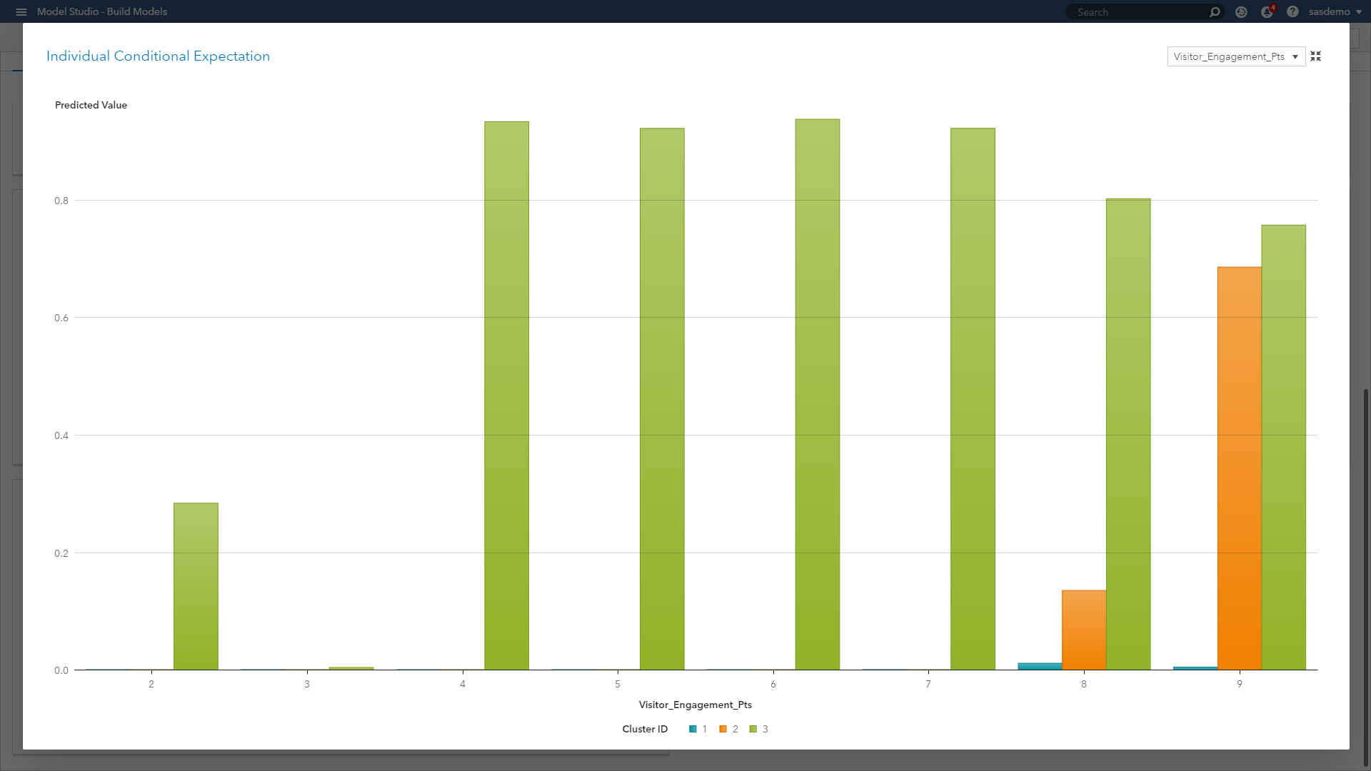
(Image 11: SAS Customer Intelligence 360 & SAS Visual Data Mining and Machine Learning - ICE plot)
When we look at the ICE plot above, it presents the relationship across three clustered segments with respect to engagement behavior on sas.com. The plot showcases that engagement scores of four or higher are strong predictive signals for Segment 3, scores less than nine are weak predictors of Segment 2, and engagement as a predictor overall is useless for Segment 1. ICE plots separate the PD function (which, after all, is an average) to reveal localized interactions and unique differences by segment.
To avoid visualization overload, ICE plots only show one feature at a time. If you want efficiency for larger data, you might need to make some adjustments. For example, you can bin numeric variables, or you can sample or cluster your data set. These techniques can give you reasonable approximations of the actual plots when dealing with voluminous data.
For those readers who would like a more technical SAS resource for PD and ICE plots, check out this fantastic white paper by Ray Wright.
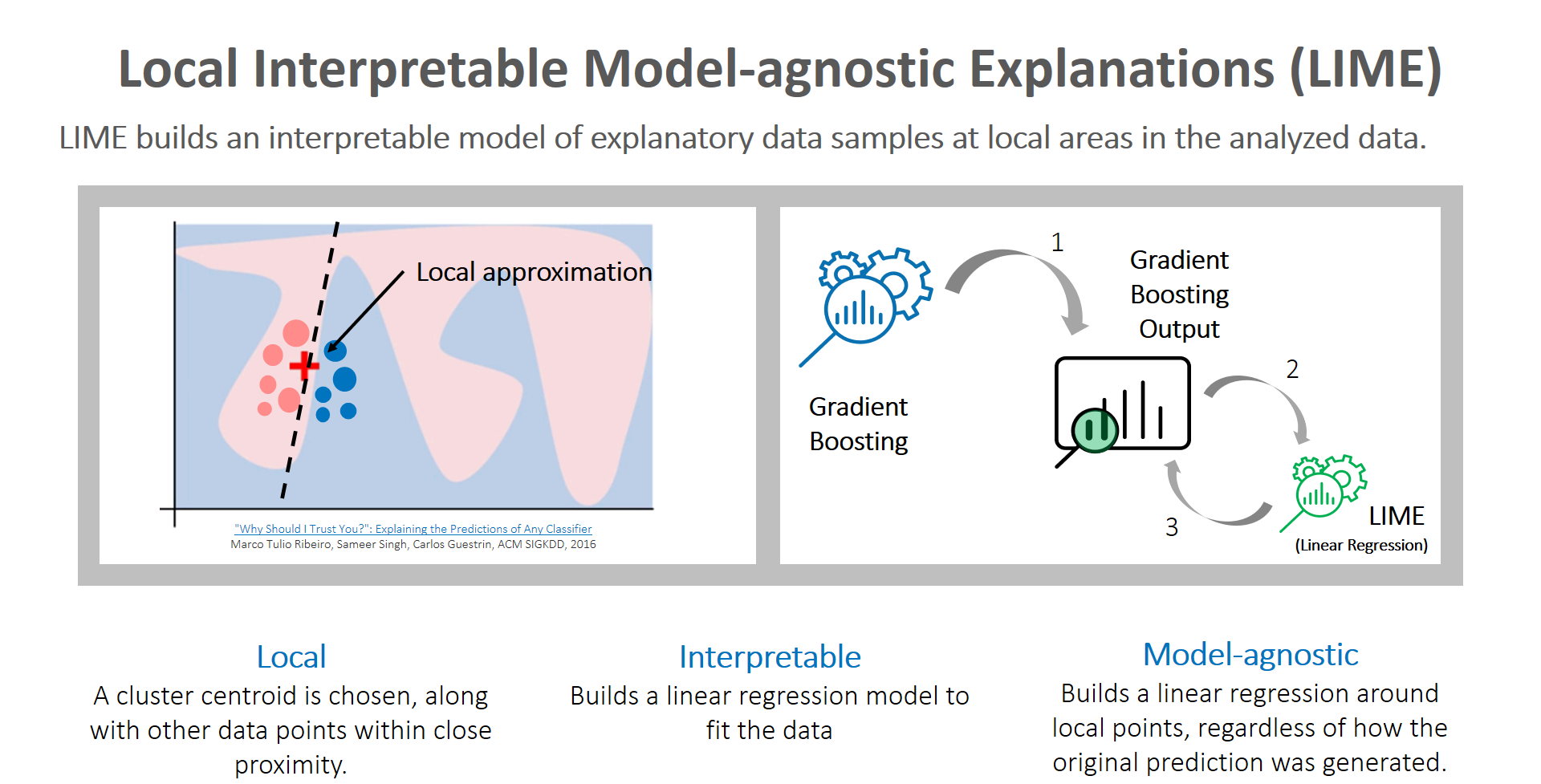
Local interpretable model-agnostic explanations (LIME): Global and localized views are critical topics that analysts must focus on to tell clearer stories about predictions made by machine learning models. Although surrogate models are a reasonable proxy method to consider, they can cause analysts anxiety because they are highly approximated. However, LIME builds an interpretable model of explanatory data samples at local areas in the analyzed data. Here is a great video primer on LIME. Caught your attention? Now let me steer you to the accompanying article diving deeper into the subject.
The key reason to use LIME is that it is much easier to approximate a black-box model by using a simple model locally (in the neighborhood of the prediction you want to explain), as opposed to trying to approximate a model globally.
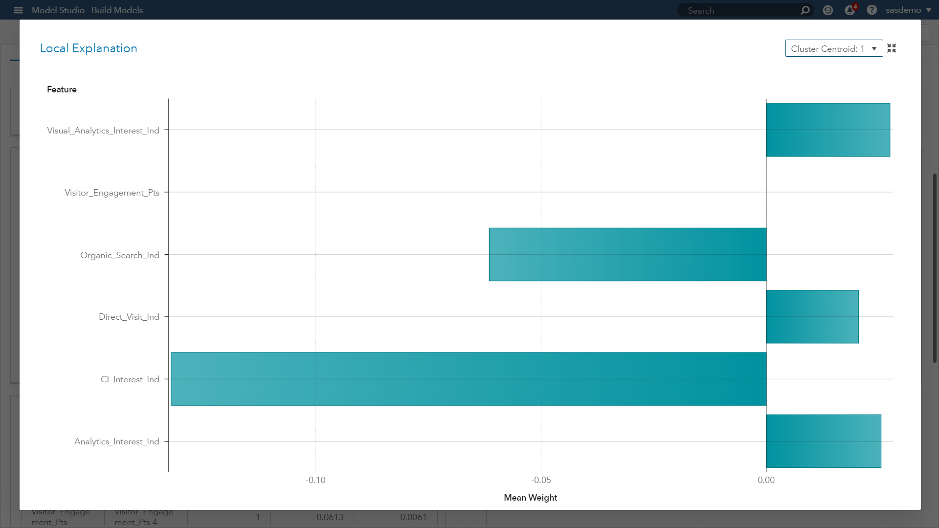 (Image 12: SAS Customer Intelligence 360 & SAS Visual Data Mining and Machine Learning - LIME plot for cluster 1)
Look at the LIME plot above. It presents a butterfly visual plot summarizing the positive and negative impacts of predictors related to visitor goal conversion behavior of a given cluster centroid (Cluster 1). The LIME graph represents the coefficients for the parameter estimates of the localized linear regression model.
The ICE plot creates the localized model around a particular observation based on perturbed sample sets of the input data. That is, near the observation of interest, a sample set of data is created. This data set is based on the distribution of the original input data. The sample set is scored by the original model and sample observations are weighted based on proximity to the observation of interest. Next, variable selection is performed using the LASSO technique. Finally, a linear regression is created to explain the relationship between the perturbed input data and the perturbed target variable.
 (Image 13: LIME plot summary)
The final result is an easily interpreted linear regression model that is valid near the observation of interest. Our takeaway from Image 12 is showing which predictors have those positive and negative estimates within the localized sample. Now let’s look at a second LIME plot for another cluster within our model.
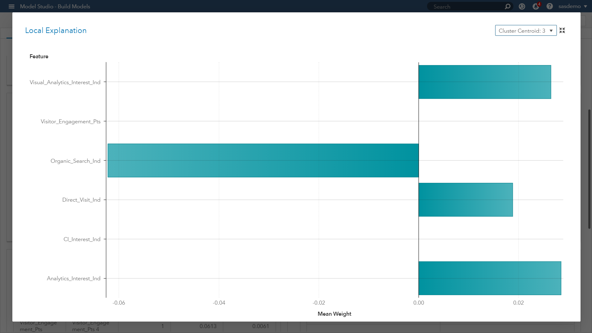 (Image 14: SAS Customer Intelligence 360 & SAS VDMML - LIME plot for cluster 3)
When comparing with Image 12, this new plot in Image 14 provides you:
- Confidence that similar prediction trends across the parameter estimates are occurring by segment, except for one feature.
- The viewing of the SAS Customer Intelligence web page across a visitor journey at sas.com had a negative weight for Cluster 1, but not for Cluster 3.
- As an analyst, investigating this feature and seeking a stronger understanding of its influence will only help in your assessment, developing model trust, and communicating accurate insights.
If you would like to learn more about LIME within SAS Viya, please check out this on-demand webinar.
Unraveling the opaque black box of machine learning will continue to be an area of focus and research across every industry’s machine learning use cases. As the digital experience of consumers continues to rise in importance, let’s maximize AI’s potential in this world of voluminous data and actionable analytics without recklessly trusting intuition. SAS Customer Intelligence 360 with SAS Viya provides the mechanisms and visual diagnostics to help address this challenge.
 (Image 15: SAS Customer Intelligence 360 & SAS Visual Data Mining and Machine Learning - Machine learning project for digital analytics)
.jpg")
Catch up on SAS Innovate 2026
Nearly 200 sessions are now available on demand with the SAS Innovate Digital Pass.
Explore Now →SAS AI and Machine Learning Courses
The rapid growth of AI technologies is driving an AI skills gap and demand for AI talent. Ready to grow your AI literacy? SAS offers free ways to get started for beginners, business leaders, and analytics professionals of all skill levels. Your future self will thank you.
