- Home
- /
- SAS Communities Library
- /
- Is summer over already? Time to create a custom vector plot in SAS Vis...
- RSS Feed
- Mark as New
- Mark as Read
- Bookmark
- Subscribe
- Printer Friendly Page
- Report Inappropriate Content
Is summer over already? Time to create a custom vector plot in SAS Visual Analytics!
- Article History
- RSS Feed
- Mark as New
- Mark as Read
- Bookmark
- Subscribe
- Printer Friendly Page
- Report Inappropriate Content
As we move from summer into fall, I find myself still wanting to do some of the fun activities that the summertime offers. Throughout the summer, I love being outdoors and especially up at Falls Lake, NC. Fishing, swimming and canoeing are some of the great activities that people can enjoy during the warm weather.
As we get more into the season of fall, I find myself already looking towards next summer. Mainly, I find myself asking, “when will it be warm enough to go back to Falls Lake?”. Fortunately, the USGS Water Service offers a free data feed of this exact information via rolling 15-minute intervals of water temperatures from various survey towers across the lake.
Recently, I was reviewing one of the data feeds and realized I could make a custom graph within SAS Visual Analytics which would tell me exactly when the lake will be warm enough for swimming. By making a few edits, I could make my custom graph look just like the graphics you see on weather broadcasts on TV!
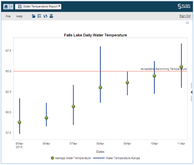
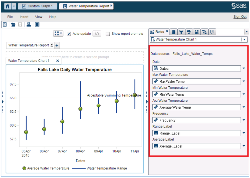
The chart above is a custom graph I created in SAS Visual Analytics. After taking the USGS water data (from last April) and feeding it into VA, I created a Vector/Bubble Plot showing the lake's daily water temperatures. I also added a reference line to show when the water is considered warm enough to swim. Below I will explain how to make this plot using the SAS Visual Analytics Graph Builder, as part of the community custom graph series.
It’s fairly easy once you start using the VA Graph Builder from the right panel in VA Home (look for Custom Graph) or from the object tab in the left panel in Visual Analytics Designer.
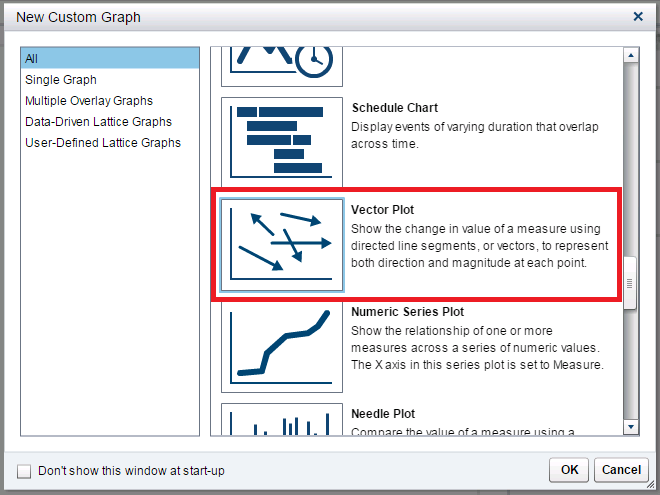
In Visual Analytics 7.1, there is a Vector Plot available in the New Custom Graph gallery. From this gallery that is on the initial page, scroll down and select the Vector Plot graph.
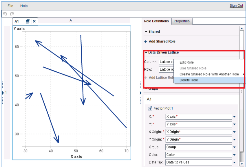
Once you have selected this plot, the next step is to edit the roles that come with the stock Vector Plot template. The first step is to remove the two Data-Driven Lattice roles. This can be achieved by clicking the small arrow to the right of these roles and selecting Delete Roll.
Do this for both the Column and Row Roles under the Data Driven Lattice menu.
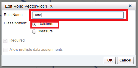
Next, continue to edit the roles that come with the stock Vector Plot. These edits will enable the plot to show the data the way we want. First, edit the X role under Vector Plot 1. This can be achieved by clicking the small arrow to the right of these roles and selecting Edit Role. After clicking Edit Role you will be presented with a dialog box asking how you wish to edit the role. For this role, we want to rename it Date and change the classification to Datetime.
Click OK. You will then be presented with a dialog box wanting you to confirm that both the X and X Origin classifications will now be Datetime. Click OK.
For the rest of the roles in the “Vector Plot 1” we simply want to rename these. This can be done via the same method for how we renamed the X role. However we do NOT need to change the classification. For each role, simply select Edit Role and edit the names as below:
- X = Date (already done)
- Y = Max Water Temperature
- X Origin = Date
- Y Origin = Min Water Temperature
- Group = Range Label
You will want to delete the two roles Color and Data Tip as they will not be used in our plot.
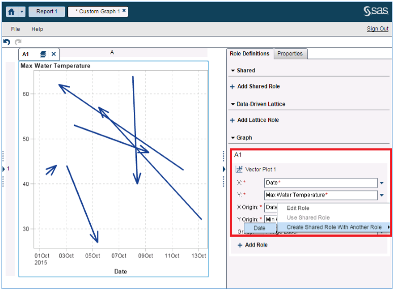
We will also need to share the X and X Origin roles within this plot. This can be achieved by clicking the small arrow to the right of the X Origin role and selecting Create Shared Role With Another Role. Select the only option, which will be the role Date.
Be sure to name this new, shared role: Date.
You’re almost done! All we need to do now is add a bubble plot to this Vector Plot so we can display the Green Bubbles from the initial chart shown above. It’s very easy to add a bubble plot to this vector plot. Simply select Bubble Plot from the left-hand pane and drag it into the center of the Vector Plot you’re currently working on.
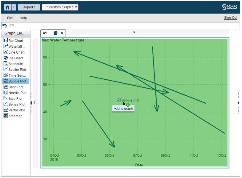
All we need to do now is edit the roles for our new bubble plot. As before, rename the roles for the bubble plot to match the names below:
- X = Date
- Y = Avg Water Temperature
- Size = Frequency
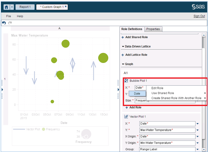
We will also need to add the X axis to the Shared Role of Date we created in the previous plot. Click the arrow on the right of the Bubble Plot’s X role and select Use Shared Role. Date will be the only option.
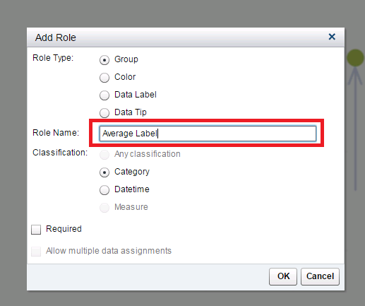
We will also need to add a new role to the bubble plot. Select Add Role under Bubble Plot 1. In the Add Role dialog box, name the new role Average Label. You can accept the rest as default choices for this new role.
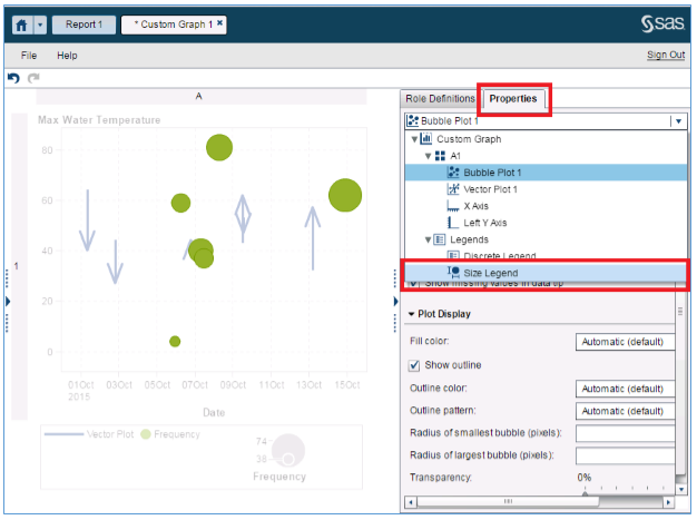
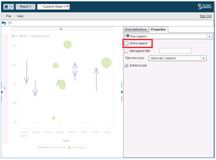
The final step to build the water temperature plot is to remove one of the Bubble Plot’s legends. This can be done by clicking the Properties tab on the right hand pane. From the initial Dropdown, select the Size Legend.
Once selected, uncheck the Show Legend option:
Now you’re done! You’ve gone through the steps to re-create the graph from the top of this post.
The final step is to use your graph in a report. For the data, you can use the data from the GSCS supplied as a csv file in this post. I edited the GSCS Data from Falls Lake last April to get the graph to have a cleaner display. Be sure this data is available in SAS Visual Analytics Designer. Place your newly created custom graph on the report canvas and map the data to the graph as shown in the Roles tab on the right of the screenshot below:
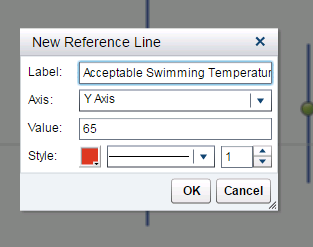
Finally, add a reference line to show when the water is warm enough to go swimming. Click Create New Reference Line on the properties panel and create one. For my ideal swimming temperature, I chose 65 degrees. But you might want to choose a different temperature depending on how brave you are!
And you’ve done it! You now have the water temperature chart we started with at the top of this post! The added benefit of course is having the dynamic capabilities of SAS Visual Analytics enabled on your graph.
How to make the example work for you:
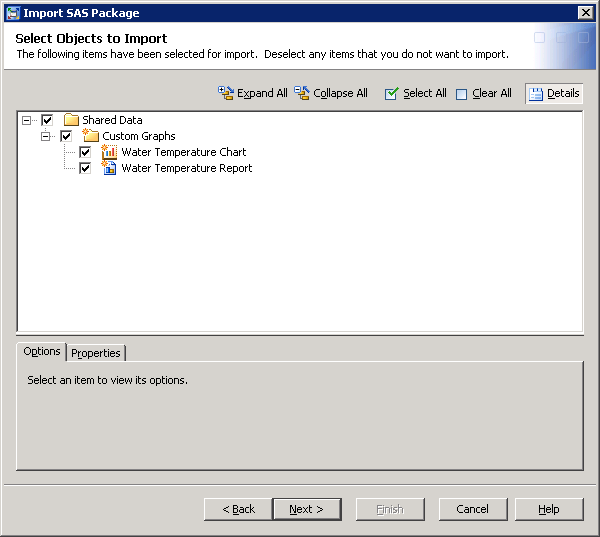
This example was created in SAS Visual Analytics 7.2. Attached is a SAS package file containing the custom graph template, sample report and data in csv file format. Load the csv file into memory on your Visual Analytics instance and you will be able to import this package if you have access to the SAS Management Console 7.2. Please refer to these instructions.
If you do not have access, contact your SAS Visual Analytics Administrator. Be sure to select the report and the custom graph.
Think you’ll give this a try? Tell us about your project, and share you own custom graph examples on the community!
Closing note: the data in this example are static (the dates are from April). However there is potential to connect this graph to an automated feed from the USGS Water Service. To see how to connect the two, use the FILENAME URL method I demonstrate in my 2012 SAS Global Form Paper, "There’s an App for That”: It’s Called SAS® ODS! Mobile Data Entry and Reporting via SAS ODS.
Don't miss out on SAS Innovate - Register now for the FREE Livestream!
Can't make it to Vegas? No problem! Watch our general sessions LIVE or on-demand starting April 17th. Hear from SAS execs, best-selling author Adam Grant, Hot Ones host Sean Evans, top tech journalist Kara Swisher, AI expert Cassie Kozyrkov, and the mind-blowing dance crew iLuminate! Plus, get access to over 20 breakout sessions.
Free course: Data Literacy Essentials
Data Literacy is for all, even absolute beginners. Jump on board with this free e-learning and boost your career prospects.
Get Started
- Find more articles tagged with:
- sas_visual_analytics_custom_graph_object
