- Home
- /
- SAS Communities Library
- /
- How to integrate a web map visualization into a SAS Visual Analytics r...
- RSS Feed
- Mark as New
- Mark as Read
- Bookmark
- Subscribe
- Printer Friendly Page
- Report Inappropriate Content
How to integrate a web map visualization into a SAS Visual Analytics report with #WebMapWednesday
- Article History
- RSS Feed
- Mark as New
- Mark as Read
- Bookmark
- Subscribe
- Printer Friendly Page
- Report Inappropriate Content
In the previous #WebMapWednesday article, we finished our first web map using the ArcGIS online toolset. Now we will look at the steps required for integrating it into a SAS Visual Analytics (VA) report.
Before you integrate a web map
At this point we need to create a VA report and download the data we are going to use. Also required is a hosted webpage built from the SAS open-source GeoWebMap project. The GitHub project has instructions on how to get this webpage set up for VA reports. In the initial #WebMapWednesday article, we learned that the data explored in this series would be related to the eruption of Mt. Kilauea in Lower Puna, Hawaii, in May of 2018.
For this article, the data is from the Hawaii Statewide GIS Program. The Hawaii Statewide GIS Program is an agency that coordinates the collection of geographic data that is used across the Hawaiian government. In 2015 they conducted research on the food sustainability of the Hawaii islands. As part of this research they compiled an agricultural baseline that documented the locations, crop type, and size of almost all the agricultural fields on the islands. We will use this agricultural baseline to map out the areas of agricultural fields affected by the lava. This will allow a better understanding of the Kilauea’s eruption impact on an industry important to the citizens of Lower Puna. To improve performance of the web map, this data has been filtered to just the Lower Puna area.
Let's get going
Once you have a new VA report ready, go to the #WebMapWednesnay GitHub project and download the file Agricultural_Baseline.csv.
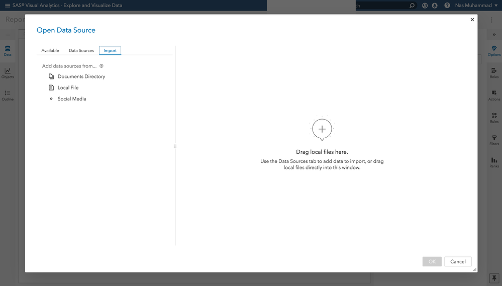
Once it is downloaded, select the Data pane in your VA report.
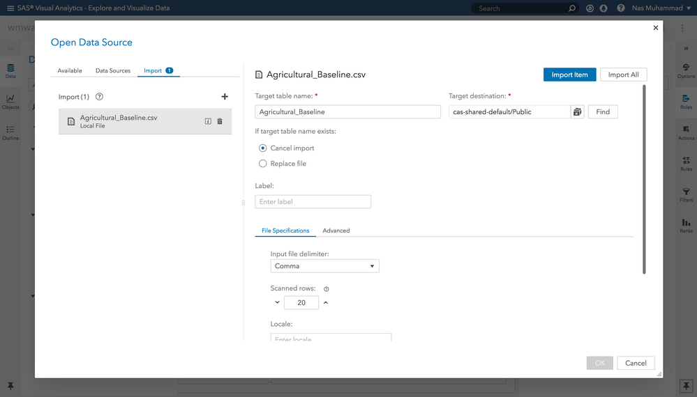
Then select Import and choose Local File.
Select the Agricultural_Baseline.csv file in the file browser. Next, select Import Item.
After the file is processed, select OK, and the data will made available in the VA report.
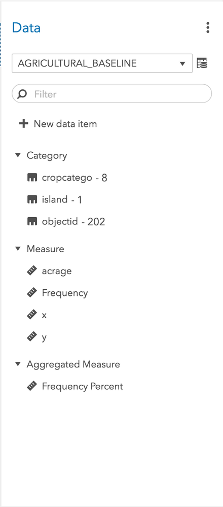
The data panel of your report should now appear like the above screen shot after a successful import of the agricultural baseline data.
Two ways to integrate your web maps in VA Reports
Now that we have created a web map, there are two ways to include it in your report: the Web Content control or Data-Driven Content control.
Web Content Control
Including a web map using the Web Content control requires a few simple steps:
- From the Objects pane in VA, drag and drop the Web Content object into your report.
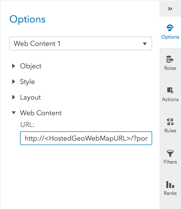
- Select the Web Content control in the report.
- In the Options pane, set the Web Content URL to the URL of your hosted GeoWebMap webpage.
- In the previous #WebMapWednesdy article, when we created a web map there was a string of alphanumeric characters associated with it called a portal item ID. We will be using this ID to point our Web Content control to the created web map. Add this argument after the URL: ?portalItemId=”<Portal Item ID of Web Map Created Earlier>”
A web map as a Web Content Control is best when the only goal is to have a web map appear in the report. If you want to add data and interact with other report elements, you’ll need a Data-Driven content control.
Data-Driven Content Control
Integration using the Data-Driven Content control has most of the same steps as the Web Content Control – the only difference being that now we will add report data into the mix. We will be creating a choropleth visualization. A choropleth is a visualization that represents geographic areas with polygons on a map. It is different from the other web map visualizations (scatter and bubble) in that it requires an Esri feature layer in addition to a provided data set. This Esri feature layer provides the choropleth with the shapes that it needs to render on the web map. The data set provided to the web map needs to have each field of data marked with a unique identifier that matches a shape in the Esri feature layer based on the ID in the Esri layer’s fields.
As mentioned before, we will be looking at the agricultural baseline data provided by the Hawaii Statewide GIS Program, which also has an Esri feature layer associated with it that can be found at their Geospatial Data Portal. The choropleth visualization will have shapes representing the areas of agricultural fields affected by the lava. We will overlay them onto the web map we created earlier.
Here's how:
- Create a new page in your report.
- Drag and drop the Data-Driven Content control into the report.
- Select the Data-Driven Content control in the report; in the Options pane, set the Web Content URL the same URL as the Web Content control we created earlier. The URL would look similar to: http://”<HostedGeoWebMapUrl>”/?portalItemId=”<Portal Item ID of Web Map Created Earlier>”
- Click OK then select the Roles
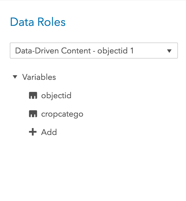
- Click Add, and select the cropcatego and objectid
- Next, add more arguments onto the URL so that the web map is aware that data is being passed to it. Add the following to the end of the url:
&visualizationType=choropleth&geoId=objectid&featureServiceGeoId=objectid&featureServiceUrl=https://geodata.hawaii.gov/arcgis/rest/services/LandUseLandCover/MapServer/4
Here is a breakdown of the URL we just created:
|
Argument |
Value |
Description |
|
visualizationType |
“choropleth” |
Can be “scatter,” “bubble,” or “choropleth” |
|
portalItemId |
String of alphanumeric characters |
The ID for the web map served at arcgis.com |
|
geoId |
“objectid” |
The label of the column containing the geographic identifiers for the areas to be drawn. Corresponds to values in the feature layer used for choropleth. |
|
featureServiceGeoId |
“objectid” |
The name of the attribute in the Esri feature service that will match values found in the geoId column of the VA data.
|
|
featureServiceUrl |
A URL pointing to an Esri feature layer |
The url to the Esri feature service containing the shapes of the geographies identified by the geoId. |
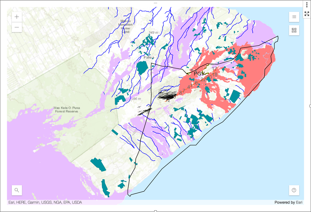
After following these steps, you should now see a collection of blue polygons overlaid onto your web map; this is a choropleth:
Congratulations! You have created your first Esri web map and integrated it into a VA report. Once a web map visualization has been integrated into a report, it can be controlled like many other VA objects through filtering and interactions.
This is just one of the ways to present SAS-processed data using Esri integration. Through the rest of the #WebMapWednesday series we will explore each possible visualization type currently available and the options that can be applied to them through the URL parameters. (See a full list on the Geoweb map Github.)
Additional resources
- Community article: Webmap case study in SAS Visual Analytics
Next Post

Remember to follow the #WebMapWednesday article series on the SAS Communities Library and the associated Twitter hashtag. Comment below or Tweet your questions and comments!
Data Appendix
- ArcGIS Server Service provided by the US Geological Survey. The feature layer used in the report visualizes the lava flow from May 3, 2018, until August 9, 2018.
- Agricultural Baseline data was collected by the Spatial Data Analysis and Visualization Lab at the University of Hawaii at Hilo.
April 27 – 30 | Gaylord Texan | Grapevine, Texas
Registration is open
Walk in ready to learn. Walk out ready to deliver. This is the data and AI conference you can't afford to miss.
Register now and lock in 2025 pricing—just $495!
SAS AI and Machine Learning Courses
The rapid growth of AI technologies is driving an AI skills gap and demand for AI talent. Ready to grow your AI literacy? SAS offers free ways to get started for beginners, business leaders, and analytics professionals of all skill levels. Your future self will thank you.
- Find more articles tagged with:
- Web Map Wednesday
