- Home
- /
- SAS Communities Library
- /
- Creating a split view radar chart in SAS Visual Analytics with #D3Thur...
- RSS Feed
- Mark as New
- Mark as Read
- Bookmark
- Subscribe
- Printer Friendly Page
- Report Inappropriate Content
Creating a split view radar chart in SAS Visual Analytics with #D3Thursday
- Article History
- RSS Feed
- Mark as New
- Mark as Read
- Bookmark
- Subscribe
- Printer Friendly Page
- Report Inappropriate Content
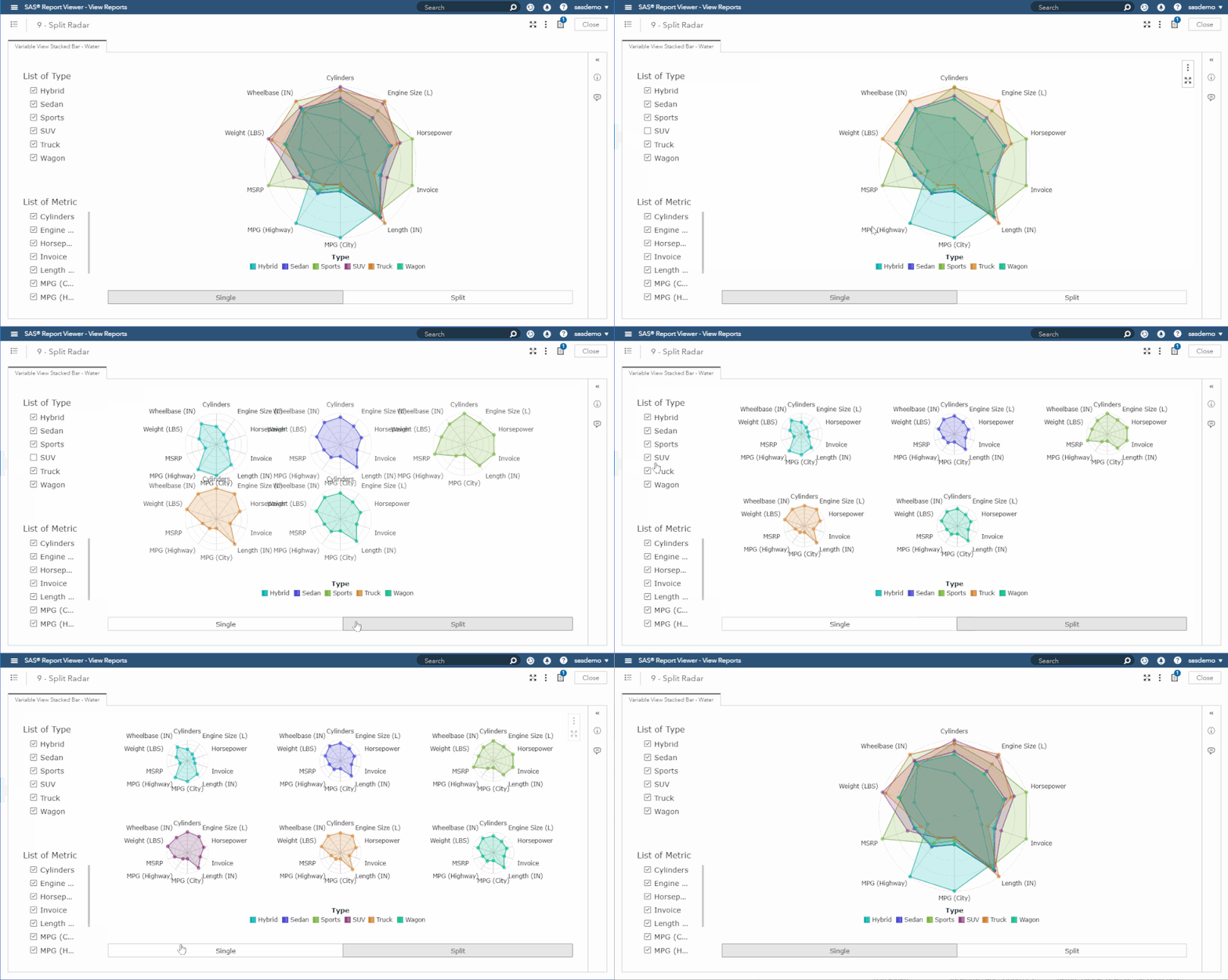
This post we will combine the knowledge gained from our previous posts to create a split view radar chart in SAS Visual Analytics (VA)!

Since this post is an amalgamation of the previous two posts (a radar chart and a variable view stacked bar chart), there isn't much new material to cover. The only new topic is how to create an optimal grid to support multiple charts in one SVG.
As with previous posts I've included sample data (Sample_Data_9.sas7bdat) for this post to help you get started. If you would like to create your own data set to use with this graph, first follow the data steps outlined in our radar chart post and then use the following SAS code to add the View column to your data set:
data YOUR_NEW_LIB.YOUR_NEW_DS;
  set YOUR_ORIG_LIB.YOUR_ORIG_DS;
  if mod(_N_, 2) eq 0 then View = "Split";
  else View = "Single";
run;
Creating the Grid
Let's hop right into the code to calculate our grid's dimensions:
function gridify() {
  const ar = WIDTH / HEIGHT;
  const factors = [];
  const n = DATA.length;
  let gridW, gridH, tileW, tileH, radius;

  // Determine possible width/height combinations to create grid
  for (let i = n; i > 0; i--) {
    gridW = i;
    gridH = Math.ceil(n / i);
    tileW = Math.max(WIDTH / gridW, TILE_MIN_WIDTH);
    tileH = Math.max((HEIGHT - LEG_HEIGHT) / gridH, TILE_MIN_HEIGHT);
    radius = Math.min(tileW - 2 * SIDE_PAD, tileH - 2 * TOP_PAD) / 2;

    factors.push({
      gridW: gridW,
      gridH: gridH,
      tileW: tileW,
      tileH: tileH,
      radius: radius
    });
  }

  // Find width/height combination that maximizes radius
  let factor = factors[0];
  for (let i = 1; i < factors.length; i++) {
    if (factors[i].radius > factor.radius) {
      factor = factors[i];
    }
  }

  // Assign global dimensions using optimal width/height
  GRID_WIDTH = factor.gridW;
  GRID_HEIGHT = factor.gridH;
  TILE_WIDTH = Math.max(WIDTH / GRID_WIDTH, TILE_MIN_WIDTH);
  TILE_HEIGHT = Math.max((HEIGHT - LEG_HEIGHT) / GRID_HEIGHT, TILE_MIN_HEIGHT);
  WIDTH = GRID_WIDTH * TILE_WIDTH;
  HEIGHT = GRID_HEIGHT * TILE_HEIGHT + LEG_HEIGHT;
}
This code uses the number of categories and the dimensions of the container to determine which grid width/height combination maximizes the radius of our split apart charts.
Now that we have our grid dimensions, we can create our individual charts:
// Create group for each category and create sub-elements within each group
CATEGORY_GROUPS = SVG.selectAll(".g-category").data(DATA, function(d) {
  return d.category;
});

CATEGORY_GROUPS.enter()
  .append("g")
  .classed("g-category", true)
  .attr("id", function(d) {
    return "g-category-" + d.category;
  })
  .merge(CATEGORY_GROUPS)
  .attr("transform", function(d, i) {
    return SPLIT
      ? "translate(" +
        ((i % GRID_WIDTH) * TILE_WIDTH + TILE_WIDTH / 2) +
        ", " +
        (TOP_PAD + Math.floor(i / GRID_WIDTH) * TILE_HEIGHT + RADIUS) +
        ")"
      : "translate(" + WIDTH / 2 + ", " + (TOP_PAD + RADIUS) + ")";
  })
  .each(function(d, i) {
    let categoryGroup = this;
    let iCategory = i;

    // Create grid lines
    ...

    // Create grid circles
    ...

    // Create measure labels
    ...

    // Create data paths + data points
    ...
  });
I won't spend much time here, but it is important to note that we now have to create a set of grid lines, grid circles, measure labels, data paths, and data points for each category group. This allows us to split what was previous one single chart into one chart per category.
For more details on how to handle this split and the transitions between views, please check out the full code at the GitHub linked below!
Additional Resources
Next Post
Next post we will learn to visualize nested data using a sunburst chart!
Remember to follow these articles on the SAS Communities Library and the #D3Thursday Twitter hashtag. Comment below or Tweet your questions and comments!
- Mark as Read
- Mark as New
- Bookmark
- Permalink
- Report Inappropriate Content
Where I am supposed to run this code? thx
- Mark as Read
- Mark as New
- Bookmark
- Permalink
- Report Inappropriate Content
You can test out this visualization in Visual Analytics by copying the URL for the demo file (https://sassoftware.github.io/sas-visualanalytics-thirdpartyvisualizations/samples/D3Thursday/9_Spli...) and pasting it into the URL option field for your data-driven content object. For production, you should create a copy of the HTML file (https://github.com/sassoftware/sas-visualanalytics-thirdpartyvisualizations/blob/master/samples/D3Th...) and place it on a server you own so that it can be accessed from your VA server. You would then link to the production version of the file on your server, rather than the demo file linked above. For an in depth tutorial on creating and linking third-party content in VA, please see my first D3 Thursday post: https://communities.sas.com/t5/SAS-Communities-Library/Customize-data-visualizations-in-SAS-Visual-A....
April 27 – 30 | Gaylord Texan | Grapevine, Texas
Registration is open
Walk in ready to learn. Walk out ready to deliver. This is the data and AI conference you can't afford to miss.
Register now and save with the early bird rate—just $795!
SAS AI and Machine Learning Courses
The rapid growth of AI technologies is driving an AI skills gap and demand for AI talent. Ready to grow your AI literacy? SAS offers free ways to get started for beginners, business leaders, and analytics professionals of all skill levels. Your future self will thank you.
- Find more articles tagged with:
- D3 Thursday

