- Home
- /
- SAS Communities Library
- /
- Charting Complex Timelines with SAS -- and Van Halen
- RSS Feed
- Mark as New
- Mark as Read
- Bookmark
- Subscribe
- Printer Friendly Page
- Report Inappropriate Content
Charting Complex Timelines with SAS -- and Van Halen
- Article History
- RSS Feed
- Mark as New
- Mark as Read
- Bookmark
- Subscribe
- Printer Friendly Page
- Report Inappropriate Content
SAS programming concepts in this and other Free Data Friday articles remain useful, but SAS OnDemand for Academics has replaced SAS University Edition as a free e-learning option. Hit the orange button below to start your journey with SAS OnDemand for Academics:
In the cult classic 1984 mockumentary movie This is Spinal Tap, one of the tropes so effectively parodied was the constant changes in line up experienced by so many rock bands. The trope is, of course, all the more effective because it’s so true.
Many bands undergo huge changes in personnel over the years, often raising the question of how authentic the current line up truly is. One way that the online encyclopaedia Wikipedia attempts to make sense of these changes is through a standard timeline chart showing personnel, instruments and studio albums released.
In this edition of Free Data Friday, we will be using data from Wikipedia to recreate these timeline charts with some improvements and also showing how they can be used to illustrate timelines in other fields and to quickly identify trends and points of interest.
Get the Data
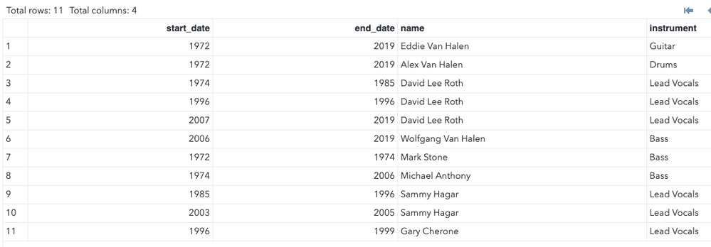
I decided to use data from Wikipedia relating to the varying membership of one my favourite bands – Van Halen. Given the relatively small amount of data involved, it was simpler to copy it manually than it would have been to attempt to scrape it from the Wikipedia page. Here is the SAS code used to create the required data with a screen shot of the resulting file:
data vanhalen;
	infile datalines dlm=",";
	length start_date 8. end_date 8. name $30 instrument $20;
	input start_date end_date name instrument;
	datalines;
1972,2019,Eddie Van Halen,Guitar
1972,2019,Alex Van Halen,Drums
1974,1985,David Lee Roth,Lead Vocals
1996,1996,David Lee Roth,Lead Vocals
2007,2019,David Lee Roth,Lead Vocals
2006,2019,Wolfgang Van Halen,Bass
1972,1974,Mark Stone,Bass
1974,2006,Michael Anthony,Bass
1985,1996,Sammy Hagar,Lead Vocals
2003,2005,Sammy Hagar,Lead Vocals
1996,1999,Gary Cherone,Lead Vocals
;
run;
Get Started with SAS OnDemand for Academics
 Getting the Data Ready
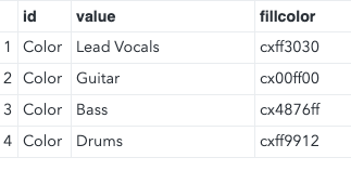
Because I created the input data set myself, there was nothing I needed to do to it in this phase. I did create an attribute map data set to control the colors used for the instrument bars. Attribute maps work rather like formats in that they allow you to control chart attributes based on the data charted. This particular map ensures that as long as I used the attribute map the bars denoting an artist’s instrument would always be consistent in color e.g. guitarists bars would always be green, vocalists bars always red etc. Here’s the code to create the attribute map data set and a screen shot of the resulting data set:
data getattrs;
	retain id 'Color';
	infile datalines dlm=",";
	length value $20 fillcolor $8;
	input value fillcolor;
	datalines;
Lead Vocals,cxff3030
Guitar,cx00ff00
Bass,cx4876ff
Drums,cxff9912
;
run;
The Results
Firstly, I examined the chart displayed on the Van Halen Wikipedia page along with a few others. This is what the Van Halen chart looks like:
There were some things I wasn’t 100% happy with:
- I didn’t like the way an artist’s secondary instruments were displayed. It makes the colors difficult to see leading to potential confusion. In addition, looking at entries for some performers I found it difficult to see much justification for showing their “second string” instrument; and
- I felt the bars were a little small, again making it difficult to discern the colors.
The way to create a timeline chart like this with SAS University Edition is to use the SGPlot procedure to build a highlow chart. This creates a form of bar chart in which the bars “float” i.e. the bars do not have to start at the lowest point of the axis and can break at multiple points if necessary. Here’s the code I used to create my Van Halen timeline chart
ods graphics on / width=8in height=5in;
title "Van Halen Timeline";
footnote1 j=l "Notes:";
footnote2 j=l "1. David Lee Roth briefly reunited with Van Halen in 1996";
footnote3 j=l "2. Eddie Van Halen performed lead vocals in addition to guitar 1972-1974";
footnote4 j=l "3. Eddie Van Halen performed keyboards on a number of tracks,
	most notably 'Jump'";
footnote5 j=r "Data From Wikipedia";
proc sgplot data=vanhalen dattrmap=getattrs;
	highlow y=name low=start_date high=end_date /
		group=instrument
		type=bar
		barwidth=0.5
		attrid=color
		name="hllegend";
		yaxis label="Band Member" reverse;
		xaxis label="Year" values=(1972 to 2019 by 2);
		refline 1978 1979 1980 1981 1982 1984 1986
				1988 1991 1995 1998 2012/ axis=x lineattrs=(thickness=4
			color=cx000000) legendlabel ="Studio Album" name="reflegend";
		keylegend "hllegend" "reflegend";
run;
There are several points to note:
- I wanted to add some explanatory points to the chart to explain important things which would otherwise not be shown or would be unclear. The simplest way of doing this was by using multiple footnotes. These were:
- David Lee Roth’s short-lived reunion with the band in 1996. Because he re-joined and left within the same calendar year and I’m using year values for the X axis the bar for that brief period is not displayed; and
- Eddie Van Halen’s brief period as a lead vocalist during the early part of the band’s history – as I mentioned I didn’t want to include secondary roles on the chart itself and so otherwise the reader would be left wondering who the vocalist was during that early period; and
- Despite my dislike of including secondary instruments I felt it important to mention Eddie Van Halen’s role as a keyboard player, particularly as it features so prominently in their most famous single, “Jump”.
- I added the reference line description into the legend by using the keylegend statement. This allows for much greater control over the contents and appearance than if you simply use a default legend; and
-
I obtained the hex values for the all the colors I used from a web page which I often use which gives values for over 500 colors
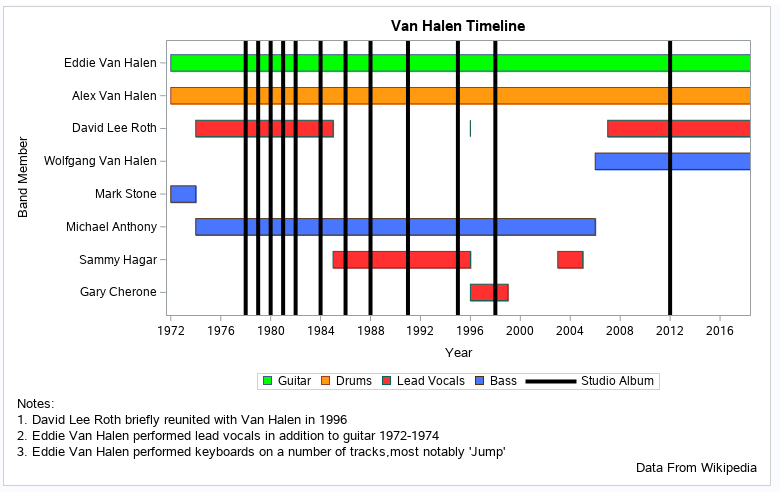
This is what the final chart looks like
We can see a couple of things straight away from the timeline:
- Van Halen is, by the standards of rock bands, quite stable with the exception of the lead vocalist role which, apart from one period (with Gary Cherone), has repeatedly “churned” between David Lee Roth and Sammy Hagar; and
- In the late 1970s and early 1980s the band was extremely prolific in terms of studio albums with a marked tailing off in recent years (only one album since 2000.)
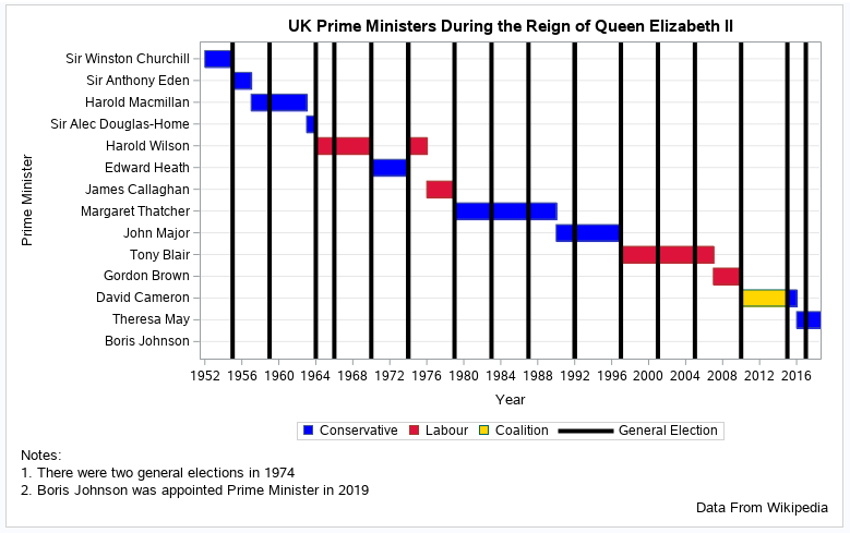
Of course, these timelines could be used for more serious subjects. Here’s the code and output for a timeline I created showing which UK Prime Ministers have served during the reign of Queen Elizabeth II:
data primeministers;
	infile datalines dlm=",";
	length start_date 8. end_date 8. name $30 party $20;
	input start_date end_date name party;
	datalines;
1952,1955,Sir Winston Churchill,Conservative
1955,1957,Sir Anthony Eden,Conservative
1957,1963,Harold Macmillan,Conservative
1963,1964,Sir Alec Douglas-Home,Conservative
1964,1970,Harold Wilson,Labour
1970,1974,Edward Heath,Conservative
1974,1976,Harold Wilson,Labour
1976,1979,James Callaghan,Labour
1979,1990,Margaret Thatcher,Conservative
1990,1997,John Major,Conservative
1997,2007,Tony Blair,Labour
2007,2010,Gordon Brown,Labour
2010,2015,David Cameron,Coalition
2015,2016,David Cameron,Conservative
2016,2019,Theresa May,Conservative
2019,2019,Boris Johnson,Conservative
;
run;

data getattrs;
	retain id 'Color';
	infile datalines dlm=",";
	length value $20 fillcolor $8;
	input value fillcolor;
	datalines;
Conservative,cx0000ff
Labour,cxdc143c
Coalition,cxffd700
;
run;

ods graphics on / width=8in height=5in;
title "UK Prime Ministers During the Reign of Queen Elizabeth II";
footnote1 j=l "Notes:";
footnote2 j=l "1. There were two general elections in 1974";
footnote3 j=l "2. Boris Johnson was appointed Prime Minister in 2019";
footnote4 j=r "Data From Wikipedia";

proc sgplot data=primeministers dattrmap=getattrs;
	highlow y=name low=start_date high=end_date /
		group=party
		type=bar
		barwidth=0.75
		attrid=color
		name="hllegend";
		yaxis label="Prime Minister" reverse grid;
		xaxis label="Year" values=(1952 to 2019 by 2);
		refline 1955 1959 1964 1966 1970 1974 1974
			1979 1983 1987 1992 1992 1997 2001 2005
			2010 2015 2017 / axis=x lineattrs=(thickness=4
			color=cx000000) legendlabel ="General Election" name="reflegend";
		keylegend "hllegend" "reflegend";
run;
Three things are apparent from the chart:
- The large preponderance of Prime Ministers during this period have come from the Conservative party – the blue bars far outnumber the red ones.
- Only one Prime Minister has regained the role after losing it during the Queen’s reign, Harold Wilson, who was Prime Minister 1966-1970 and 1974-1976. The chart doesn’t show this but in earlier years regaining the role was much more common.
- The three longest continuous periods in office were consecutive – the premierships of Margaret Thatcher, John Major and Tony Blair.
Now it's your Turn!
Did you find something else interesting in this data? Share in the comments. I’m glad to answer any questions.
Visit [[this link]] to see all the Free Data Friday articles.
SAS AI and Machine Learning Courses
The rapid growth of AI technologies is driving an AI skills gap and demand for AI talent. Ready to grow your AI literacy? SAS offers free ways to get started for beginners, business leaders, and analytics professionals of all skill levels. Your future self will thank you.
- Find more articles tagged with:
- Data for learning
- Free Data Friday


