- Home
- /
- Programming
- /
- Graphics
- /
- Bargraph with an Axis of Percent
- RSS Feed
- Mark Topic as New
- Mark Topic as Read
- Float this Topic for Current User
- Bookmark
- Subscribe
- Mute
- Printer Friendly Page

- Mark as New
- Bookmark
- Subscribe
- Mute
- RSS Feed
- Permalink
- Report Inappropriate Content
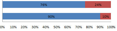
Does SAS 9.2 have the ability to display a Bargraph with an Axis of percent? My goal is to show a percent comparison of variable ‘Status’. Like the below image. The code would theoretically look something like this.
proc gchart data=enrollment;
hbar enrRepTy /
type=percent
inside=subpct
sumvar=STUDENTS_ENROLLED
pctsum
subgroup=Status
discrete
gaxis=axis1 maxis=axis2 raxis=axis3
legend = legend1;
run; Quit;
Accepted Solutions

- Mark as New
- Bookmark
- Subscribe
- Mute
- RSS Feed
- Permalink
- Report Inappropriate Content
http://robslink.com/SAS/democd7/aaaindex.htm
Has some examples that should get you started.
A common theme has to do with the AXIS definition in the values part and format chosen.
- Mark as New
- Bookmark
- Subscribe
- Mute
- RSS Feed
- Permalink
- Report Inappropriate Content
What I could do is make a summary dataset that has the percentages hard coded rather than attempting to calculate the percentage when making the graph. It is highly likely there is a built in function for this though.

- Mark as New
- Bookmark
- Subscribe
- Mute
- RSS Feed
- Permalink
- Report Inappropriate Content
Can you provide sample data?
- Mark as New
- Bookmark
- Subscribe
- Mute
- RSS Feed
- Permalink
- Report Inappropriate Content
http://robslink.com/SAS/democd7/aaaindex.htm
Has some examples that should get you started.
A common theme has to do with the AXIS definition in the values part and format chosen.
- Mark as New
- Bookmark
- Subscribe
- Mute
- RSS Feed
- Permalink
- Report Inappropriate Content
Ballardw, I found this in one of the examples in your link. It is straight forward.
data my_data;
input CATEGORY SERIES $ 3-11 AMOUNT;
datalines;
1 Series A 5.0
2 Series A 6.8
3 Series A 9.2
1 Series B 6.5
2 Series B 6.9
3 Series B 5.6
1 Series C 2.3
2 Series C 3.1
3 Series C 2.3
;
run;
proc sql;
create table my_data as
select *, sum(amount) as bartotal
from my_data
group by category;
quit; run;
data my_data; set my_data;
format catpct percent6.0;
catpct=amount/bartotal;
run;
data my_data; set my_data;
length htmlvar $500;
htmlvar=
'title='||quote(
'Category: '||trim(left(category))||'0D'x||
'Series: '||trim(left(series))||'0D'x||
'Amount: '||trim(left(amount))||'0D'x||
'Percent: '||trim(left(put(catpct,percent6.0)))||' of '||trim(left(bartotal))
)||
' href="bar6_info.htm"';
run;
proc gchart data=my_data;
hbar category / discrete type=sum sumvar=catpct nostats nolegend
subgroup=series /* this controls the coloring */
autoref clipref cref=graycc space=4.0
maxis=axis1 raxis=axis2
cframe=white coutline=black
html=htmlvar
des='' name="&name";
run;

- Mark as New
- Bookmark
- Subscribe
- Mute
- RSS Feed
- Permalink
- Report Inappropriate Content
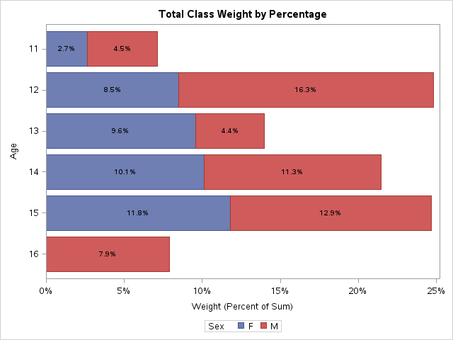
SAS 9.4m2 supports everything you want via PROC SGPLOT (see below). SAS 9.4 supports everything but the segment labels. At SAS 9.2, you will need to pre-summarize as you suggested.
Title "Total Class Weight by Percentage";
proc sgplot data=sashelp.class;
hbar age / response=weight stat=pct group=sex seglabel;
run;
SAS Innovate 2025: Call for Content
Are you ready for the spotlight? We're accepting content ideas for SAS Innovate 2025 to be held May 6-9 in Orlando, FL. The call is open until September 25. Read more here about why you should contribute and what is in it for you!
Learn how use the CAT functions in SAS to join values from multiple variables into a single value.

Find more tutorials on the SAS Users YouTube channel.
 Click image to register for webinar
Classroom Training Available!
Select SAS Training centers are offering in-person courses. View upcoming courses for:
-
5 replies
-
01-16-2015 03:40 PM
-
2119 views
-
3 likes
-
4 in conversation
-
