- Home
- /
- Programming
- /
- Programming
- /
- how to choose to display some of the values
- RSS Feed
- Mark Topic as New
- Mark Topic as Read
- Float this Topic for Current User
- Bookmark
- Subscribe
- Mute
- Printer Friendly Page
- Mark as New
- Bookmark
- Subscribe
- Mute
- RSS Feed
- Permalink
- Report Inappropriate Content
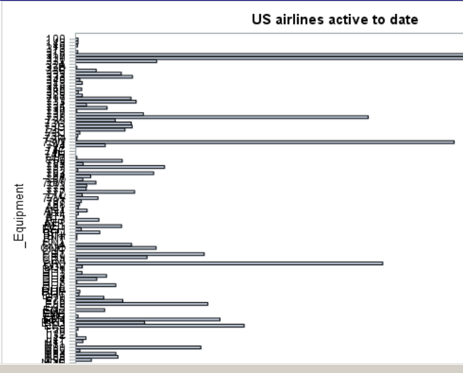
the names on the yaxis are overlap because two many values.
Can I just choose some values to display? e.g. choose formmer three values with a higher frequency.
I use the flowwing code to draw the plot
PROC SGPLOT DATA= Us_flight;
HBAR _Equipment ;
YAXIS FITPOLICY = NONE;
RUN;Accepted Solutions
- Mark as New
- Bookmark
- Subscribe
- Mute
- RSS Feed
- Permalink
- Report Inappropriate Content
It might be simpler to make your value labels smaller with FITPOLICY=NONE VALUEATTRS=(size=5);
- Mark as New
- Bookmark
- Subscribe
- Mute
- RSS Feed
- Permalink
- Report Inappropriate Content
You could try combining VALUES= and VALUESDISPLAY= option in the YAXIS statement.
YAXIS FITPOLICY=NONE VALUES=("A" "B" "C") VALUESDISPLAY=("A" "" "C");
will display values for A, B, and C but labels for A and C only.
- Mark as New
- Bookmark
- Subscribe
- Mute
- RSS Feed
- Permalink
- Report Inappropriate Content
It might be simpler to make your value labels smaller with FITPOLICY=NONE VALUEATTRS=(size=5);
SAS Innovate 2025: Call for Content
Are you ready for the spotlight? We're accepting content ideas for SAS Innovate 2025 to be held May 6-9 in Orlando, FL. The call is open until September 25. Read more here about why you should contribute and what is in it for you!
Learn how use the CAT functions in SAS to join values from multiple variables into a single value.
Find more tutorials on the SAS Users YouTube channel.
 Click image to register for webinar
Classroom Training Available!
Select SAS Training centers are offering in-person courses. View upcoming courses for:


