- Home
- /
- SAS Communities Library
- /
- Use Python to Visualize CAS Results
- RSS Feed
- Mark as New
- Mark as Read
- Bookmark
- Subscribe
- Printer Friendly Page
- Report Inappropriate Content
Use Python to Visualize CAS Results
- Article History
- RSS Feed
- Mark as New
- Mark as Read
- Bookmark
- Subscribe
- Printer Friendly Page
- Report Inappropriate Content
SAS Viya’s Open Source integration allows you to work with CAS results with several different tools: Python, R, Lua, Java, and REST. SAS’s proprietary Python library, SWAT (SAS Scripting Wrapper for Analytics Transfer), extends the open source visualization library matplotlib, an incredible tool for creating meaningful graphs from data. SWAT utilizes matplotlib entirely in the background, allowing a user to visualize their CAS data with a single line of code. This article serves as an introduction to the matplotlib library and its integration with SWAT.
SWAT and matplotlib
Before I begin exploring matplotlib, I want to draw attention to how exactly SWAT can utilize matplotlib in the background.
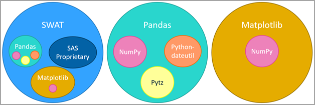
One of Python’s greatest features is its dense catalog of libraries. As a part of SAS Viya’s Open Source integration, SAS has published a proprietary library named SWAT (SAS Scripting Wrapper for Analytics Transfer), which allows you to access CAS results inside a Python environment. SWAT includes tools for visualizing CAS results thanks to the extension of a very popular Python library named matplotlib. Seen below is the composition of SWAT’s internal libraries.
As seen, matplotlib comes as a library internal to SWAT.
Select any image to see a larger version.
Mobile users: To view the images, select the "Full" version at the bottom of the page.
SWAT is designed to run all the matplotlib code in the background, which allows a user to create meaningful graphs from CAS results in a single line of code. There is also an option to import it directly, which allows full access to the library’s features. This article serves as introduction on how to use SWAT and matplotlib to visualize CAS results.
Installing matplotlib
If you are looking to access the full features of matplotlib, you’ll need to install it. To do so, use the Python package manager pip. Open a command prompt and enter the following command:
py -m pip install matplotlib
After you run this command, you will now be able to import matplotlib into any of your Python programs you create. If you are looking to use matplotlib in a Jupyter Notebook on a JupyterHub server, you will also need to use pip to install it. To install matplotlib via pip, create a new cell in your Jupyter notebook and enter the following command:
pip install matplotlibIntro to matplotlib
Importing
Before using matplotlib inside your Python environment, you’ll need to import the package with the following code:
import matplotlib.pyplot as plt
If this cell runs successfully, then you have successfully downloaded and imported matplotlib.
Figures and Axes
Graphs in matplotlib are reliant on two object types: axes and figures. A figure is the highest-level object type which can hold one or more axes. The axes are the object that points can be plotted upon. Both figures and axes have many attributes and functions assigned to them, which allows the user to build and customize their graphs to meet their specific needs.
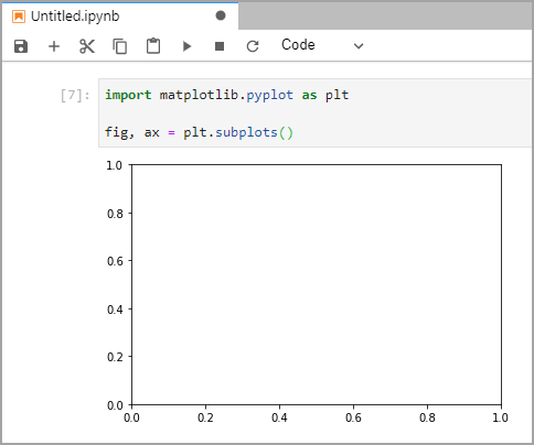
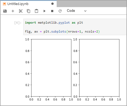
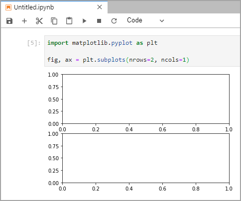
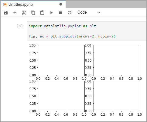
To create a basic graph, the plt.subplots() function can be used. This function creates the figure and axes for a given graph at the same time. By default, this function creates a figure with a single pair of axes, but the nrows and ncols parameters can be set to create multiple axes inside the figure.
fig, ax = plt.subplots() # Creates a figure with a single pair of axes
fig, ax = plt.subplots(nrows = 1, ncols = 2) # Creates a figure with 2 axes aligned horizontally
fig, ax = plt.subplots(nrows = 2, ncols = 1) # Creates a figure with 2 axes aligned vertically
fig, ax = plt.subplots(nrows = 2, ncols = 2) # Creates a figure with 4 axes
When creating a figure with multiple axes, the default figure size (6.4 x 4.8 inches) may be too small. The figsize parameter can be used to resize the figure produced by plt.subplots().
fig, ax = plt.subplots(nrows = 1, ncols = 2, figsize=(12, 6)) # Creates a figure of size 12x6 inches with 2 axes
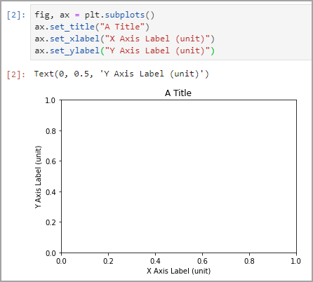
When creating visualizations, it’s important to label your data correctly. The ax.set_title(), ax.set_xlabel(), and ax.set_ylabel() allows you to provide context to your graph.
fig, ax = plt.subplots()
ax.set_title("A Title")
ax.set_xlabel("X Axis Label (unit)")
ax.set_ylabel("Y Axis Label (unit)")
Plotting Data
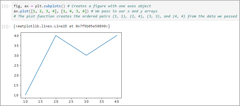
To plot data on an axes object, use axes.plot() function. By passing the x and y parameters as two 1-dimensional arrays, matplotlib is able to create (x, y) coordinates to then plot on the axes.
fig, ax = plt.subplots() # Creates a figure with one axes object
ax.plot([1, 2, 3, 4], [1, 4, 3, 4]) # We pass in our x and y arrays
# The plot function creates the ordered pairs (1, 1), (2, 4), (3, 3), and (4, 4) from the data we passed
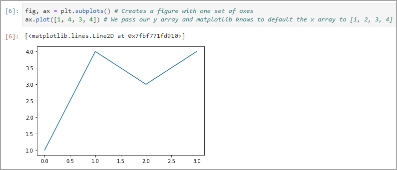
The default value for the x array is [1, 2, 3, …, n] where n is the size of the y array. This means that the only required parameter for ax.plot() is the y array.
fig, ax = plt.subplots() # Creates a figure with one set of axes
ax.plot([1, 4, 3, 4]) # We pass our y array and matplotlib knows to default the x array to [1, 2, 3, 4]
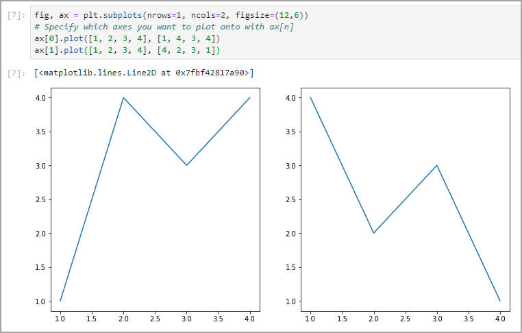
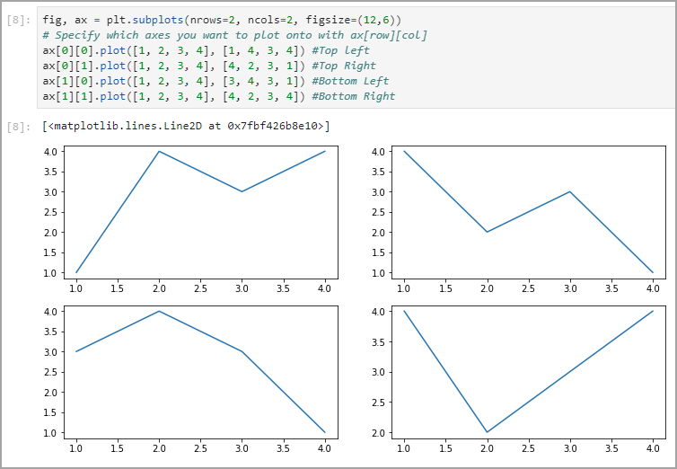
In the case you have created a figure with multiple axes, plotting on either set of axes is quite simple.
fig, ax = plt.subplots(nrows=1, ncols=2, figsize=(12,6))
# Specify which axes you want to plot onto with ax[n]
ax[0].plot([1, 2, 3, 4], [1, 4, 3, 4])
ax[1].plot([1, 2, 3, 4], [4, 2, 3, 1])
fig, ax = plt.subplots(nrows=2, ncols=2, figsize=(12,6))
# Specify which axes you want to plot onto with ax[row][col]
ax[0][0].plot([1, 2, 3, 4], [1, 4, 3, 4]) #Top left
ax[0][1].plot([1, 2, 3, 4], [4, 2, 3, 1]) #Top Right
ax[1][0].plot([1, 2, 3, 4], [3, 4, 3, 1]) #Bottom Left
ax[1][1].plot([1, 2, 3, 4], [4, 2, 3, 4]) #Bottom Right
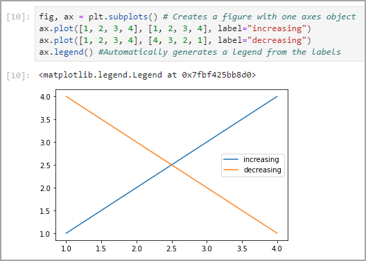
It’s also possible to plot multiple sets of data on a single set of axes. It’s important to label your data sets to make your visualizations more meaningful.
fig, ax = plt.subplots() # Creates a figure with one axes object
ax.plot([1, 2, 3, 4], [1, 2, 3, 4], label="increasing")
ax.plot([1, 2, 3, 4], [4, 3, 2, 1], label="decreasing")
ax.legend() #Automatically generates a legend from the labels
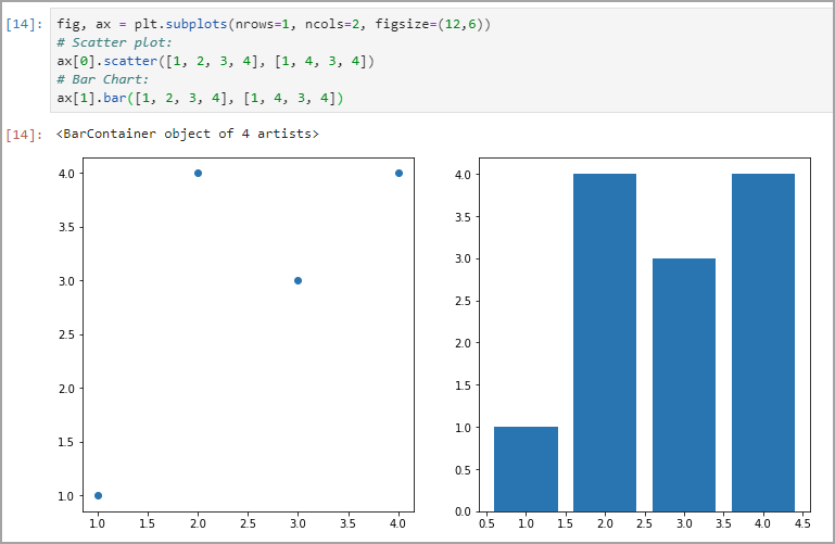
Matplotlib also has various functions for different types of graphs, such as scatter plots, bar charts, histograms, pie charts and more.
fig, ax = plt.subplots(nrows=1, ncols=2, figsize=(12,6))
# Scatter plot:
ax[0].scatter([1, 2, 3, 4], [1, 4, 3, 4])
# Bar Chart:
ax[1].bar([1, 2, 3, 4], [1, 4, 3, 4])
Visualizing CAS Results
Rarely would you want to pull an entire data source out of CAS to visualize. CAS, the Cloud Analytic Service, is a platform for high-performance analytics and distributed computing. It’s meant to perform analytics on large data quickly! Data is stored in a distributed manner across CAS nodes, and you would not want to pull that data source down into a Python instance to visualize. Instead, you should visualize CAS results from analytics operations.
CAS can perform all types of analytics, from statistics to data mining and machine learning to optimization and forecasting. For example, you could model and score Titanic Survival as seen here. At the bottom of this example, the ROC and Lift graphs are examples of when matplotlib can be used for local visualization, while the analytics are left to CAS.
See this article for additional information about the available SAS engines: Understanding SAS: The Different Processing Engines
Connect to CAS using SWAT
To use the SWAT (SAS Wrapper for Analytics Transfer) library with Python, first install it just as you did matplotlib using:
py -m pip install swat
or
pip install swat
and then be sure to import it with the following Python code
import swat
Creating your CAS Connetion
To create your CAS session, you’ll need to run the following code:
sess = swat.CAS("sas-cas-server-default-client", port=5570, username="username", password="password")
sess
This CAS session was created using a binary connection on the port 5570. Depending on how your SAS administrator set up your CAS server, the name of your server or the port it can be accessed may be different. If you are having trouble accessing your CAS server via SWAT, contact your SAS administrator.
Visualization Examples
The following visualization examples will be using small tables available in the SAS Help library. Remember that it is not advised to bring an entire data source down into Python to visualize but, instead, the analytics results.
Creating a Scatter Plot using SWAT
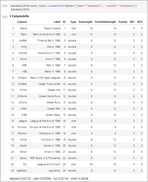
With a CAS session created, you’ll be able to visualize results using matplotlib easily. Using the data found in SASHELP.BASEBALL, I created a scatter plot of the number of home runs a player made versus their yearly salary. First, I pulled the column info for the SASHELP.BASEBALL table so that I knew the official column names.
baseballInfo=sess.table.columnInfo(table={"name":"baseball", "caslib":"helpdata"})
baseballInfo
SASHELP.BASEBALL contains 24 columns of data for each player, but I only wanted to graph the columns Salary versus nRuns. With these two variable names in mind, I graphed my data using the following code:
baseballSubset = sess.table.fetch(fetchVars=[{"name":"salary"}, {"name":"nRuns"}], table={"name":"baseball", "caslib":"helpdata", "where":"Salary"}, to=1000)
baseballTable = baseballSubset.get_tables("Fetch")[0]
baseballTable.plot.scatter(x="Salary", y="nRuns")
By specifying my fetchVars as “salary” and “nRuns”, I ensured that my results contained only the data necessary to my visualization. As well, the use of “where Salary” ensured that any rows where the Salary was unknown (NaN) were not fetched.
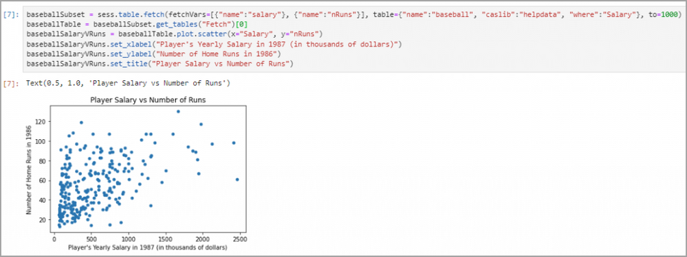
SWAT runs all the matplotlib code in the background, creating a figure, axes, and then plotting on the axes all in one line of code. The CASTable.plot.scatter() function returns the axes object that was created in the background. As shown by the graph outputted with the code above, the graph lacks some important information, such as descriptive x and y axis labels. To label the axes, matplotlib functions can be used, as shown below:
baseballSubset = sess.table.fetch(fetchVars=[{"name":"salary"}, {"name":"nRuns"}], table={"name":"baseball", "caslib":"helpdata", "where":"Salary"}, to=1000)
baseballTable = baseballSubset.get_tables("Fetch")[0]
baseballSalaryVRuns = baseballTable.plot.scatter(x="Salary", y="nRuns")
baseballSalaryVRuns.set_xlabel("Player's Yearly Salary in 1987 (in thousands of dollars)")
baseballSalaryVRuns.set_ylabel("Number of Home Runs in 1986")
baseballSalaryVRuns.set_title("Player Salary vs Number of Runs")
Alternatively, these values can be fed directly into the plot.scatter() function as parameters:
baseballSubset = sess.table.fetch(fetchVars=[{"name":"salary"}, {"name":"nRuns"}], table={"name":"baseball", "caslib":"helpdata", "where":"Salary"}, to=1000)
baseballTable = baseballSubset.get_tables("Fetch")[0]
baseballSalaryVRuns = baseballTable.plot.scatter(x="Salary", y="nRuns", xlabel="Player's Yearly Salary in 1987 (in thousands of dollars)", ylabel="Number of Home Runs in 1986", title="Player Salary vs Number of Runs")
Creating a Line Graph using matplotlib
To explore some more advanced usage of the CASTable.plot() functions, I created a line graph using the results from SASHELP.STOCKS. The STOCKS table contains stock market data for three companies (IBM, Micosoft, and Intel) from 1996 to 2005.
Similar to the last example, SASHELP.STOCKS has more columns than we will be using in our visualization. I first pulled the column info for SASHELP.STOCKS using the following code:
stocksInfo=sess.table.columnInfo(table={"name":"stocks", "caslib":"helpdata"})
stocksInfo
As seen, there are eight total columns, but for my visualization, I only focused on the Stock, Date, and Close columns. I created three results, one for each of the companies, using the code below:
stocksSubsetIBM = sess.table.fetch(fetchVars=[{"name":"Stock"}, {"name":"Date"}, {"name":"Close"}], table={"name":"stocks", "caslib":"helpdata", "where":"Stock = 'IBM'"}, to=1000)
IBMTable = stocksSubsetIBM.get_tables("Fetch")[0]
stocksSubsetIntel = sess.table.fetch(fetchVars=[{"name":"Stock"}, {"name":"Date"}, {"name":"Close"}], table={"name":"stocks", "caslib":"helpdata", "where":"Stock = 'Intel'"}, to=1000)
intelTable = stocksSubsetIntel.get_tables("Fetch")[0]
stocksSubsetMicrosoft = sess.table.fetch(fetchVars=[{"name":"Stock"}, {"name":"Date"}, {"name":"Close"}], table={"name":"stocks", "caslib":"helpdata", "where":"Stock = 'Microsoft'"}, to=1000)
microsoftTable = stocksSubsetMicrosoft.get_tables("Fetch")[0]
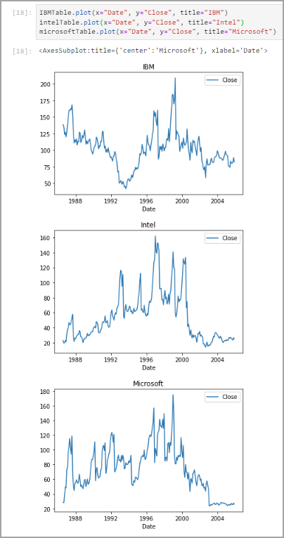
I first plotted the three results by creating three separate figures for each graph, which returns three graphs in three rows.
IBMTable.plot(x="Date", y="Close", title="IBM")

intelTable.plot(x="Date", y="Close", title="Intel")

microsoftTable.plot(x="Date", y="Close", title="Microsoft")
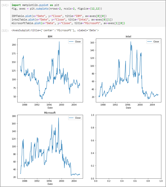
By importing and implementing matplotlib, it is possible to create a subplot and then plot your data on axes of your choice. I created a subplot with 2 rows by 2 columns, and then plotted onto three of those axes:
import matplotlib.pyplot as plt
fig, axes = plt.subplots(nrows=2, ncols=2, figsize=(12,12))

IBMTable.plot(x="Date", y="Close", title="IBM", ax=axes[0][0])
intelTable.plot(x="Date", y="Close", title="Intel", ax=axes[0][1])
microsoftTable.plot(x="Date", y="Close", title="Microsoft", ax=axes[1][0])
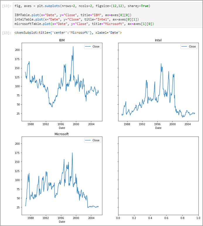
These graphs were not comparable, though, as their y axes were different across each figure. To fix this, I ensured that the subplots parameter sharey was set to true.
fig, axes = plt.subplots(nrows=2, ncols=2, figsize=(12,12), sharey=True)

IBMTable.plot(x="Date", y="Close", title="IBM", ax=axes[0][0])
intelTable.plot(x="Date", y="Close", title="Intel", ax=axes[0][1])
microsoftTable.plot(x="Date", y="Close", title="Microsoft", ax=axes[1][0])
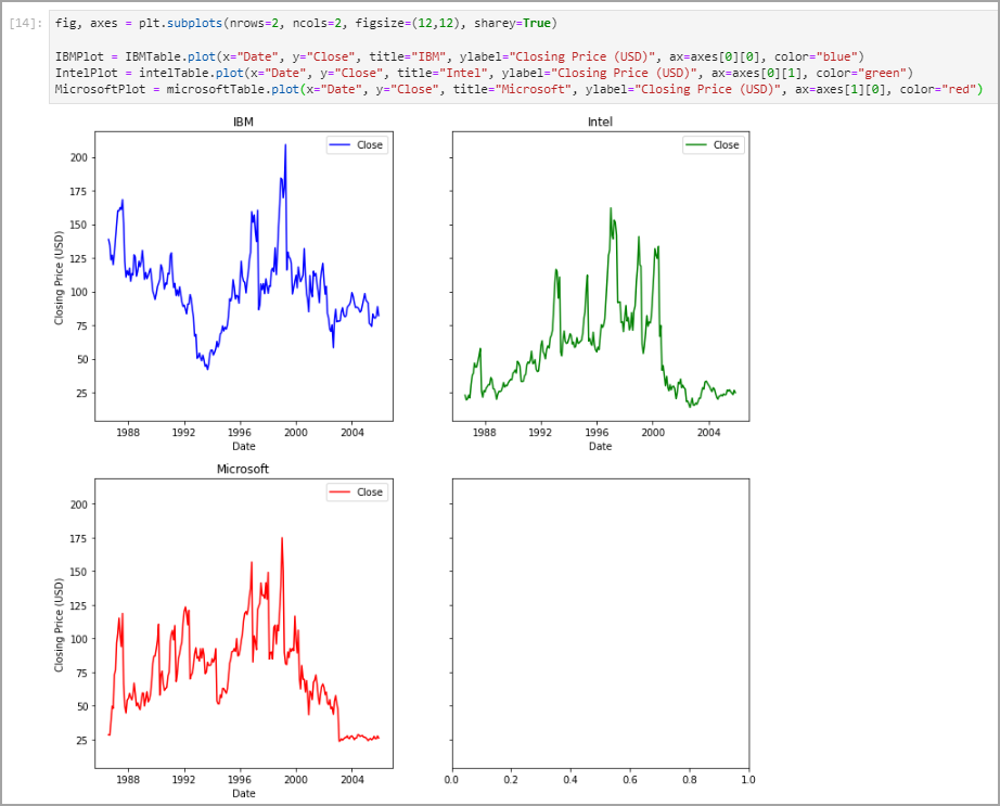
I then went on to making the graphs more descriptive by adding x axis labels and unique colors for each graph.
fig, axes = plt.subplots(nrows=2, ncols=2, figsize=(12,12), sharey=True)

IBMPlot = IBMTable.plot(x="Date", y="Close", title="IBM", ylabel="Closing Price (USD)", ax=axes[0][0], color="blue")
IntelPlot = intelTable.plot(x="Date", y="Close", title="Intel", ylabel="Closing Price (USD)", ax=axes[0][1], color="green")
MicrosoftPlot = microsoftTable.plot(x="Date", y="Close", title="Microsoft", ylabel="Closing Price (USD)", ax=axes[1][0], color="red")
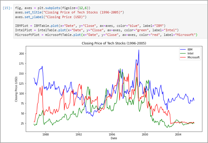
I also created a single graph that contained the data for all three companies on the same axes. To do so, all you must do is set the ax parameter to the same axes object for each dataset.
fig, axes = plt.subplots(figsize=(12,6))
axes.set_title("Closing Price of Tech Stocks (1996-2005)")
axes.set_ylabel("Closing Price (USD)")

IBMPlot = IBMTable.plot(x="Date", y="Close", ax=axes, color="blue", label="IBM")
IntelPlot = intelTable.plot(x="Date", y="Close", ax=axes, color="green", label="Intel")
MicrosoftPlot = microsoftTable.plot(x="Date", y="Close", ax=axes, color="red", label="Microsoft")
When plotting more than one dataset on a single axes object, I had to remove the title and ylabel parameters from the plot() function and instead used the axes.set_title() and axes.set_ylabel() functions. As well, I had to give each plotted result a label using the label parameter, which gave each line a distinct name in the legend in the top right.
Importing matplotlib
As mentioned, SWAT comes with matplotlib built-in, meaning users are not required to import it directly. This can be incredibly useful for creating visualizations, but it is important to note there will be less opportunity for customization. It is important to note that, to work directly with matplotlib objects, the matplotlib library must be imported. In the stocks example, the process of creating a subplot and then using plot() to draw a graph on said subplot is only possible by importing matplotlib. This is because the subplot() function is not provided with SWAT, but instead only with matplotlib. Importing matplotlib is not always required, though, to create a meaningful visualization, as shown by the baseball example.
Further Use
Matplotlib’s versatility combined with its integration with SAS Viya’s CAS makes it a great tool for creating quick visualizations of SAS results using Python. As one of the most popular Python packages, it also has extensive documentation and example uses all around the web. The tools demonstrated in this blog only scratch the surface of what matplotlib can do. Next time you find yourself working with SAS results inside Python, consider implementing matplotlib to add in some visuals.
More Resources
Matplotlib — Visualization with Python
API Reference — Matplotlib 3.5.3 documentation
swat.cas.table.CASTable.plot — SWAT 1.11.0 documentation (sassoftware.github.io)
SAS Help Center: Baseball Data
Find more articles from SAS Global Enablement and Learning here.
- Mark as Read
- Mark as New
- Bookmark
- Permalink
- Report Inappropriate Content
hello Michael, thank you for this article. I have one clarification question, what is the difference of using Python via SWAT and proc python in SAS Viya SAS Studio? can you do the same things with both? regards Karolina
- Mark as Read
- Mark as New
- Bookmark
- Permalink
- Report Inappropriate Content
Hello Karolina! Thank you for checking out my blog. SWAT is a Python library that allows you to work with CAS inside a Python environment. The PROC PYTHON statement, on the other hand, is a statement that allows you to use Python code inside a SAS session.
In my examples, I use SWAT to bring CAS results into a Python session. A user may find this useful if they find the Python environment more familiar or are interested in using tools only available in a Python environment. Be sure to check out Peter Styliadis's blog series Getting Started with Python Integration to SAS® Viya®, where he explores the ins and outs of SWAT, as well as the great use cases it provides.
PROC PYTHON is a great option for implementing Python code inside your SAS session. Think of this as the reverse of using SWAT: instead of bringing SAS data to Python, Python is brought to SAS data. Beverly Brown highlights some awesome uses for PROC PYTHON in her blog Using PROC PYTHON to augment your SAS programs.
Let me know if you have any further questions about using Python with SAS Viya!
Michael
Available on demand!
Missed SAS Innovate Las Vegas? Watch all the action for free! View the keynotes, general sessions and 22 breakouts on demand.
Free course: Data Literacy Essentials
Data Literacy is for all, even absolute beginners. Jump on board with this free e-learning and boost your career prospects.
