- Home
- /
- SAS Communities Library
- /
- Efficiently Modeling Interval Targets Using Bayesian Additive Regressi...
- RSS Feed
- Mark as New
- Mark as Read
- Bookmark
- Subscribe
- Printer Friendly Page
- Report Inappropriate Content
Efficiently Modeling Interval Targets Using Bayesian Additive Regression Trees -Part 2
- Article History
- RSS Feed
- Mark as New
- Mark as Read
- Bookmark
- Subscribe
- Printer Friendly Page
- Report Inappropriate Content
In my previous article, I tried to cover basics of BART model, its mathematical form, MCMC algorithm and regularization priors. In this article, I demonstrate training a BART model using BART node in Model Studio. I also compare BART model with other modeling techniques including a traditional linear regression model. Note that the BART node in Model Studio models the interval targets only.
Training a BART model in Model Studio
In the demonstration, I will be using a data set from a charitable organization that seeks to predict the amount of donation made by their customers who chose to make donations. The data set includes variety of information on its customers like demographic details, past donation amounts and frequency of donation etc. The challenge is to build a machine learning model that can accurately predict the amount of donation (Donation_Amt) when almost half of the donation amounts are having missing values. Why donation amounts have these many missing values? Well, it is because not everyone in the database will choose to donate. A partial view of data table is produced below for reference.
Select any image to see a larger version.
Mobile users: To view the images, select the "Full" version at the bottom of the page.
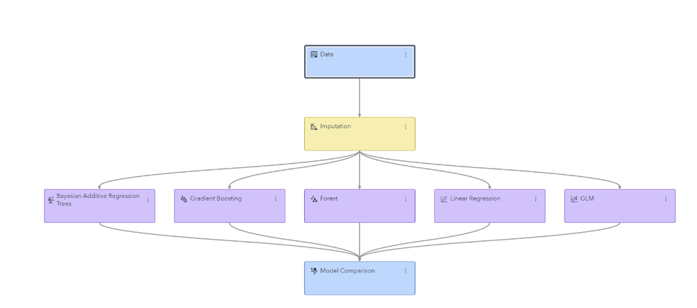
I will be using Model Studio to build several models (including a BART model) to predict the interval target (Donation_Amt, in this case). I am assuming that you are already familiar with the steps required to create a pipeline in Model Studio. If not, check out Build Models with SAS Model Studio | SAS Viya Quick Start Tutorial. I invoked a basic template for interval target that includes imputation node, a linear regression node and a model comparison node in the pipeline. Remember, the imputation node can impute the missing values in any of the predictors but cannot handle the missingness in a target variable. Besides the default linear regression model I would try several other machine learning algorithms to model the interval target. In this attempt I would add a generalized linear model (GLM node) to the Imputation node and change the default value of Target probability distribution from Poisson to Normal, i.e. select Target probability distribution > Normal. All other settings are kept at their default. Then I add a gradient boosting node, a forest node and finally a BART node to the Imputation node with their default settings. All these modeling nodes are automatically connected to the Model Comparison node to facilitate model comparison. The completed pipeline should resemble the following.
Select Run pipeline to run all the included nodes in pipeline. Before discussing the Model Comparison node results and the champion model I would like to spend some time on BART model results (after all this article is about BART model). Right-click on BART node and select Results. On the Node tab, let us first discuss the Trace plot.
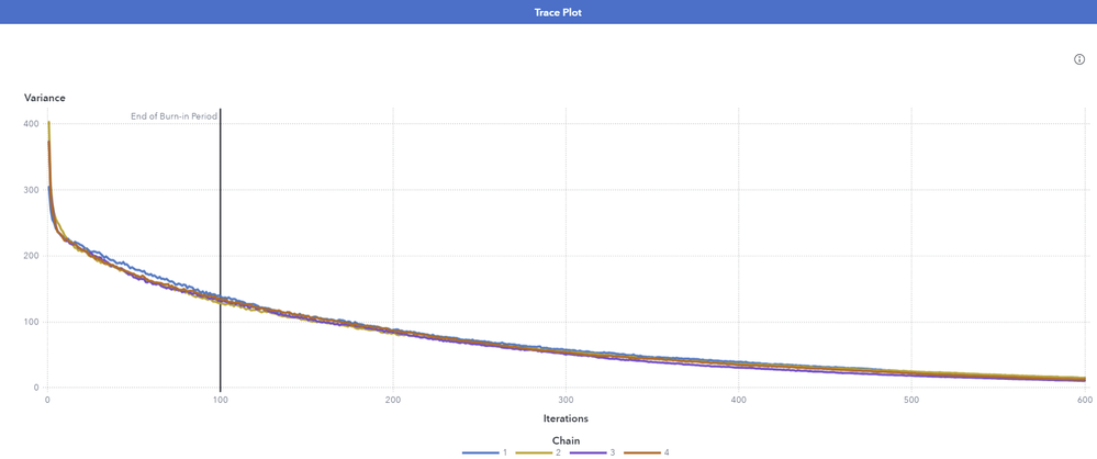
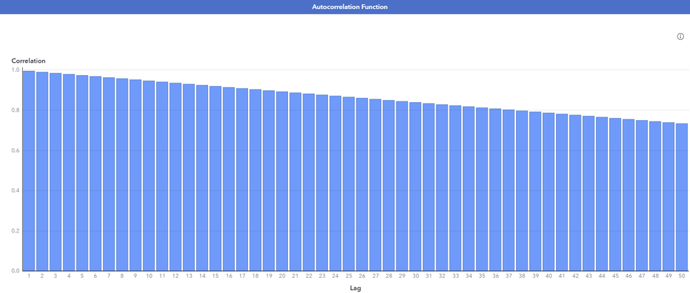
It plots the sampled values of the variance parameter against the number of iterations. We need to make sure that the MCMC sampler explores the parameter space efficiently. Ideally, a Markov chain traverses the parameter space efficiently with a relatively constant mean and variance as the number of iterations increases. The Trace Plot can suggest that a Markov chain did not converge to its stationary distribution if there are visible trends, or if the distribution of values changes over time. Assessing the convergence of Markov chain is important, as no valid inferences can be drawn if the chain is not converged. Above trace plot highlights convergence issues as a clear trend is evident in the graph. To address convergence issues, you can either change the model specifications or increase the number of iterations. The vertical line in the graph indicates the end of burn-in period of initial iterations that are discarded. Remember, the Burn-in refers to the practice of discarding an initial portion of a Markov chain sample so that the effect of the initial values on the posterior inference is minimized. The default value is 100, hence the line is drawn at 100th iteration. However, you can adjust the burn-in period, depending upon the problem. Next, we look at the Autocorrelation function plot. It measures the correlation
between MCMC draws at different lags.
The lag-k autocorrelation is the correlation between every sample that are k-steps apart. Ideally, this autocorrelation should become smaller as k increases, i.e. samples can be considered as independent. On the other hand, high autocorrelation at long lags indicates poor sampling efficiency. In the adjoining Autocorrelation function plot, there is a lot of serial correlation between successive draws, and we clearly see high autocorrelation at long lags which suggest poor sampling efficiency. This means that the chain is very slow in exploring the sample space and that the sample space has been explored only few times. In short, though autocorrelation does not lead to biased Monte Carlo estimates, it does indicate poor sampling efficiency. In such scenario, we can thin the MCMC chain, that is we discard n samples for every sample that we keep. In Model Studio, you can do so by increasing the value for the Thinning rate property. Note that increasing thinning rate discards a potentially large number of samples. Though high autocorrelation can be concern in some applications, the estimates are more precise if you use all the samples, even in the presence of high autocorrelation.
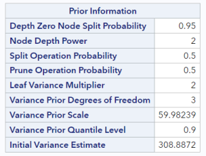
Next, I expand the Output to see results from the BART procedure. The Prior information table displays:
Chain information table indicates the samples saved per chain. In this example, system uses 4 Markov chains which by default is equal to the number of worker nodes. The value 500 comes from the Number of iterations property setting in the MCMC option. This number excludes the burn-in iterations.
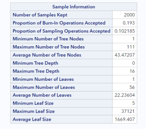
Scroll further down to see the information about posterior samples. Note that 2000 samples are kept which means to score a new data with the model, each new data point needs to traverse all the 2000 samples of the ensemble to generate predictions.
Node also produces Path EP score code and DS2 package code that can be used outside of Model Studio environment to score new data.
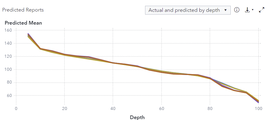
Now, I click on the Assessment tab and examine the Predicted reports window.
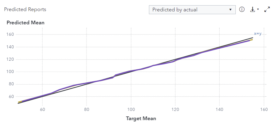
The graph displays the actual and predicted means for each quantile (depth in increments of 5). It is evident from the graph that the actual mean and predicted mean are very close to each other for both the training and validation data role. Hence model seems to be making accurate predictions. From the drop-down menu on the top right corner, you can request for another assessment plot, i.e. predicted mean by actual mean graph.
This plot also indicates that the model seems to be doing a good job in making predictions as the predicted means and actual means are going hand-in hand.
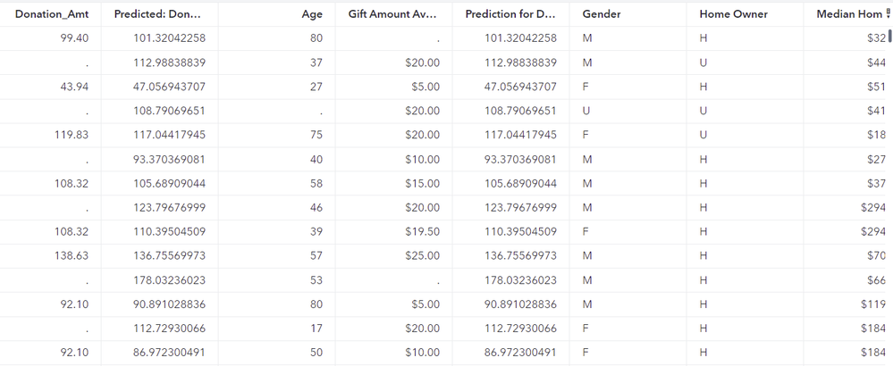
Next, I select the Output Data tab to examine the predictions made by the model. Select View output data twice to open a data table that includes a predicted target column along with the original inputs. In the output table snippet below, I have rearranged the default order of predicted columns and input variables to be able to quickly compare the actual and predicted target values. The first column (Donation_Amt) is now the actual target and second column (Predicted:Donation_Amt) is the predicted value. Looking at the first few observations, it appears that the BART model is doing a good job in predicting the target value.
Next, I examine the Model Comparison node results to identify the best model among all the competing models.
Right-click the Model Comparison node to view the results.
Model comparison table reveals Forest as the champion model having lowest ASE (average squared error) of 16.65, and BART model finishing close second with ASE value of 30.76.
Summary
The BART model is a flexible Bayesian nonparametric approach to regression that consists of a sum of multiple decision trees. They can incorporate continuous predictors, categorical predictors, missing values (in predictors) and interactions. However, it is interesting to know how BART models compare with other tree-based ensemble methods? Well, in the gradient boosting algorithm, trees are added sequentially to the ensemble. Each subsequent tree is fit to the residuals of the previous tree and the loss function is minimized. The random forests use randomization to create a large number of independent trees, and then reduce prediction variance by averaging predictions across the trees. The BART on the other hand differs from these tree-based methods as the trees are not added to the ensemble; instead, it uses Gibbs sampler that successively modifies each tree in the ensemble. The BART algorithm is computationally intensive due to its iterative nature. Scoring new data with the model can also be time consuming because each new data point needs to traverse all the saved samples of the ensemble to generate predictions.
Available on demand!
Missed SAS Innovate Las Vegas? Watch all the action for free! View the keynotes, general sessions and 22 breakouts on demand.
Free course: Data Literacy Essentials
Data Literacy is for all, even absolute beginners. Jump on board with this free e-learning and boost your career prospects.
Get Started
- Find more articles tagged with:
- GEL

