- Home
- /
- SAS Viya
- /
- VA Gallery
- /
- Visualizing Seasonal Weather Data Using An Air Temperature Circle Grap...
- RSS Feed
- Mark as New
- Mark as Read
- Bookmark
- Subscribe
- Printer Friendly Page
- Report Inappropriate Content
Visualizing Seasonal Weather Data Using An Air Temperature Circle Graph
- Article History
- RSS Feed
- Mark as New
- Mark as Read
- Bookmark
- Subscribe
- Printer Friendly Page
- Report Inappropriate Content
What's your ideal outdoor temperature to go for a jog? For me, I think the best temperature to go running is 65 degrees Fahrenheit. Ever since winter began I've been wondering when we are going to start seeing some 65 degree days. This got me thinking, what's a good way to use SAS Visual Analytics to visualize the average daily air temperatures throughout the 4 seasons of the year? Specifically, how many days are above and below 65 degrees?
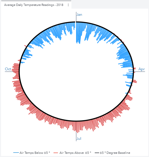
I began by opening the SAS Graph Builder and in just a few minutes, I was able to create the graph below.
Each line represents the average air temperature for each day of the year. The blue lines that extend inward represent days where the average temperature was BELOW 65 degrees. Conversely, the red lines that extend outward represent days where the average temperature was ABOVE 65 degrees. The length of the lines represent the actual value of the average air temperature for each day.
Data is obtained from the USGS Water Services website (Credit: U.S. Geological Survey - Department of the Interior/USGS) and processed with with SAS Visual Analytics 8.5.
Get the details of how to re-create this chart in this SAS Communities Library article.
Available on demand!
Missed SAS Innovate Las Vegas? Watch all the action for free! View the keynotes, general sessions and 22 breakouts on demand.


