- Home
- /
- SAS Viya
- /
- VA Gallery
- /
- Fatality Analysis - United States
- RSS Feed
- Mark as New
- Mark as Read
- Bookmark
- Subscribe
- Printer Friendly Page
- Report Inappropriate Content
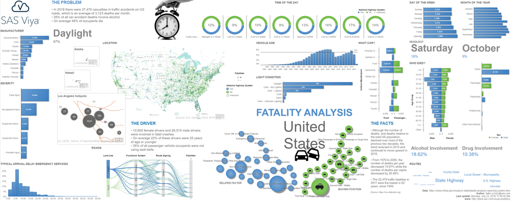
Fatality Analysis - United States
- Article History
- RSS Feed
- Mark as New
- Mark as Read
- Bookmark
- Subscribe
- Printer Friendly Page
- Report Inappropriate Content
- Mark as Read
- Mark as New
- Bookmark
- Permalink
- Report Inappropriate Content
Great way to show so many aspects of the problem! May I just suggest regarding the car manufacturer bar graph ( top right) : would it be a good idea to weigh it by the volume (the inverse of volume actually, or perhaps a "per 1000 vehicles sold in the US") of the respective manufacturers. I wouldn't want those Chevy drivers to feel uneasy just because GM happens to be one of the larger companies. At the same time, Hyundai's representation in the lower part of that graph may show it in a even better light.
But I do understand there is a trade-off - an infographic might be better off sticking to simple measures.
regards,
Sundaresh
- Mark as Read
- Mark as New
- Bookmark
- Permalink
- Report Inappropriate Content
Thanks Sundaresh. Yes, that makes sense as a weighted measure would better show the manufacture relationship here. Clearly - as you figured - GM is top on the list given its higher sales volume but of course we shouldn’t give the impression these cars are less safe than others (well, we will see once we use a weighted measure ;-). I will put this one the list of things to check/improve in version 2 - I got a few other tweaks to make anyway.
But really appreciate your feedback!
Regards, Falko
Available on demand!
Missed SAS Innovate Las Vegas? Watch all the action for free! View the keynotes, general sessions and 22 breakouts on demand.


