- Home
- /
- SAS Viya
- /
- VA Gallery
- /
- Example sales dashboard for execs using SAS Visual Analytics
- RSS Feed
- Mark as New
- Mark as Read
- Bookmark
- Subscribe
- Printer Friendly Page
- Report Inappropriate Content
Example sales dashboard for execs using SAS Visual Analytics
- Article History
- RSS Feed
- Mark as New
- Mark as Read
- Bookmark
- Subscribe
- Printer Friendly Page
- Report Inappropriate Content
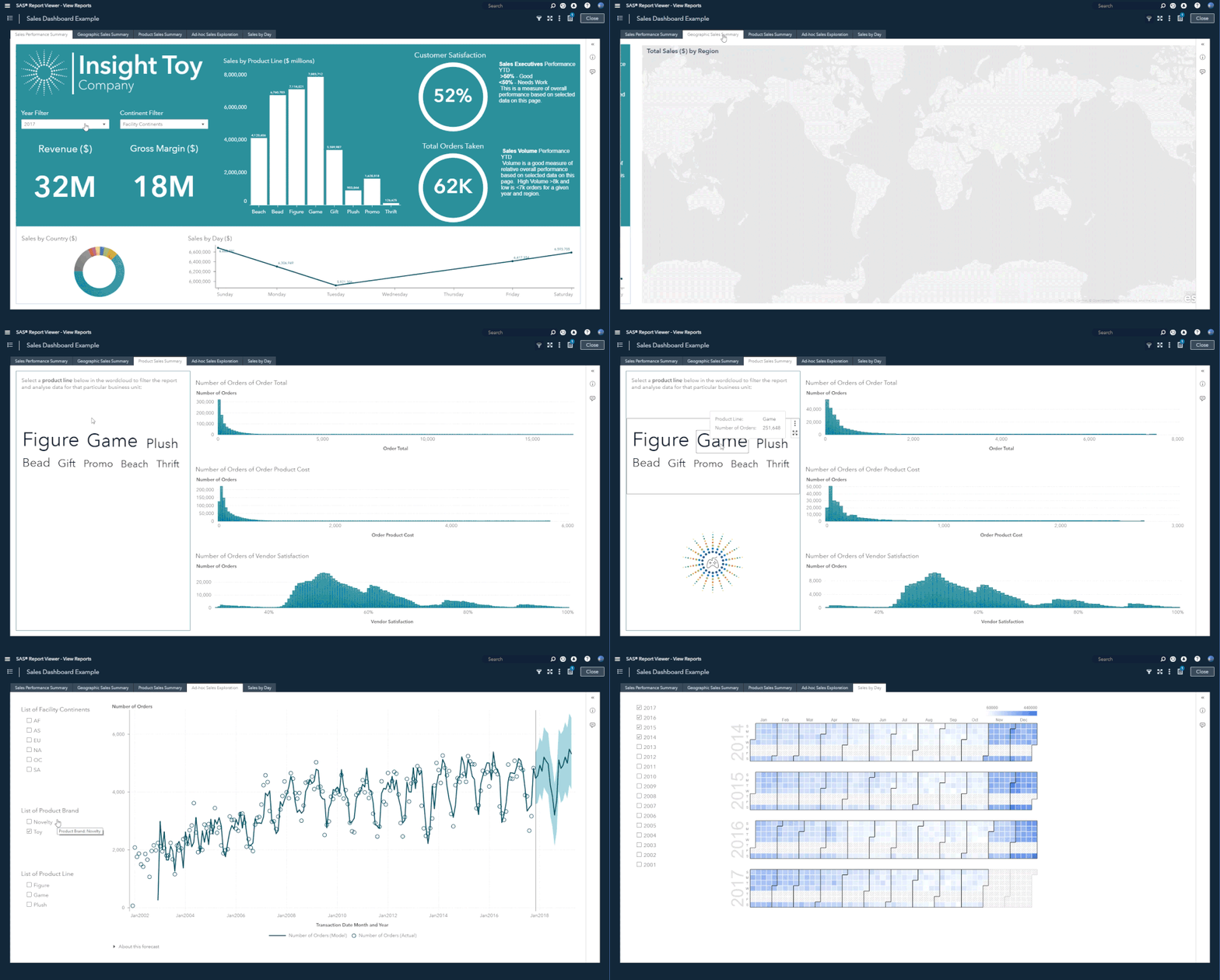
Here is a dashboard I created using sample data and used as an image in my book “Infographics Powered by SAS: Data Visualization Techniques for Business Reporting” and I thought I would share some ideas on how I created this example. Watch a short video demonstration of the dashboard below.


Who is my Audience?
I always start with the audience in mind. In this example, I built this dashboard for the executive user in mind. SAS can display the dashboard on any device, however when I want to design a formatted layout and make it work for a particular use case, I think of how the audience will interact with the report. This way I get to decide on how I want to tell a story to this audience. I also do this as a way of focusing my own goals/priorities of the initial dashboard design and layout.
Here are some tips and features used in building this dashboard:
Set Fixed Report Size: I use the set fixed report size option whenever I want to enforce a report size across any device for the audience. This feature allows me to ensure my layout remains true to my design even if viewed on a different screen type.
Nested Containers: I use containers a whole lot. I even nest containers to create very small areas to control my layout. This also allows me to create object templates and reuse these designs over and over again for other reports in SAS Visual Analytics.
Colors: I use consistent color scheme to make the layout look more like the corporate/customer color scheme. The main design theme should not interfere with the impact of the data and insight being shared.
Balance: We are trying to be balanced with our objects, so we don’t overwhelm the audience with chaos. We aim to create an approachable entry point or ‘on ramp’ to data. These objects include images, text and data.
Interactivity: We can add simple filters to the dashboard can make the dashboard have wider appeal for multiple audiences, and provides limited self-service for deeper insight. Also providing drill through options means that you can use this as a launch pad to many other dashboards or data visualization to provide more details.
As you know, I mention these points and many more with every post and ultimately, as the analyst, we are building these dashboards to get the audience to be engaged with our data. Building dashboards is an iterative process and requires a feedback loop to improve as the audience needs change.
I would really like to see visualizations you are creating in SAS Visual Analytics. Please share your examples to this gallery. I am happy to share the XML VA report specification if others are keen to reuse this template - just send me a message or comment below.
VIDEO Demo below:
Available on demand!
Missed SAS Innovate Las Vegas? Watch all the action for free! View the keynotes, general sessions and 22 breakouts on demand.

